Chapter 5 Process Data in R
R specializes in data processing, encompassing a wide range of operations such as downloading, importing, cleaning, merging, transforming, summarizing, analyzing, and visualizing data. Previous chapters have introduced the core functions for performing these tasks (refer to Chapter 3 and 4). This chapter takes a practical approach by applying these concepts to real financial datasets in three illustrative examples. The key tools introduced in each example are summarized in Table 5.1.
| Data | Import Format | Tasks | |
|---|---|---|---|
|
|
Bitcoin prices |
DSV file
\(\downarrow\) data.frame
|
|
|
|
Stock and oil prices |
Web API data
\(\downarrow\) xts
|
|
|
|
House prices |
Excel workbook
\(\downarrow\) tibble
|
|
As shown in Table 5.1, each example leverages different file types, data structures, and tools. Example 1 manipulates data frames using base R, as introduced in Chapter @ref(data.frame). Example 2 employs xts objects, detailed in Chapter 4.8. Example 3 utilizes Tidyverse functions on tibbles, as discussed in Chapter 4.6.
New in this chapter is the focus on data import methods. Example 1 deals with DSV files, including CSV and TSV. Example 2 retrieves data via Web API. Example 3 deals with Excel workbooks. For importing data formats not covered here, search “import data in R” along with the format name in Google. You’ll likely find a dedicated package for the task. For instance, the DBI and RSQLite packages facilitate SQL database imports, while haven enables importing SPSS, SAS, and Stata files.
Additionally, this chapter expands on visualization methods beyond those covered in Chapter 3.4. For instance, Example 2 introduces plot.zoo() for graphing xts objects, and Example 3 incorporates advanced plotting via the ggplot2 package.
5.1 Process Bitcoin Price Data
This section demonstrates how to process Bitcoin prices from the Bitstamp exchange, obtained from CryptoDataDownload (Bitstamp 2024). Once the data is downloaded as a CSV file, it is imported into R. The date column undergoes conversion to a POSIXct data type. Subsequently, the data is visualized and exported in both RDS and CSV formats.
5.1.1 Download DSV File
The procedure to obtain this dataset is detailed in Chapter 3.7.3. Briefly:
- Visit www.cryptodatadownload.com.
- Navigate to “Historical Data” > “US & UK Exchanges”.
- Click on “Bitstamp”, then find the “Bitstamp minute data broken down by year” section.
- Choose “BTC/USD 2023 minute” and click “Download CSV”.
After downloading, ensure you place the file in your R working directory, specifically inside a folder named “files”, and rename the file to BTCUSD_minute.csv. For information on how to identify and set your working directory, refer to Chapters 3.7.1 and 3.7.2.
5.1.2 Import DSV File
In R, datasets are primarily stored and manipulated using two-dimensional structures such as matrices and data frames, complemented by extensions such as tibbles, data tables, and xts objects. Various functions exist for importing external datasets into R. The choice of function depends both on the external dataset’s format, whether CSV, Excel, or XML, and the intended data structure in R, whether a data frame, matrix, tibble, or xts object.
DSV (delimiter-separated values) is a common file format used to store tabular data. As the name suggests, the values in each row of a DSV file are separated by a delimiter. This delimiter is a sequence of one or more characters used to specify the boundary between separate, independent regions in a data table. Depending on the character used as a delimiter, different notations emerge, such as CSV (comma-separated values) and TSV (tab-separated values). Sometimes semicolons, spaces, or other characters are used as delimiters in similar formats.
Here’s an example of how data is stored in a CSV file:
Gender, Age, Score, Rank
Male, 25, 100, 3
Female, 22, 90, 4
And for a TSV file, the data would look like this:
Gender    Age    Score    Rank
Male    25    100    3
Female    22    90    4
Note the use of tabs in the TSV example to separate the data fields, in contrast to the commas used in the CSV example.
To read DSV files into R and convert them to data frames, the read.table() function comes in handy. The function has several arguments that allow customization based on the structure and specifics of your DSV file. Before importing, it’s advisable to preview your DSV file in a spreadsheet program like Microsoft Excel to understand its layout and structure.
Here’s an illustration of how to employ the function using the downloaded BTCUSD_minute.csv file:
# Load DSV file containing Bitcoin prices
btcusd <- read.table(
    file = "files/BTCUSD_minute.csv",
    sep = ",",         # Delimiter is a comma (CSV)
    header = TRUE,     # The file has a header row with column names
    dec = ".",         # Decimal point character is a period
    na.strings = "NA", # Character string representing NA values
    skip = 1,          # Skips the introductory row (website's name)
    nrows = 5000       # Limits reading to the initial 5000 rows
)

# Display the first 4 rows of columns 1 to 7 for an overview
btcusd[1:3, 1:7]
## unix date symbol open high low close
## 1 1697413380 2023-10-15 23:43:00 BTC/USD 27114 27119 27107 27119
## 2 1697413320 2023-10-15 23:42:00 BTC/USD 27114 27120 27114 27120
## 3 1697413260 2023-10-15 23:41:00 BTC/USD 27115 27119 27115 27119In this illustration:
file: Denotes the DSV file’s path and name.sep: The delimiter is a comma for this CSV file, i.e.sep = ",". For a TSV file, you would usesep = "\t". Ifsep = ",", theread.csv()function could be used similarly without the need for thesepargument.header: Indicates the presence of a header in the file. When TRUE, the row following the skipped rows (if any) is considered as the column names.dec: Specifies the character for decimal points. In the U.S., this is typically2.84withdec = ".", while in parts of Europe it’s2,84withdec = ",".na.strings: Sets the string that corresponds toNAvalues. Some datasets may use “N/A” or might leave the entry blank, leading to configurations likena.strings = "N/A"orna.strings = "", respectively.skip: States the initial lines to omit from the file.nrows: Caps the rows read from the file.
By tweaking these parameters, you can handle a wide range of DSV file structures and peculiarities.
It’s important to note that the read.table() function by default imports the DSV file as a data frame:
## [1] "data.frame"Once the data is imported, you can transform the data frame into various data structures:
- Convert to a tibble using the
as_tibble()function from thetibblepackage. - Transform into a data table via the
as.data.table()function from thedata.tablepackage. - Create an
xtsobject using thexts()function from thextspackage.
For more direct approaches:
- The
read_delim()function from thereadrpackage by Wickham, Hester, and Bryan (2024), part of the Tidyverse, directly imports DSV files as a tibble. - The
fread()function, found in thedata.tablepackage, imports DSV files as a data table. - To directly read DSV files as
zooobjects, one can use theread.zoo()function from thezoopackage. Subsequently, to transform thezooobject into anxtsobject, apply theas.xts()function from thextspackage.
While these functions share certain traits with read.table(), they also come with their own unique features. To fully understand their capabilities and differences, consider consulting their respective documentation using ?read_delim, ?fread, and ?read.zoo after loading the readr, data.table, and zoo packages.
5.1.3 Inspect Data
Once data is imported, a preliminary examination ensures its accuracy. This can be done by simply entering the data name btcusd into the console. However, since R prints the entire data frame, the columns will not be visible if the data contains more rows than the size of the screen. To accommodate this, you can use the head() function to print the column names and the first six observations, or the tail() function to print the column names and the last six observations, where the additional input n = 10 increases it to ten observations:
##            unix                date  symbol  open  high   low close
## 4991 1697099580 2023-10-12 08:33:00 BTC/USD 26799 26799 26799 26799
## 4992 1697099520 2023-10-12 08:32:00 BTC/USD 26805 26805 26805 26805
## 4993 1697099460 2023-10-12 08:31:00 BTC/USD 26796 26807 26796 26807
## 4994 1697099400 2023-10-12 08:30:00 BTC/USD 26789 26800 26789 26800
## 4995 1697099340 2023-10-12 08:29:00 BTC/USD 26794 26794 26794 26794
## 4996 1697099280 2023-10-12 08:28:00 BTC/USD 26798 26798 26796 26796
## 4997 1697099220 2023-10-12 08:27:00 BTC/USD 26786 26790 26784 26790
## 4998 1697099160 2023-10-12 08:26:00 BTC/USD 26790 26790 26790 26790
## 4999 1697099100 2023-10-12 08:25:00 BTC/USD 26790 26792 26787 26790
## 5000 1697099040 2023-10-12 08:24:00 BTC/USD 26778 26778 26777 26778
In cases where numerous columns still prove problematic even with head() or tail(), RStudio provides a spreadsheet-like viewer for data frames via the View() function (exclusive to RStudio and not included in R):
For an exploration of the data’s structure and summary, execute str(btcusd) and summary(btcusd).
5.1.4 Clean Data
It’s important to check the data type of each column, as the import process may have misassigned data types. Utilize sapply() together with class() for this task:
# Examine the data structure of the dataset
class(btcusd)

# Identify the data type for every column
sapply(btcusd, class)
## [1] "data.frame"
## unix date symbol open high low
## "integer" "character" "character" "integer" "integer" "integer"
## close Volume.BTC Volume.USD
## "integer" "numeric" "numeric"In this scenario, R has accurately discerned Bitcoin prices and trading volumes as numerical values. The columns open, high, low, and close denote the opening, peak, trough, and closing prices within a minute interval, respectively. Volume.BTC and Volume.USD quantify transaction volumes in bitcoins and USD.
However, the date column wasn’t identified as a specific date format, such as POSIXct. This requires manual conversion (refer to Chapter 3.3 for understanding date objects like POSIXct).
# Modify date strings to the POSIXct data type
btcusd$date <- as.POSIXct(btcusd$date)

# Recheck the data type of the date column
class(btcusd$date)
## [1] "POSIXct" "POSIXt"Such type adjustments are common when importing data in R. When employing read.table() in R, the function inspects the first 1,000 rows to deduce each column’s type. If these rows aren’t indicative of the complete dataset, misinterpretations can arise. An example: if the initial 1,000 rows of a column seem numeric but later on contain a character, R might incorrectly perceive it as numeric, where the characters are converted to numeric NA values. Another scenario is R reading a column as character values when the first 1,000 rows of a column are absent, instead of numeric values. Also, R might read “N/A” as a character string instead of a missing value, causing the column to become character type instead of numeric. The last issue can be addressed by defining na.strings = "N/A" within read.table(), or by replacing “N/A” post-import with NA and then using as.numeric() to convert to numeric.
To improve data clarity, consider adding contextual attributes like the data source and the count of imported rows. These attributes can be easily appended using R’s attr() function. For a cleaner data structure, it’s also beneficial to eliminate the row.names attribute for our btcusd object, as it merely consists of sequential numbers. In R, setting an attribute to NULL effectively removes it.
# Attach source and row count as attributes to the btcusd object
attr(btcusd, "source") <- "www.cryptodatadownload.com/cdd"
attr(btcusd, "n_rows_imported") <- nrow(btcusd)

# Erase the row.names attribute
attr(btcusd, "row.names") <- NULL

# Examine attributes to confirm changes
attributes(btcusd)
## $names
## [1] "unix" "date" "symbol" "open" "high"
## [6] "low" "close" "Volume.BTC" "Volume.USD"
##
## $class
## [1] "data.frame"
##
## $source
## [1] "www.cryptodatadownload.com/cdd"
##
## $n_rows_imported
## [1] 5000By doing so, anyone reviewing this data object can immediately understand its origin and size without having to consult external documentation. This additional layer of metadata can be especially beneficial when sharing data objects across different phases of a project or with other collaborators.
5.1.5 Visualize Data
A graph is a visual representation that displays data points on a coordinate system, typically showing the relationship between two or more variables. Each variable is assigned to an axis, and the data points are plotted accordingly. In R, the plot() function is one of the primary tools for creating graphs.
Consider the Bitcoin prices dataset, btcusd, from our previous section. We’ll map the date (btcusd$date) onto the x-axis and the closing price at each trading minute (btcusd$close) to the y-axis:
# Plot data
plot(x = btcusd$date,
     y = btcusd$close,
     type = "l",
     main = "Bitcoin Prices During 5,000 Trading Minutes",
     ylab = "USD",
     xlab = paste("Time in", format(tail(btcusd$date, 1), "%Y")))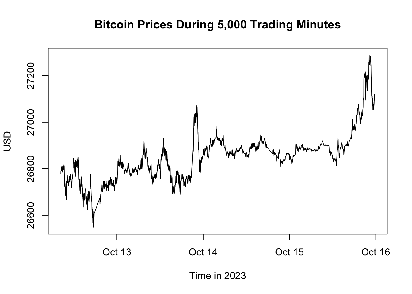
Figure 5.1: Bitcoin Prices During 5,000 Trading Minutes
Here’s a detailed breakdown of the plot() function arguments used in the example:
xandy: These are the primary arguments that specify the data for the x-axis and y-axis, respectively. In the given example,btcusd$daterepresents the time variable on the x-axis, whilebtcusd$closesignifies the Bitcoin closing prices on the y-axis.type: This argument determines how the data points should be represented. The value"l"indicates that the data points should be connected with lines, producing a line graph. Other common values include"p"for points (producing a scatter plot),"b"for both points and lines, and"h"for vertical lines (like high-density plots).main: This argument defines the main title of the graph. Here, “Bitcoin Prices During 5,000 Trading Minutes” serves as the title, succinctly conveying the subject of the visualization.xlabandylab: These arguments specify the labels for the x-axis and y-axis, respectively. Properly labeling axes is vital as it provides context and clarifies the variables being visualized. In our example, “Time in 2023” denotes the time intervals on the x-axis, and “USD” indicates that the y-axis represents Bitcoin prices in US dollars.
Figure 5.1 showcases the closing prices of Bitcoin over a span of 5,000 trading minutes. By visually inspecting the graph, one can gauge the volatility, identify any potential data inconsistencies, and generally understand the behavior of Bitcoin prices over the observed interval.
5.1.6 Export Data
This section shows how to export data in two commonly used formats: RDS and DSV.
RDS
R provides a unique storage format known as RDS (R Data Structure). It’s a binary format, which means it represents data in a way that’s directly readable by computers but not easily readable by humans. The primary advantage of binary formats, like RDS, is they often allow faster read and write operations and can maintain all the intricacies of data structures. This ensures that when an R object is saved in RDS format and then reloaded, its structure and metadata remain unaltered.
To save an R object as an RDS file, use the saveRDS() function.
# Create folder for exported files
dir.create(path = "exported-files", showWarnings = FALSE)

# Save btcusd data as RDS file
saveRDS(object = btcusd, file = "exported-files/btcusd.rds")
In this example:
objectrepresents the R object to be saved.fileindicates the path and filename where the data will be stored or overwritten.
To retrieve the object from the RDS file into R, use the readRDS() function.
# Load btcusd data from an RDS file
btcusd_loaded <- readRDS(file = "exported-files/btcusd.rds")
identical(btcusd, btcusd_loaded)
## [1] TRUEKey Points:
- Always check your working directory using
getwd()to ensure files are saved where intended. Adjust it withsetwd()if necessary. - Remember, RDS files are designed for R. While efficient for R-to-R data transfers, they might not be compatible with other software.
- Ensure your storage can accommodate the file size, especially for large datasets. Though RDS files are compressed, large datasets can still occupy significant space.
- Always exercise caution when loading RDS files from unknown sources, as they could contain harmful code.
Overall, RDS is a reliable choice for preserving R objects between sessions and projects.
DSV
For compatibility across various software applications, it’s often useful to save data as DSV files, instead of R-specific formats. The write.table() function facilitates the export of data frames to DSV formats, including CSV and TSV.
# Create folder for exported files
dir.create(path = "exported-files", showWarnings = FALSE)

# Export Bitcoin price data as TSV file
write.table(x = btcusd,
            file = "exported-files/btcusd.tsv",
            sep = "\t",
            row.names = FALSE)
Here:
xrepresents the data frame to export.filedenotes the desired path and filename for the DSV file.sepspecifies the delimiter between fields. In this case, we’re using a tab (\t) for a TSV file. Notably, usingwrite.csv()is akin towrite.table()withsep = ",".- With
row.names = FALSE, the exported file won’t include row names, which are typically just sequential numbers.
By tailoring the parameters of write.table(), you can effectively store your data in the preferred format.
Points to remember:
- Always verify the working directory with
getwd()to ensure the file is saved where intended. If necessary, adjust it usingsetwd(). - After exporting, open the file in a text editor or spreadsheet application to ensure its contents are as expected.
- Be patient with large datasets. Exporting might take time, so allow R to finish the process before exiting.
Here are alternative methods for exporting DSV files in R:
- The
write_delim()function from thereadrpackage, part of the Tidyverse, exports data frames to DSV format. This function is especially useful when working with tibbles. - The
fwrite()function from thedata.tablepackage is another option for exporting data frames to DSV files. This function is optimized for speed and efficiency. - For time series data, the
write.zoo()function from thezoopackage allows you to exportzooorxtsobjects directly as DSV files.
To fully understand the capabilities and unique features of these functions, it’s recommended to consult their respective documentation using ?write_delim, ?fwrite, and ?write.zoo after loading the readr, data.table, and zoo packages.
Note that DSV export doesn’t retain attributes and may misclassify data types on import:
# Import the exported TSV file
btcusd_loaded <- read.table(file = "exported-files/btcusd.tsv",
                            sep = "\t",
                            header = TRUE)

# Verify if the original and imported TSV files match
identical(btcusd, btcusd_loaded)
## [1] FALSETherefore, while DSV files offer better software compatibility than RDS, they fall short in preserving all attributes and data types of the original object.
5.2 Process Stock and Oil Prices
This section offers a roadmap for acquiring, manipulating, visualizing, and analyzing financial data using R using stock and oil price data as example. This section begins by discussing Web APIs as a method for directly fetching data, circumventing manual downloads and uploads. The quantmod and Quandl packages are used to fetch data from various APIs.
Following data acquisition, the section guides the reader through merging disparate data streams—such as stock and commodity prices—into a unified dataset. With the data merged, it presents methods to visualize the time-series data using plotting functionalities tailored for xts objects. The focus then shifts to transforming this raw data into a more analytically amenable form, dealing specifically with the issues of irregular frequency and missing values to create a regular time series at a monthly frequency.
Finally, the section concludes by demonstrating how to tabulate key statistics like mean, volatility, and correlation. These statistics offer a quantitative lens through which to understand the dataset’s central tendencies, dispersion, and relational aspects. Altogether, the section provides a comprehensive workflow for handling financial data, from acquisition to data analysis.
5.2.1 Web API
If your computer is connected to the internet, you can directly fetch data within R, bypassing the need to download data files manually and then import them into R. This section explains how to download financial and economic data in R using a Web API.
An Application Programming Interface (API), specifically a Web API, is more than just a data file saved on a website. It is a set of rules, protocols, and tools that enable two software entities to communicate with each other. In the context of data retrieval, a Web API serves as an interface between web servers and clients, offering a systematic way to access data. When you query a Web API, the server typically generates a response dynamically based on the request parameters it receives. This data can come in various formats such as JSON, XML, HTML, or plain text.
In R, direct interaction with Web APIs is often unnecessary, thanks to specialized R packages that handle this task. These packages translate fetched data into familiar R formats like data frames or xts objects. For instance, the imfr package fetches data from the IMF API, while the OECD and Quandl packages fetch data from the OECD and Nasdaq APIs, respectively. General-purpose packages like quantmod can interact with multiple APIs. To find an API for a specific database, a simple Google search such as “r web api database_name” should suffice.
In this chapter, we utilize the getSymbols() function from the quantmod package and the Quandl() function from the Quandl package to fetch data directly into R.
5.2.2 Download via quantmod
The quantmod package by Ryan and Ulrich (2024a) serves as a comprehensive toolkit for quantitative finance, primarily focused on data acquisition, manipulation, and visualization. It is designed to assist in the workflow of both financial traders and researchers. One of the package’s key functions is getSymbols(), which allows for easy access to financial data from multiple sources like Yahoo Finance, Google Finance, and Federal Reserve Economic Data (FRED).
Using getSymbols(), you can fetch various types of financial data such as stock prices, trading volumes, and other market indicators. The function downloads the data and converts it into an xts object, a data structure introduced in Chapter 4.8 that is designed to hold time-ordered data.
Here’s a basic example of using getSymbols() to fetch stock data for Apple Inc:
# Load the quantmod package
library("quantmod")

# Download Apple stock prices from Yahoo Finance
AAPL_stock_price <- getSymbols(
  Symbols = "AAPL",
  src = "yahoo",
  auto.assign = FALSE,
  return.class = "xts")

# Display the most recent downloaded stock prices
tail(AAPL_stock_price)
## AAPL.Open AAPL.High AAPL.Low AAPL.Close AAPL.Volume AAPL.Adjusted
## 2024-06-25 209.15 211.38 208.61 209.07 56713900 209.07
## 2024-06-26 211.50 214.86 210.64 213.25 66213200 213.25
## 2024-06-27 214.69 215.74 212.35 214.10 49772700 214.10
## 2024-06-28 215.77 216.07 210.30 210.62 82542700 210.62
## 2024-07-01 212.09 217.51 211.92 216.75 60402900 216.75
## 2024-07-02 216.15 220.38 215.10 220.27 57960500 220.27After running these commands, you’ll have the Apple stock data stored in an xts object, ready for your analysis and visualization tasks.
The arguments in this context are:
Symbols: Specifies the instrument to import. This could be a stock ticker symbol, exchange rate, economic data series, or any other identifier.auto.assign: When set to FALSE, data must be assigned to an object (here,AAPL_stock_price). If not set to FALSE, the data is automatically assigned to theSymbolsinput (in this case,AAPL).return.class: Determines the type of data object returned, e.g.,ts,zoo,xts, ortimeSeries.src: Denotes the data source from which the symbol originates. Some examples include “yahoo” for Yahoo Finance, “google” for Google Finance, “FRED” for Federal Reserve Economic Data, and “oanda” for Oanda foreign exchange rates.
To find the correct symbol for financial data from Yahoo Finance, visit finance.yahoo.com and search for the company of interest, e.g., Apple. The symbol is the series of letters inside parentheses. For example, for Apple Inc. (AAPL), use Symbols = "AAPL" (and src = "yahoo").
To download economic data from FRED, visit fred.stlouisfed.org, and search for the data series of interest, e.g., unemployment rate. Click on one of the suggested data series. The symbol is the series of letters inside parentheses. For example, for Unemployment Rate (UNRATE), use Symbols = "UNRATE" (and src = "FRED").
Note that Yahoo Finance provides data in OHLC format, consisting of six columns: AAPL.Open, AAPL.High, AAPL.Low, AAPL.Close, AAPL.Volume, and AAPL.Adjusted. These values represent the opening, highest, lowest, and closing prices for a given market day, the trade volume for that day, and the adjusted closing price, which accounts for stock splits. These columns can be accessed using quantmod’s Op(), Hi(), Lo(), Cl(), Vo(), and Ad() functions. Typically, the AAPL.Adjusted column is of most interest.
# Extract adjusted Apple share price
AAPL_stock_price_adj <- Ad(AAPL_stock_price)

# Display the most recent adjusted stock prices
tail(AAPL_stock_price_adj)
## AAPL.Adjusted
## 2024-06-25 209.07
## 2024-06-26 213.25
## 2024-06-27 214.10
## 2024-06-28 210.62
## 2024-07-01 216.75
## 2024-07-02 220.275.2.3 Download via Quandl
Quandl is a data service that provides access to many financial and economic data sets from various providers. It has been acquired by Nasdaq Data Link and is now operating through the Nasdaq data website: data.nasdaq.com. Some data sets require a paid subscription, while others can be accessed for free. Quandl provides an API that allows you to import data from a wide variety of languages, including Excel, Python, and R. To fetch data into R, the Quandl() function from the Quandl package is employed.
To use Quandl, first get a free Nasdaq Data Link API key at data.nasdaq.com/sign-up. After that, install and load the Quandl package and provide the API key with the function Quandl.api_key():
# Load Quandl package
library("Quandl")

# Provide API key
api_quandl <- "CbtuSe8kyR_8qPgehZw3"  # Replace this with your API key
Quandl.api_key(api_quandl)
Then, you can download data using Quandl(), such as fetching oil price data:
# Download monthly crude oil prices from Nasdaq Data Link
# ODA_oil_price <- Quandl(code = "ODA/POILAPSP_USD", type = "xts")
ODA_oil_price <- Quandl(code = "BSE/SI1400", type = "xts")$Close

# Display the downloaded crude oil prices
tail(ODA_oil_price)
## Close
## 2023-07-14 19064.63
## 2023-07-17 19137.22
## 2023-07-18 19159.95
## 2023-07-19 19268.31
## 2023-07-20 19370.52
## 2023-07-21 19373.83Here, the code argument refers to both the data source and the symbol in the format “source/symbol”. The type argument specifies the type of data object: data.frame, xts, zoo, ts, or timeSeries.
To find the correct code for the Quandl function, visit data.nasdaq.com, and search for the data series of interest (e.g., oil price). The code is the series of letters listed in the left column, structured like this: .../..., where ... are letters. For example, for the crude oil price provided by IMF’s Open Data for Africa (ODA), use code = "ODA/POILAPSP_USD".
ODA’s crude oil price data is monthly and does not include the most recent values. For more frequent and up-to-date data, go to the search results for “oil price” and look for the dataset from the Organization of the Petroleum Exporting Countries (OPEC). Its identifier, QDL/OPEC, isn’t immediately visible in the search listings. To locate it, click on the OPEC dataset link and find the code beneath the data table. To retrieve this data, use Quandl.datatable() instead of Quandl() since it’s structured as a data table, not a typical time series.
# Download daily crude oil prices from Nasdaq Data Link
OPEC_oil_price = Quandl.datatable("QDL/OPEC")

# Convert data frame to xts object
OPEC_oil_price = xts(x = OPEC_oil_price$value, order.by = OPEC_oil_price$date)

# Display the downloaded crude oil prices
tail(OPEC_oil_price)
## [,1]
## 2024-01-18 79.39
## 2024-01-19 80.27
## 2024-01-22 79.70
## 2024-01-23 81.30
## 2024-01-24 81.05
## 2024-01-25 81.985.2.4 Clean Data
When data is retrieved using R packages that interact with Web APIs, the likelihood of encountering misassigned data types is minimal. This is in contrast to the often encountered type issues when importing from DSV or Excel files. Nonetheless, the retrieved data object may still need conversion to a more suitable data structure. For example, we converted the OPEC_oil_price object from a data frame to an xts object.
Storing meta-information, such as the data source and time of import, as contextual attributes can be particularly useful. Since the data is directly imported via R code, it’s possible to preserve the import command itself as an attribute for future reference or replication:
# Record the time of data import
attr(AAPL_stock_price, "time_of_import") <- Sys.time()
attr(AAPL_stock_price, "time_of_import")
## [1] "2024-07-03 08:48:21 CDT"# Define the function used to import AAPL stock data
import_AAPL_data <- function() {
quantmod::getSymbols(
Symbols = "AAPL",
src = "yahoo",
auto.assign = FALSE,
return.class = "xts")
}
# Attach the import function as an attribute to the data object
attr(AAPL_stock_price, "import_command") <- import_AAPL_data
# Demonstrate re-import of the data using the saved attribute
tail(attr(AAPL_stock_price, "import_command")())## AAPL.Open AAPL.High AAPL.Low AAPL.Close AAPL.Volume AAPL.Adjusted
## 2024-06-25 209.15 211.38 208.61 209.07 56713900 209.07
## 2024-06-26 211.50 214.86 210.64 213.25 66213200 213.25
## 2024-06-27 214.69 215.74 212.35 214.10 49772700 214.10
## 2024-06-28 215.77 216.07 210.30 210.62 82542700 210.62
## 2024-07-01 212.09 217.51 211.92 216.75 60402900 216.75
## 2024-07-02 216.15 220.38 215.10 220.27 57960500 220.27By doing so, the data object becomes self-descriptive, facilitating easier data sharing and replication across different project stages or among collaborators.
Note that data is only available for roughly 252 days per year, as indicated by the table generated below:
##
## 2007 2008 2009 2010 2011 2012 2013 2014 2015 2016 2017 2018 2019 2020 2021 2022
##  251  253  252  252  252  250  252  252  252  252  251  251  252  253  252  251
## 2023 2024
##  250  126
That’s because stock market data is only available on trading days, excluding weekends and holidays. The result is an irregular time series with gaps varying from one day to over a week. To achieve a regular time series, consider interpolation or aggregating to a lower frequency like monthly data. This process is detailed in a subsequent chapter (see Chapter 5.2.8) and is also discussed in Chapters 4.8.
5.2.5 Plot Apple Stock Prices
Let’s visualize the Apple stock prices using the plot() function:
Figure 5.2: Apple Share Price
Observe that this plot differs from those created in previous chapters where data was stored as vectors - specifically, columns from data frames or tibbles. This variation occurs because plot() is a wrapper function, adapting its behavior to the object type supplied (see Chapter 3.5.11 for more on wrapper functions). When given an xts object, plot() defaults to using the plot.xts() method, optimized for visualizing time series data. Therefore, it’s no longer necessary to specify it as a line plot (type = "l"), as most time series are visualized with lines. To explicitly use the xts type plot() function, you can use the plot.xts() function, which behaves identically as long as the input object is an xts object. If not, the function will attempt to convert the object first.
As we’ve explored in Chapter 4.8, an xts object is an enhancement of the zoo object, offering more features. My personal preference leans towards the zoo variant of plot(), plot.zoo(), over plot.xts() because it operates more similarly to how plot() does when applied to data frames. To utilize plot.zoo(), apply it to the xts object like so:
# Plot adjusted Apple share price using plot.zoo()
plot.zoo(AAPL_stock_price_adj,
         main = "Apple Share Price",
         xlab = "Date", ylab = "USD")
In this context, the inputs are as follows:
AAPL_stock_price_adjis thextsobject containing Apple Inc.’s adjusted stock prices, compatible withplot.zoo()thanks toxts’s extension ofzoo.mainsets the plot’s title, in this case, “Apple Share Price”.xlabandylabrespectively label the x-axis as “Date” and the y-axis as “USD”, denoting stock prices in U.S. dollars.
The usage of plot.zoo() provides a more intuitive plotting method for some users, replicating plot()’s behavior with data frames more closely compared to plot.xts().
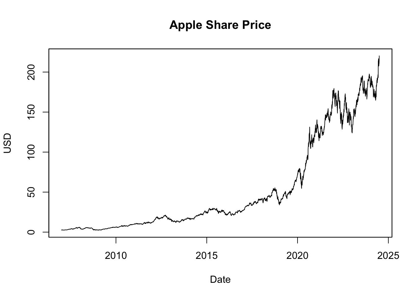
Figure 5.3: Apple Share Price Visualized with plot.zoo()
The resulting plot, shown in Figure 5.3, visualizes the Apple share prices over the last two decades. Stock prices often exhibit exponential growth over time, meaning the value increases at a rate proportional to its current value. As such, even large percentage changes early in a stock’s history may appear minor due to a lower initial price. Conversely, smaller percentage changes at later stages can seem more significant due to a higher price level. This perspective can distort the perception of a stock’s historical volatility, making past changes appear smaller than they were. To more accurately represent these proportionate changes, many analysts prefer using logarithmic scales when visualizing stock price data:
# Compute the natural logarithm (log) of Apple share price
log_AAPL_stock_price_adj <- log(AAPL_stock_price_adj)

# Plot log share price
plot.zoo(log_AAPL_stock_price_adj,
         main = "Logarithm of Apple Share Price",
         xlab = "Date", ylab = "Log of USD Price")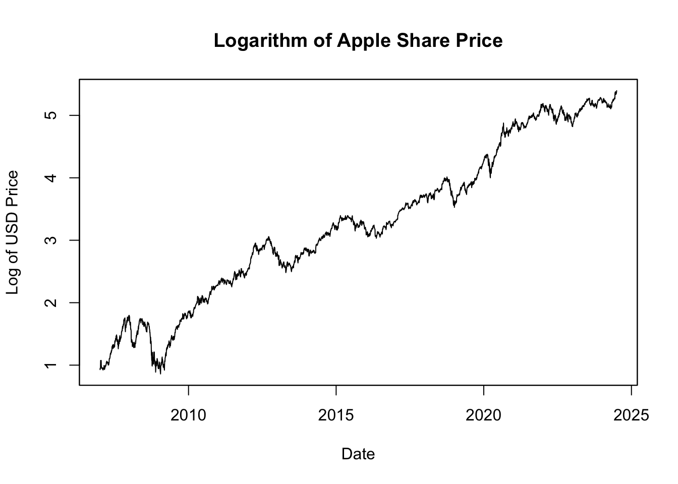
Figure 5.4: Logarithm of Apple Share Price
Figure 5.4 displays the natural logarithm of the Apple share prices. This transformation is beneficial because it linearizes the exponential growth in the stock prices, with the slope of the line corresponding to the rate of growth. More importantly, changes in the logarithm of the price correspond directly to percentage changes in the price itself. For example, if the log price increases by 0.01, this equates to a 1% increase in the original price. This property allows for a direct comparison of price changes over time, making it easier to interpret and understand the magnitude of these changes in terms of relative growth or decline.
5.2.6 Plot Crude Oil Prices
Now, we’ll use the plot.zoo() function to graph the crude oil price:
# Plot crude oil prices
plot.zoo(OPEC_oil_price,
         main = "OPEC Crude Oil Price",
         xlab = "Date",
         ylab = "USD per Barrel (159 Litres)")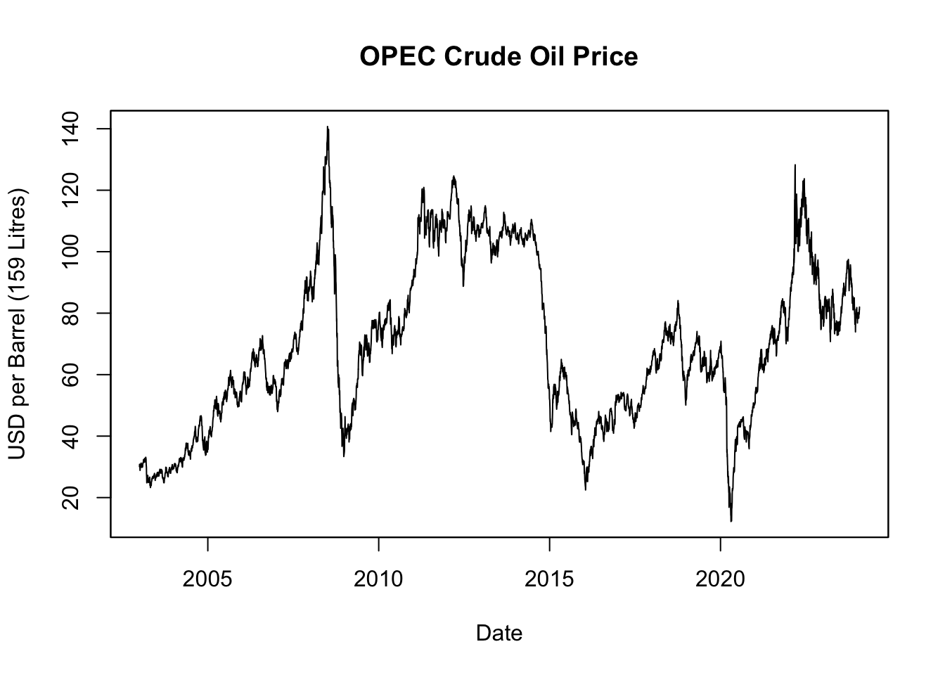
Figure 5.5: OPEC Crude Oil Price
Figure 5.5 displays the OPEC crude oil prices over the last two decades. While stock prices often exhibit long-term exponential growth due to company expansions and increasing profits, oil prices don’t inherently follow the same pattern. The primary drivers of oil prices are supply and demand dynamics, shaped by a myriad of factors such as geopolitical events, production changes, advancements in technology, environmental policies, and shifts in global economic conditions. Oil prices, as a result, can undergo substantial fluctuations, exhibiting high volatility with periods of significant booms and busts, rather than consistent exponential growth.
Visualizing oil prices over time can benefit from the use of a logarithmic scale:
# Compute the natural logarithm (log) of crude oil prices
log_OPEC_oil_price <- log(OPEC_oil_price)

# Plot log crude oil prices
plot.zoo(log_OPEC_oil_price,
         main = "Logarithm of OPEC Crude Oil Price",
         xlab = "Date",
         ylab = "Log of USD per Barrel (159 Litres)")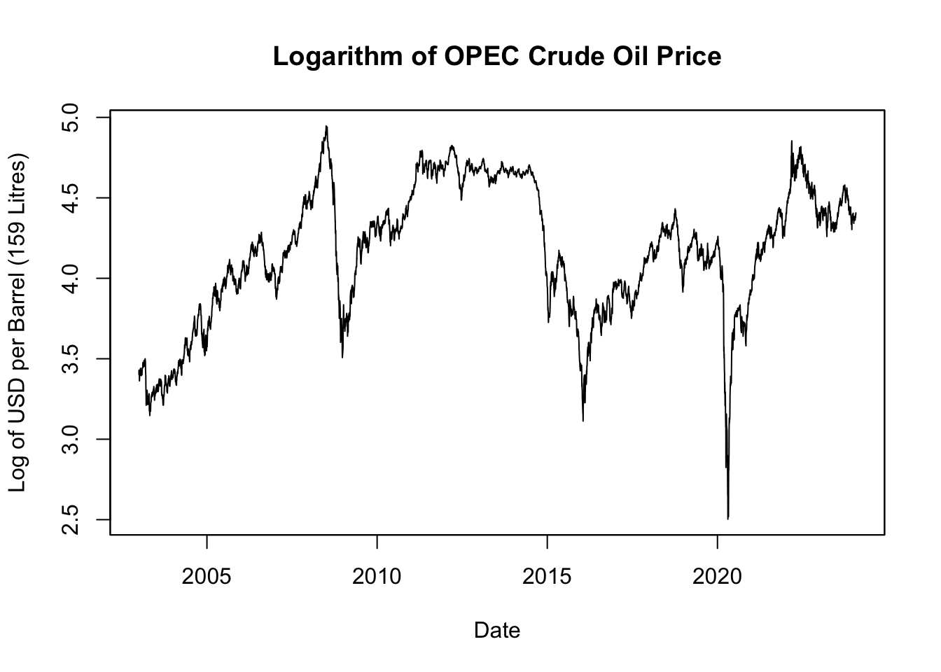
Figure 5.6: Logarithm of OPEC Crude Oil Price
The natural logarithm of crude oil price, depicted in Figure 5.6, offers a clearer view of relative changes over time. It does this by rescaling the data such that equivalent percentage changes align to the same distance on the scale, regardless of the actual price level at which they occur. This transformation means a change in the log value can be read directly as a percentage change in price. So, a decrease of 0.01 in the log price corresponds to a 1% decrease in the actual price, whether the initial price was $10, $100, or any other value. This makes the data more intuitive and straightforward to interpret, particularly when tracking price trends and volatility across various periods.
5.2.7 Merge Data
In this section, we focus on merging and cleaning two time-series datasets: Apple’s adjusted stock price (AAPL_stock_price_adj) and OPEC’s oil price (OPEC_oil_price). We’ll use R’s merge() function to combine these series into a single data object for comparative analysis.
##            AAPL.Adjusted OPEC_oil_price
## 2003-01-02            NA          30.05
## 2003-01-03            NA          30.83
## 2003-01-06            NA          30.71
Note that merging AAPL_stock_price_adj and OPEC_oil_price does not require a by argument because both datasets are xts objects. In the case of xts, merging is done automatically by date index via the merge.xts() method.
After merging, it’s sometimes useful to trim rows with NA values at either end, as they could affect subsequent analysis. The function na.trim() serves this purpose.
##            AAPL.Adjusted OPEC_oil_price
## 2007-01-03      2.530319          55.42
## 2007-01-04      2.586482          53.26
## 2007-01-05      2.568063          51.30
It’s also informative to examine specific periods where data is missing for either series. For instance, we can focus on the year 2022 to identify such instances.
## AAPL.Adjusted OPEC_oil_price## AAPL.Adjusted OPEC_oil_price
## 2022-01-17 NA 86.38
## 2022-02-21 NA 94.04
## 2022-05-30 NA 120.01
## 2022-06-20 NA 113.39
## 2022-07-04 NA 115.25
## 2022-09-05 NA 99.76
## 2022-11-24 NA 81.52While OPEC oil prices are globally traded and thus consistently available, AAPL stock prices have gaps due to U.S. market holidays, which are listed in Table 5.2 below.
Date | U.S.-Specific Holiday |
|---|---|
2022-01-17 | Martin Luther King Jr. Day |
2022-02-21 | Presidents' Day |
2022-05-30 | Memorial Day |
2022-06-20 | Juneteenth |
2022-07-04 | Independence Day |
2022-09-05 | Labor Day |
2022-11-24 | Thanksgiving |
Recognizing these details is important for time-series analysis.
5.2.8 Transform Data
In this section, we undertake a series of data transformations to prepare for further analysis. These transformations include the removal of missing values, aggregation to a monthly frequency, and computation of stock returns.
Return Formula
Returns on stocks or commodities are defined as the percentage change in price, given by: \[ r_t = 100 \left( \frac{P_t - P_{t-1}}{P_{t-1}} \right) \% \approx 100 \left( \ln P_t - \ln P_{t-1} \right)\% \] Here, \(\ln P_t\) is the natural logarithm of \(P_t\). The log difference, \(\ln P_t - \ln P_{t-1}\), approximates the arithmetic return, \(\frac{P_t - P_{t-1}}{P_{t-1}}\), particularly for small returns (less than \(\pm 20\%\)).
Log returns are better for understanding how money grows over time. Imagine you invest $100 in a stock. On the first day, the stock gains 50%, so your investment is now worth $150. The next day, the stock loses 33.33%, bringing your investment down to $100 again.
Using arithmetic returns:
- First day: (150 - 100) / 100 = 0.5 or 50%
- Second day: (100 - 150) / 150 = -0.3333 or -33.33%
- Total return = 50% - 33.33% = 16.67%
If you simply sum the arithmetic returns, you’d think you have a positive total return of 16.67%. But you’re right back where you started, with $100.
Using log returns:
- First day: \(\ln\)(150/100) = 0.4055 or 40.55%
- Second day: \(\ln\)(100/150) = -0.4055 or -40.55%
- Total log return = 40.55% - 40.55% = 0.00%
The total log return correctly shows that, over the two days, you haven’t gained or lost any money.
This example illustrates why log returns can be less misleading when you are making multiple trades or assessing performance over time. They better capture the compounding effect and provide a more accurate representation of your returns.
Aggregate to Regular Frequency
We previously noted that stock and commodity prices have irregular frequencies, with approximately 252 trading days per year. Consequently, the notion of “return” can vary in duration, from one day to an entire week, which can introduce inconsistencies in the analysis.
To address this, one approach is to interpolate the data to a daily frequency for 365 days a year. Another approach is to aggregate the data to a less frequent, but more consistent, time frame like monthly, quarterly, or yearly periods. We opt for monthly aggregation. While a month is not a regular time unit—varying from 28 to 31 days - the variation in time intervals is considerably less problematic than in the original dataset.
It’s also important to note that U.S. stock market data are unavailable on U.S.-specific holidays, whereas commodity price data might still be accessible. To facilitate an apples-to-apples comparison between the two series, it’s crucial to eliminate the commodity prices for these particular days, as well. This can be accomplished using the na.omit() function on the merged dataset, which removes any rows where at least one column has missing data.
The apply.monthly() function from the xts package is used to convert the data from a daily to a monthly frequency. Specifically, the last available price within each month is used for the monthly aggregation. This method is consistent with how the adjusted stock prices were aggregated to a daily frequency using each day’s closing price.
This results in a time series with a consistent monthly frequency.
Compute Returns
Next, we calculate monthly returns using the log formula:
To visualize the returns of both assets on a single graph, use the plot.type = "single" argument within the plot.zoo() function.
# Plot returns
plot.zoo(Returns, plot.type = "single", main = "Stock vs. Commodity Returns",
         col = c(2, 1), lwd = c(2, 1))
legend("bottomleft", legend = c("Apple Stock Return", "Crude Oil Return"),
       col = c(2, 1), lwd = c(2, 1))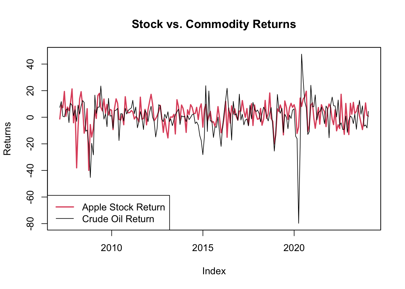
Figure 5.7: Stock vs. Commodity Returns
The plot, seen in Figure 5.7, reveals substantial volatility in both investment avenues. Apple’s stock appears less volatile than oil, which is counterintuitive given that Apple is subject to company-specific risks, whereas oil is a globally traded commodity.
While Apple’s stock is susceptible to company-specific risks such as earnings reports, innovation cycles, and market competition, its diversification in various products and global markets may cushion it against extreme volatility.
Oil, on the other hand, faces a unique blend of risks that contribute to its high volatility. These include geopolitical tensions, supply-demand imbalances, and external shocks such as natural disasters affecting production. Oil prices are also influenced by decisions made by major producers like OPEC, and global events that affect oil consumption. These multiple and often unpredictable factors can lead to large price swings in a short period, making oil a more volatile investment compared to a single company’s stock like Apple.
5.2.9 Tabulate Key Statistics
While visualizations offer a broad overview of trends and patterns, precise statistics are crucial for in-depth data analysis.
We will calculate key statistics such as the mean, volatility, minimum, and maximum returns. These measures provide insights into the central tendency and dispersion of the data. Additionally, we’ll compute correlation to examine how the two series move together and autocorrelation to understand the persistence of each series.
# Assemble key statistics in a data frame
stats_df <- rbind(
    "Mean" = apply(Returns, 2, mean),
    "Volatility (Standard Deviation)" = apply(Returns, 2, sd),
    "Minimum Return" = apply(Returns, 2, min),
    "Maximum Return" = apply(Returns, 2, max),
    "Autocorrelation" = apply(Returns, 2, function(x) cor(x, lag.xts(x, 1),
                                                          use = "complete.obs")),
    "Correlation to Crude Oil Return" = cor(Returns)[2, ])
colnames(stats_df) <- c("Apple Stock Return", "Crude Oil Return")
print(stats_df)
## Apple Stock Return Crude Oil Return
## Mean 2.1151903 0.2173427
## Volatility (Standard Deviation) 9.0237222 11.9508115
## Minimum Return -39.9818045 -79.7423517
## Maximum Return 21.3255863 47.4494913
## Autocorrelation 0.1069703 0.3068170
## Correlation to Crude Oil Return 0.3273161 1.0000000The table title should specify the unit of return (in percent), the data frequency (monthly), and the time range for which the statistics are calculated.
# Define the time range for the statistics
time_interval <- format(x = range(index(Returns)), format = "%b %Y")
print(time_interval)
## [1] "Feb 2007" "Jan 2024"# Create table title
stats_title <- paste("Monthly $\\%$-Return Statistics:",
paste(time_interval, collapse = " to "))
print(stats_title)## [1] "Monthly $\\%$-Return Statistics: Feb 2007 to Jan 2024"The table output from print(stats_df) is unsuitable for professional documents. For Microsoft Word or PowerPoint, export the table to a CSV file using write.table() and then insert it into the document. For LaTeX or HTML formats, employ the kable() function from the knitr package for a more refined table presentation.
# Load knitr for table rendering
library("knitr")

# Format table with rounded statistics
kable(x = round(stats_df, 2),
      caption = stats_title,
      format = "simple")
Table: (\#tab:return-stats) Monthly $\%$-Return Statistics: Feb 2007 to Jan 2024

                                   Apple Stock Return   Crude Oil Return
--------------------------------  -------------------  -----------------
Mean                                             2.12               0.22
Volatility (Standard Deviation)                  9.02              11.95
Minimum Return                                 -39.98             -79.74
Maximum Return                                  21.33              47.45
Autocorrelation                                  0.11               0.31
Correlation to Crude Oil Return                  0.33               1.00
In HTML or LaTeX documents, kable() produces neatly formatted tables, as seen in Table 5.3, by setting the format parameter to either format = "html" or format = "latex". For further customization options of the kable() function, refer to Chapter 6.7.
| Apple Stock Return | Crude Oil Return | |
|---|---|---|
| Mean | 2.12 | 0.22 |
| Volatility (Standard Deviation) | 9.02 | 11.95 |
| Minimum Return | -39.98 | -79.74 |
| Maximum Return | 21.33 | 47.45 |
| Autocorrelation | 0.11 | 0.31 |
| Correlation to Crude Oil Return | 0.33 | 1.00 |
Table 5.3 presents key statistical metrics for two investment avenues - Apple stock and crude oil - over a specific time period. Apple stock shows a mean return of approximately 2.12%, which is higher than crude oil’s mean return of 0.22%, suggesting better average performance. Moreover, crude oil exhibits greater volatility, with a standard deviation of about 11.95% compared to Apple’s 9.02%, indicating higher risk. Both investment avenues have experienced substantial downside risks, as evidenced by their minimum monthly returns of approximately -39.98% and -79.74% for Apple and crude oil, respectively. Crude oil has seen peaks of considerably higher returns than Apple, with a maximum of about 47.45%, compared to Apple’s 21.33%. The autocorrelation values of 0.11 for Apple and 0.31 for crude oil suggest that past returns have some, albeit limited, influence on future returns, more so for crude oil. Lastly, a correlation of 0.33 between Apple and crude oil returns indicates a mild positive relationship, implying that diversifying across these two asset classes may offer limited but non-negligible benefits.
5.2.10 Visualize Correlations
The correlations outlined in Table 5.3 merit further inspection through scatter plots. These visualizations allow for an assessment of whether the observed correlations hold broadly or are mainly driven by outliers.
# Put three plots on one figure
par(mfrow = c(1, 3))

# Autocorrelation of Apple returns and their lags
x_var <- lag.xts(Returns$AAPL.Adjusted, 1)
y_var <- Returns$AAPL.Adjusted
plot.default(x = x_var, y = y_var,
             xlab = "Lagged Apple Stock Returns", ylab = "Apple Stock Returns")
abline(a = lm(y_var ~ x_var), col = "blue")
corr_text <- round(x = cor(x = x_var, y = y_var, use="complete.obs"), digits = 2)
text(x = min(na.omit(x_var)), y = min(na.omit(y_var)) + 10,
     labels = paste("Autocorrelation:", corr_text), pos = 4, col = "blue")

# Autocorrelation of oil returns and their lags
x_var <- lag.xts(Returns$OPEC_oil_price, 1)
y_var <- Returns$OPEC_oil_price
plot.default(x = x_var, y = y_var,
             xlab = "Lagged Oil Returns", ylab = "Oil Returns")
abline(a = lm(y_var ~ x_var), col = "red")
corr_text <- round(x = cor(x = x_var, y = y_var, use="complete.obs"), digits = 2)
text(x = min(na.omit(x_var)), y = min(na.omit(y_var)) + 10,
     labels = paste("Autocorrelation:", corr_text), pos = 4, col = "red")

# Correlation of Apple and oil returns
x_var <- Returns$OPEC_oil_price
y_var <- Returns$AAPL.Adjusted
plot.default(x = x_var, y = y_var,
             xlab = "Oil Returns", ylab = "Apple Stock Returns")
abline(a = lm(y_var ~ x_var), col = "purple")
corr_text <- round(x = cor(x = x_var, y = y_var, use="complete.obs"), digits = 2)
text(x = min(na.omit(x_var)), y = min(na.omit(y_var)) + 10,
     labels = paste("Correlation:", corr_text), pos = 4, col = "purple")

# Add a title above all three plots
par(mfrow = c(1, 1))  # Reset to a single plot layout
title("Cross- and Autocorrelations of Financial Returns", outer = TRUE, line = -2)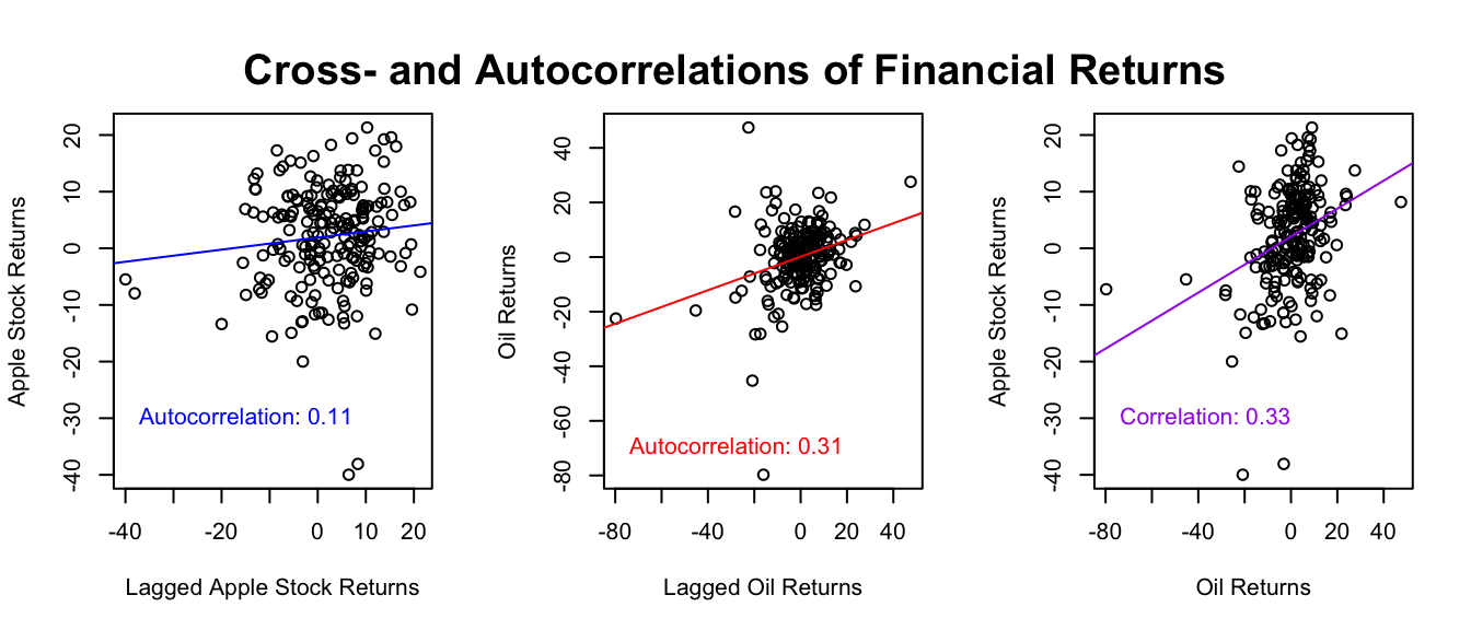
Figure 5.8: Cross- and Autocorrelations of Financial Returns
In this R code:
par(mfrow = c(1, 3)): Configures the plotting space to display three plots in one row. The parametermfrowsets this layout, where the first number1specifies the number of rows and the second3specifies the number of columns.plot.default(...): Creates the scatter plots to compare returns. Theplot.default()function is invoked explicitly to bypass the default time-series plotting behavior ofxtsobjects that would be triggered by the genericplot()function. For a discussion on wrapper functions likeplot()and their associated methods, refer to Chapter 3.5.11.abline(lm(...), ...): Adds a line to the plot, showing the best-fit straight line through the data points. This line helps to visualize the relationship between the variables.corr_text <- round(cor(x, y, use = "complete.obs), 2): Calculates the rounded correlation between the two sets of returns, omitting pairs withNAvalues viause = "complete.obs".text(x = min(na.omit(x_var)), min(y = na.omit(y_var)) + 10, ...): Places a label on each plot, showing the rounded correlation coefficient. The text appears close to the minimum values of the x and y axes to avoid overlap.par(mfrow = c(1, 1)): Reverts the plotting area to a single-frame layout, necessary for adding an overarching title.title("Cross- and Autocorrelations of Financial Returns", outer = TRUE, line = -2): Positions an overarching title above all subplots. Theouter = TRUEparameter ensures the title appears outside the individual plot areas, andline = -2adjusts its vertical positioning.
Figure 5.8 examines the relationships among Apple stock returns, oil price returns, and their respective lagged values. The first two panels show that data points significantly diverge from the fitted lines, suggesting that the autocorrelation values 0.11 and 0.31 are likely influenced by outliers rather than representing a consistent trend. The third panel, however, shows a more stable relationship between Apple and oil returns, which correlation value is 0.33. This suggests that low (or high) returns in one asset generally coincide with low (or high) returns in the other. This matches what we see in Figure 5.7, where if one asset goes up or down, the other usually does the same.
5.3 Process House Price Data
This chapter focuses on the processing of residential property price (RPP) data from the Bank for International Settlements (BIS, 2023b). The aim is to prepare the data for further analyses, especially its comparison with policy rates, also obtained from BIS (2023a). The chapter employs functions from the Tidyverse ecosystem in R, specifically using dplyr and tidyr for data manipulation as previously introduced in Chapter 4.6. Given the dataset’s multidimensional nature - spanning various indicators, regions, and time periods - the chapter introduces advanced plotting techniques via the ggplot2 package. It also addresses the complexities of computing associative statistics in such a multidimensional setting. Upon completing this chapter, readers will gain a holistic understanding of how to manage and analyze multidimensional data using these R tools.
5.3.1 Download Excel Workbook
To get RPP data from the BIS (2023b), follow these steps:
- Go to www.bis.org.
- Go to “Statistics” > “Property Prices” > “Selected Residential”.
- Click the “XLSX” button next to the data description: “Nominal and real residential property prices…”.
- Once downloaded, place the file in your R working directory, specifically in a folder named “files,” and name it
pp_selected.xlsx.
House prices will also be compared to policy rates from the BIS (2023a), obtained as follows:
- Go to www.bis.org.
- Go to “Statistics” > “Other Indicators” > “Policy Rates”.
- Click the “XLSX” button next to the data description: “Monthly data”.
- Once downloaded, place the file in your R working directory, specifically in a folder named “files,” and name it
cbpol.xlsx.
For guidance on finding and setting your working directory, see Chapters 3.7.1 and 3.7.2. To learn how to create a folder and download files directly from a website within R, check Chapter 3.7.3.
5.3.2 Import Excel Workbook
An Excel workbook (xlsx) is a file that contains one or more spreadsheets (worksheets), which are the separate “pages” or “tabs” within the file. An Excel worksheet, or simply a sheet, is a single spreadsheet within an Excel workbook. It consists of a grid of cells formed by intersecting rows (labeled by numbers) and columns (labeled by letters), which can hold data such as text, numbers, and formulas.
The readxl package by Wickham and Bryan (2023) provides functions that allow for importing Excel files into R as a tibble structure, which is the tidyverse-version of a data frame (see Chapter 4.6 for an overview on tibbles, and Chapter 3.6.7 for the tidyverse). Hence, to import the residential property price (RPP) database, which is an Excel workbook, install and load the readxl package by running install.packages("readxl") in the console and include the package at the beginning of your R script. You can then use the excel_sheets() function to print the names of all Excel worksheets in the workbook, and the read_excel() function to import a particular worksheet.
Here’s an illustration of how to employ the excel_sheets() function using the pp_selected.xlsx file downloaded from the Bank for International Settlements.
# Load the packages
library("readxl")
library("tibble")
library("dplyr")
library("tidyr")

# Get names of all Excel worksheets
sheet_names <- excel_sheets(path = "files/pp_selected.xlsx")
sheet_names
## [1] "Content" "Summary Documentation" "Quarterly Series"This reveals that there are three Excel sheets: “Content”, “Summary Documentation”, and “Quarterly Series”. The “Content” sheet provides information about how the Excel workbook is structured, as well as how to cite the data when using it, and links to documentation files. The “Summary Documentation” sheet provides information about the house price variables, such as the variable’s code, reference area, unit of measurement, and whether it’s price adjusted. Finally, the “Quarterly Series” sheet stores the house prices, where each row is a different quarter, and each column is a different variable. There are four header rows, where the first three include information about the variable that is also available in the “Summary Documentation” sheet, and the last row references the variable’s code. Hence, it is sufficient to import “Summary Documentation” for variable information and “Quarterly Series” without the first three rows for the data.
# Import Excel worksheet: "Summary Documentation"
RPP_labels <- read_excel(
    path = "files/pp_selected.xlsx",
    sheet = "Summary Documentation",
    col_names = TRUE,                # The file has a header row with names
    na = "-"                         # Character string representing NA values
)

# Import Excel worksheet: "Quarterly Series"
RPP_wide <- read_excel(
    path = "files/pp_selected.xlsx",
    sheet = "Quarterly Series",
    col_names = TRUE,                # The file has a header row with names
    na = "",                         # Character string representing NA values
    skip = 3                         # Skips the first three rows
)
As a side note, when the Excel workbook consists of a large number of sheets, e.g. each representing different variables, then it makes sense to use lapply() to import all sheets at once:
# Import all worksheets of an Excel workbook without customization
import_all <- lapply(sheet_names, function(x)
    read_excel(path = "files/pp_selected.xlsx", sheet = x))

# Name the list elements, each representing a different worksheet
names(import_all) <- sheet_names
In the provided code snippet, the lapply() function is used to apply the read_excel() function to each element in the sheet_names list, returning a list that is the same length as the input. Consequently, the import_all object becomes a list in which each element is a tibble corresponding to an individual Excel worksheet, which is named accordingly. For instance, to access the worksheet “Summary Documentation”, you would select import_all[["Summary Documentation"]]. This approach is useful if each sheet refers to a different variable, but in this case, since we only have three sheets, importing each sheet separately with sheet-specific customizations makes more sense.
5.3.3 Inspect and Clean Data
Once data is imported, a preliminary examination ensures its accuracy. Note that because read_excel() imports data as a tibble and not a data frame, R doesn’t print the entire data frame; hence, simply entering the data names RPP_labels and RPP into the console already provides a good overview. For more details, use RStudio’s spreadsheet-like viewer via View(RPP_labels) and View(RPP) (exclusive to RStudio and not included in R).
For a more detailed exploration of the data’s structure, execute str() or glimpse() from the tibble package, and execute summary() for a summary of the data.
## Rows: 248
## Columns: 9
## $ `Data set`       <chr> "BIS_SPP", "BIS_SPP", "BIS_SPP", "BIS_SPP", "BIS_SPP"…
## $ Code             <chr> "Q:4T:N:628", "Q:4T:N:771", "Q:4T:R:628", "Q:4T:R:771…
## $ Frequency        <chr> "Quarterly", "Quarterly", "Quarterly", "Quarterly", "…
## $ `Reference area` <chr> "Emerging market economies (aggregate)", "Emerging ma…
## $ Value            <chr> "Nominal", "Nominal", "Real", "Real", "Nominal", "Nom…
## $ Unit             <chr> "Index, 2010 = 100", "Year-on-year changes, in per ce…
## $ Coverage         <chr> "Emerging markets covered in the BIS residential prop…
## $ `Series title`   <chr> "Residential property prices selected - Nominal - Ind…
## $ Breaks           <chr> NA, NA, NA, NA, NA, NA, NA, NA, NA, NA, NA, NA, NA, N…
Here, all variables of the RPP_labels tibble are of data type character <chr>, which makes sense, as they consist of verbal descriptions of the data.
Examining the data types of each column is crucial as they may be incorrectly assigned during import. Use sapply() in conjunction with class() to identify the types:
# Inspect the overall structure of the dataset
class(RPP_wide)

# Determine the class of each column
RPP_data_types <- sapply(RPP_wide, class)

# Validate if the first column 'Period' is of Date or POSIXct type
RPP_data_types[1]

# Confirm whether all remaining columns are numeric
all(RPP_data_types[-1] == "numeric")
## [1] "tbl_df" "tbl" "data.frame"
## $Period
## [1] "POSIXct" "POSIXt"
##
## [1] TRUEIn this case, R correctly identifies the ‘Period’ as POSIXct and all house prices as numeric. No type conversions are needed.
To improve data clarity, consider adding contextual attributes like the data source and the count of imported rows, as we did with the imported Bitcoin price data in Chapter 5.1.4.
Lastly, pay attention to variable labels. The column Value in BIS’s RPP data indicates whether the residential property price (RPP) is "Real" or "Nominal". To avoid confusion with data values, the column name is changed to Measure. Additionally, the column Reference area is simplified to Region, and the Unit descriptions are abbreviated for ease. Converting these attributes into factors enhances computational efficiency.
# Rename variables
RPP_labels <- RPP_labels %>%
    mutate(Code = factor(Code),
           Region = factor(`Reference area`),
           Unit = factor(Unit),
           Measure = factor(Value))

# Abbreviate unit labels
renaming_vector <- c("Year-on-year changes, in per cent" = "YoY-Growth",
                     "Index, 2010 = 100" = "Index")
levels(RPP_labels$Unit) <- renaming_vector[levels(RPP_labels$Unit)]
This R code performs two main tasks: renaming variables and modifying their labels.
- Rename Variables:
mutate(Code = factor(Code), Region = factor('Reference area'), Unit = factor(Unit), Measure = factor(Value)): Themutatefunction fromdplyris used to change the column names. Here,Reference areais renamed toRegionandValuetoMeasure. All these variables are also converted to factors which are more efficient for computation and analysis in R.
- Abbreviate Labels:
renaming_vector <- c("Year-on-year changes, in per cent" = "YoY-Growth", "Index, 2010 = 100" = "Index"): A vector calledrenaming_vectoris created to store the new abbreviated labels.levels(RPP_labels$Unit) <- renaming_vector[levels(RPP_labels$Unit)]: This line replaces the old labels in theUnitcolumn with the new abbreviated labels fromrenaming_vector.
The renaming is better done after converting to factors because R will then only change the factor levels instead of having to traverse through each string to replace it, thus enhancing computational efficiency.
5.3.4 Reshape Data
The process of reshaping data from wide to long format and vice versa is often critical for effective data analysis. For data frames, the reshape() function is commonly used, as explored in Chapter 4.5.8. For tibbles, we generally use pivot_longer() and pivot_wider() functions from the tidyr package. These are discussed in detail in Chapter 4.6.8.
From Wide to Long Format
Let’s take a look at the initial structure of our data. Tables 5.4 and 5.5 display our RPP data and its corresponding labels.
| Period | Q:US:R:628 | Q:US:R:771 | Q:XM:R:628 | Q:XM:R:771 |
|---|---|---|---|---|
| 2022-09-30 | 158.1889 | 2.7320 | 115.2157 | -2.4634 |
| 2022-12-31 | 157.5075 | -0.1327 | 110.6743 | -6.4343 |
| 2023-03-31 | 157.7020 | -2.4097 | 109.2423 | -7.1131 |
| Code | Region | Measure | Unit |
|---|---|---|---|
| Q:US:R:628 | United States | Real | Index |
| Q:US:R:771 | United States | Real | YoY-Growth |
| Q:XM:R:628 | Euro area | Real | Index |
| Q:XM:R:771 | Euro area | Real | YoY-Growth |
In Table 5.4, the data is organized in a wide format, where each variable forms a column. Conversely, Table 5.5 displays the labels in a long format, where each variable corresponds to a row. To align these two different structures, we employ the pivot_longer() function from the tidyr package.
# Load the necessary package
library("tidyr")

# Reshape the data from a wide to a long format.
RPP <- RPP_wide %>%
    pivot_longer(cols = -Period,
                 names_to = "Code",
                 values_to = "Value",
                 values_drop_na = TRUE)
The pivot_longer() function in the code reshapes the data from wide to long format. Here’s the breakdown of its arguments:
cols = -Period: Specifies that all columns except “Period” will be converted to a long format.names_to = "Code": The names of the reshaped columns will be stored in a new column named “Code”.values_to = "Value": The values from the reshaped columns will go into a new column named “Value”.values_drop_na = TRUE: Any rows that would containNAvalues in the new “Value” column are removed.
So, the function takes multiple columns and condenses them into two: one for the Code (original column names) and one for the Value (original data values), as is evident in Table 5.6.
| Period | Code | Value |
|---|---|---|
| 2022-09-30 | Q:US:R:628 | 158.1889 |
| 2022-09-30 | Q:US:R:771 | 2.7320 |
| 2022-09-30 | Q:XM:R:628 | 115.2157 |
| 2022-09-30 | Q:XM:R:771 | -2.4634 |
| 2022-12-31 | Q:US:R:628 | 157.5075 |
| 2022-12-31 | Q:US:R:771 | -0.1327 |
| 2022-12-31 | Q:XM:R:628 | 110.6743 |
| 2022-12-31 | Q:XM:R:771 | -6.4343 |
| 2023-03-31 | Q:US:R:628 | 157.7020 |
| 2023-03-31 | Q:US:R:771 | -2.4097 |
| 2023-03-31 | Q:XM:R:628 | 109.2423 |
| 2023-03-31 | Q:XM:R:771 | -7.1131 |
With the data now in long format, it becomes feasible to merge it with the labels. For this, we use the left_join() function from the dplyr package. This type of join is explained in Chapter 4.6.6. The advantage of a “left” join is that it ensures no data is omitted; if any labels are missing, the associated data remains intact, with the label fields populated as NA.
# Perform the merging operation
RPP <- RPP %>%
    left_join(y = RPP_labels %>%
                  select(Code, Region, Unit, Measure),
              by = "Code") %>%
    select(-Value, everything(), Value)
The left_join() function is used to merge two datasets based on a common column, in this case, “Code”.
y = RPP_labels %>% select(Code, Region, Unit, Measure): Specifies that the second dataset in the join is a subset ofRPP_labels, containing only the columns “Code”, “Region”, “Unit”, and “Measure,” omitting redundant or overly detailed columns like “Frequency” and “Coverage.”by = "Code": Specifies that the datasets will be merged based on the “Code” column.select(-Value, everything(), Value): Rearranges the columns, moving the “Value” column to the end.
The left_join() operation will keep all rows from RPP (the left dataset), and add corresponding data from RPP_labels where the “Code” matches. If there’s a “Code” in RPP that is not found in RPP_labels, that row will still be in the output, but the new columns (“Region”, “Unit”, “Measure”) will have NA values.
After merging, the data and labels appear fully integrated in a long format, as can be seen in Table 5.7.
| Period | Code | Region | Unit | Measure | Value |
|---|---|---|---|---|---|
| 2022-09-30 | Q:US:R:628 | United States | Index | Real | 158.1889 |
| 2022-09-30 | Q:US:R:771 | United States | YoY-Growth | Real | 2.7320 |
| 2022-09-30 | Q:XM:R:628 | Euro area | Index | Real | 115.2157 |
| 2022-09-30 | Q:XM:R:771 | Euro area | YoY-Growth | Real | -2.4634 |
| 2022-12-31 | Q:US:R:628 | United States | Index | Real | 157.5075 |
| 2022-12-31 | Q:US:R:771 | United States | YoY-Growth | Real | -0.1327 |
| 2022-12-31 | Q:XM:R:628 | Euro area | Index | Real | 110.6743 |
| 2022-12-31 | Q:XM:R:771 | Euro area | YoY-Growth | Real | -6.4343 |
| 2023-03-31 | Q:US:R:628 | United States | Index | Real | 157.7020 |
| 2023-03-31 | Q:US:R:771 | United States | YoY-Growth | Real | -2.4097 |
| 2023-03-31 | Q:XM:R:628 | Euro area | Index | Real | 109.2423 |
| 2023-03-31 | Q:XM:R:771 | Euro area | YoY-Growth | Real | -7.1131 |
The data in long format, showcased in Table 5.7, is often referred to as “tidy” data. This format makes it easier to work with the data in future analysis steps.
From Long to Wide Format
Some data manipulation tasks and R packages need data in a specific format. For example, the xts package for time series, as mentioned in Chapter 4.8, requires data in wide format. In this format, each row corresponds to a time period, and each column represents a variable.
The challenge in switching from long to wide format is that the long format has multiple descriptor columns, like Region, Unit, and Measure. In wide format, this results in complex column names, like Region.Unit.Measure, as displayed in the following Table ??.
| Period | Italy.Nominal.Index | Italy.Nominal.YoY-Growth | Italy.Real.Index |
|---|---|---|---|
| 2022-12-31 | 90.4318 | 2.6923 | 70.9075 |
| 2023-03-31 | 90.4318 | 1.0407 | 70.6296 |
| 2023-06-30 | 92.2100 | 0.7401 | 71.7172 |
The conversion from long to wide format, i.e. from Table 5.7 to 5.8, is achieved using the pivot_wider() function from the tidyr package.
# Reshape from long to wide
RPP_with_labels_wide <- RPP %>%
    pivot_wider(id_cols = "Period",
                names_from = c("Region", "Measure", "Unit"),
                values_from = "Value",
                names_sep = ".")
In this R code snippet, the function pivot_wider() from the tidyr package is used to transform a long-format dataset (RPP) into a wide-format one (RPP_with_labels_wide). Here’s a breakdown of the function’s arguments:
id_cols = "Period": This sets the “Period” column as the identifier column, around which the reshaping will happen.names_from = c("Region", "Measure", "Unit"): The unique combinations of values in these columns (“Region,” “Measure,” “Unit”) will become new column names in the wide-format dataset.values_from = "Value": Specifies that the numerical “Value” column from the long-format dataset will be used to populate the cells in the new wide-format columns.names_sep = ".": The new column names generated from “Region,” “Measure,” and “Unit” will be separated by a period (.)
So the resulting RPP_with_labels_wide dataset, visualized in Table 5.8, will have a column for each unique combination of “Region,” “Measure,” and “Unit,” and these will be populated with the corresponding “Value” from the original RPP dataset. The “Period” column remains as the identifier.
The resulting wide-format data can be hard to read because of the complex column names. One solution is to filter and focus on specific subsets before converting to wide format. For instance, to focus on the real RPP index, we first filter the data:
# Select real RPP index
RPP_real_index <- RPP %>%
    filter(Measure == "Real", Unit == "Index") %>%
    select(Period, Region, `Real RPP` = Value)
Then, we can convert this filtered data to wide format:
# Reshape from wide to long
RPP_real_index_wide <- RPP_real_index %>%
    pivot_wider(id_cols = "Period",
                names_from = c("Region"),
                values_from = "Real RPP")
Here, the column names become simpler, just representing different regions, as shown in Table 5.9. It makes the wide-format data easier to work with.
| Period | Australia | Colombia | Japan | Germany | South Africa | United States |
|---|---|---|---|---|---|---|
| 2022-09-30 | 133.8846 | 142.4936 | 122.0932 | 153.4093 | 93.1363 | 158.1889 |
| 2022-12-31 | 126.6149 | 138.2781 | 119.8312 | 142.6217 | 93.1787 | 157.5075 |
| 2023-03-31 | 122.4054 | 138.2344 | 123.0206 | 136.4207 | 92.2980 | 157.7020 |
By focusing on a subset, we simplify the wide-format data, making it more manageable for analysis.
5.3.5 Layered Line Graphs
Line graphs serve to illustrate temporal trends and patterns. In R, there are two main approaches for creating such graphs: the base R plotting system, featuring functions like plot() and matplot(), and the ggplot2 package by Wickham et al. (2024), which employs the ggplot() function. Although both visualize data, there are stark differences in their approaches, particularly in their data format requirements, layering philosophies, and extensibility.
Basic Line Graphs Using matplot()
Base R functions like plot() and matplot() operate under a procedural paradigm. Essentially, what you see is what you get. Each function call adds or modifies specific attributes of the graph, and there’s limited scope for dynamically layering or extending the plot.
In the basic plot(x, y) function, a vector y is plotted relative to another vector x. When y is a matrix, matplot(x, y) serves as the alternative. Generally, matplot() anticipates data in wide format, where each time-series or category is allocated its own column. While this approach is convenient for simple visualizations, it may become cumbersome for more complex, multi-layered visualizations.
Here’s how to use matplot() to plot residential property prices for all regions, assuming the data is in wide format:
# Produce line plots
matplot(x = RPP_real_index_wide$Period,
        y = RPP_real_index_wide[, -1],
        type = "l",
        main = "Residential Property Prices - All Regions",
        xlab = "Period",
        ylab = "Index, 2010 = 100",
        ylim = c(0, 250))
This R code chunk creates a line plot of residential property prices for all regions using the matplot() function. Here’s a breakdown of the code:
matplot(x = RPP_real_index_wide$Period, y = RPP_real_index_wide[, -1], type = "l"): The functionmatplot()is used to plot multiple lines. Thexargument specifies the time period to be plotted on the x-axis. Theyargument specifies the data for the y-axis, omitting the first column which contains the time period. Thetype = "l"argument indicates that lines should be used for the plot.main = "Residential Property Prices - All Regions": Sets the title of the graph.xlab = "Period": Labels the x-axis as “Period”.ylab = "Index, 2010 = 100": Labels the y-axis as “Index, 2010 = 100”.ylim = c(0, 250): Sets the limits for the y-axis to range from 0 to 250.
In summary, this code chunk generates Figure 5.9, a line plot that displays the trend of residential property prices across all regions over a specified period. Note that the regions are not labeled to avoid crowding the plot.
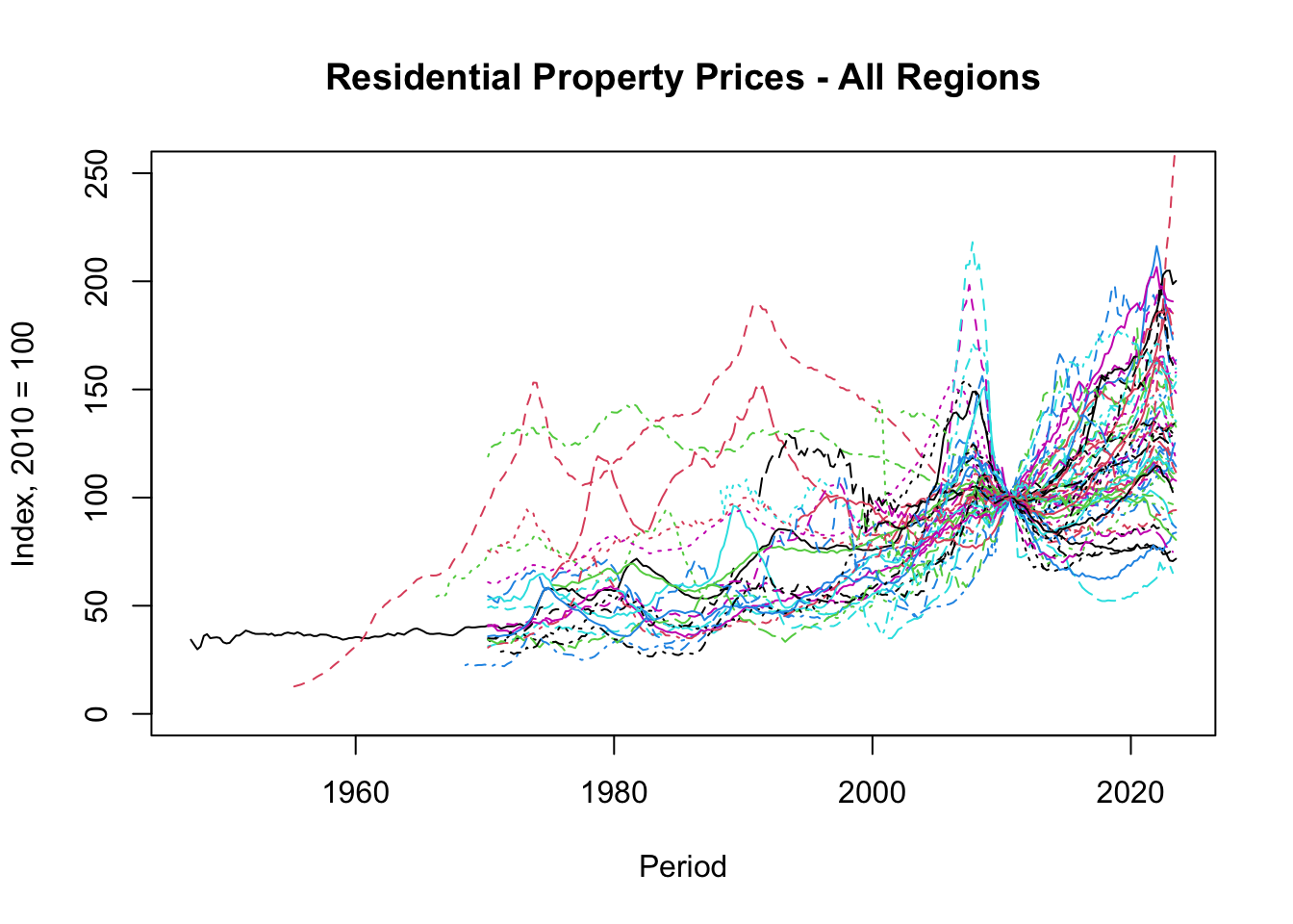
Figure 5.9: Basic Plot of Residential Property Prices - All Regions
To add labels in a less cluttered plot, you can manually select a subset of regions as shown in the following example:
# Select variables to plot
selected_countries <- c(
    "Australia",     # Oceania
    "Colombia",      # South America
    "Japan",         # Asia
    "Germany",       # Europe
    "South Africa",  # Africa
    "United States"  # North America
)

# Multiple line plots
matplot(x = RPP_real_index_wide$Period,
        y = RPP_real_index_wide[, selected_countries],
        type = "l",
        main = "Residential Property Prices - Selected Countries",
        xlab = "Period",
        ylab = "Index, 2010 = 100",
        lty = 1:6, col = 1:6, lwd = 1 + 0:5 / 3)
legend(x = "topleft", legend = selected_countries,
       lty = 1:6, col = 1:6, lwd = 1 + 0:5 / 3,
       seg.len = 2, ncol = 1)
This R code chunk creates a line plot for residential property prices for a selected group of countries. Here’s what each part of the code does:
selected_countries <- c(...): This line defines a vector namedselected_countriesthat contains the names of countries you want to plot. They are categorized by continent for clarity.matplot(x = RPP_real_index_wide$Period, y = RPP_real_index_wide[, selected_countries], type = "l"): Thematplot()function plots multiple lines. Thexargument specifies what should be on the x-axis (time period). Theyargument specifies which columns (countries) from the data frame should be plotted on the y-axis. Thetype = "l"specifies that lines should be used for plotting.main = "Residential Property Prices - Selected Countries": Sets the title of the graph.xlab = "Period", ylab = "Index, 2010 = 100": These arguments label the x-axis and y-axis, respectively.lty = 1:6, col = 1:6, lwd = 1 + 0:5 / 3: These arguments set the line types (lty), colors (col), and line widths (lwd) for the lines in the plot.legend(x = "topleft", legend = selected_countries, ...): Adds a legend at the top left of the plot. The legend shows which line corresponds to which country. The line types, colors, and widths are set similar to those in the plot.
Overall, this code chunk generates Figure 5.10, a line plot featuring residential property prices for the selected countries over time. The plot is customized with titles, labels, and a legend for better readability and interpretation.
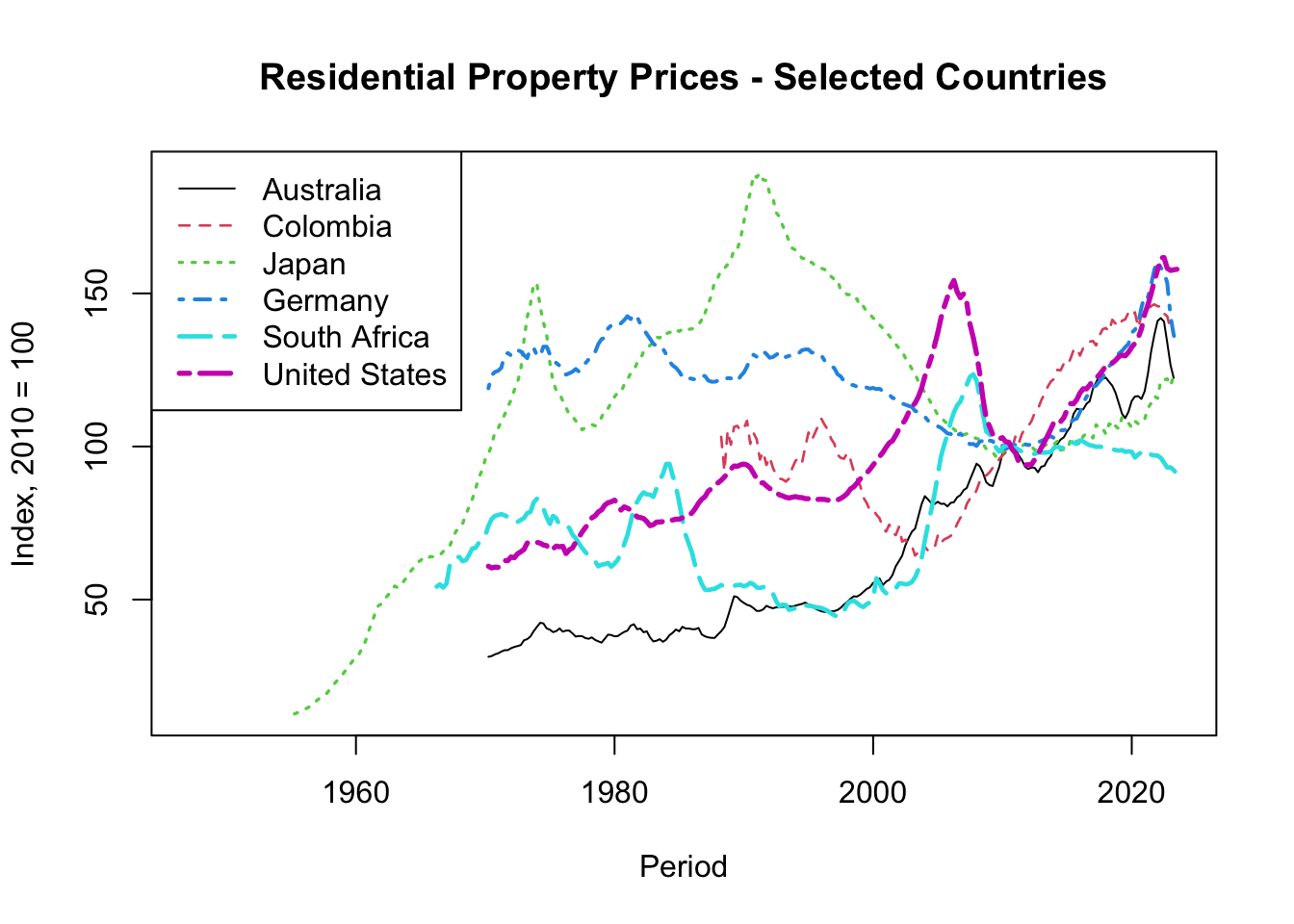
Figure 5.10: Basic Plot of Residential Property Prices - Selected Countries
Layered Line Graph Using ggplot()
In contrast to base R plotting functions, ggplot2 adopts an approach known as the Grammar of Graphics. This paradigm treats a plot as a layered composition, where each layer serves a specific role. For example, you may start with a layer that defines the data and the axes, then add layers for graphical elements like lines, points, or bars. Further layers could include labels, annotations, or even statistical transformations.
In essence, the Grammar of Graphics allows you to break down complex visualizations into understandable parts and then reassemble them. This layered structure offers two main advantages:
Flexibility: You can add, remove, or modify individual layers without affecting the rest of the plot. This enables a high level of customization.
Extensibility: Because each layer serves a defined purpose, it is easier to extend the functionality of a plot by adding new types of layers or modifying existing ones. This makes it well-suited for creating complex, multi-faceted visualizations.
This layered approach aligns well with long-format data, where different description columns (e.g., Region, Measure, Unit) can be mapped to different layers or facets, enabling more intricate graphical storytelling.
ggplot2 requires data in long format. In long format, each row is a single observation, making it easier to map different aesthetic attributes (like color, shape, size) to variables in the data.
First, let’s select and filter the data:
# Choose countries to plot
selected_countries <- c(
    "Australia",     # Oceania
    "Colombia",      # South America
    "Japan",         # Asia
    "Germany",       # Europe
    "South Africa",  # Africa
    "United States"  # North America
)

# Select variables to plot and remove missing values
RPP_graph <- RPP %>%
    filter(Region %in% selected_countries &
               Unit == "Index" &
               Measure == "Real") %>%
    na.omit()
Creating a simple line graph:
# Load package
library("ggplot2")

# Make line plot
ggplot(data = RPP_graph,
       mapping = aes(x = Period, y = Value, color = Region)) +
    geom_line()
This R code chunk creates a line plot using the ggplot() function from the ggplot2 package. Here’s what each part of the code does:
ggplot(data = RPP_graph, mapping = aes(x = Period, y = Value, color = Region)): This initializes the plot using theggplot()function.data = RPP_graph: Specifies the data frame that contains the data to be plotted.mapping = aes(x = Period, y = Value, color = Region): Theaes()function defines the aesthetic mapping, specifying which variables in the data frame are to be used for the x-axis (Period), y-axis (Value), and color (Region).
geom_line(): This is a layer that adds the line geometry to the plot. It creates lines connecting the points as defined by theaes()mappings.
The + operator is used to add the line layer (geom_line()) to the initial ggplot() object.
In summary, this code chunk generates a line plot, displayed in Figure 5.11, where the x-axis represents the Period, the y-axis represents the Value, and lines of different colors represent different Regions.
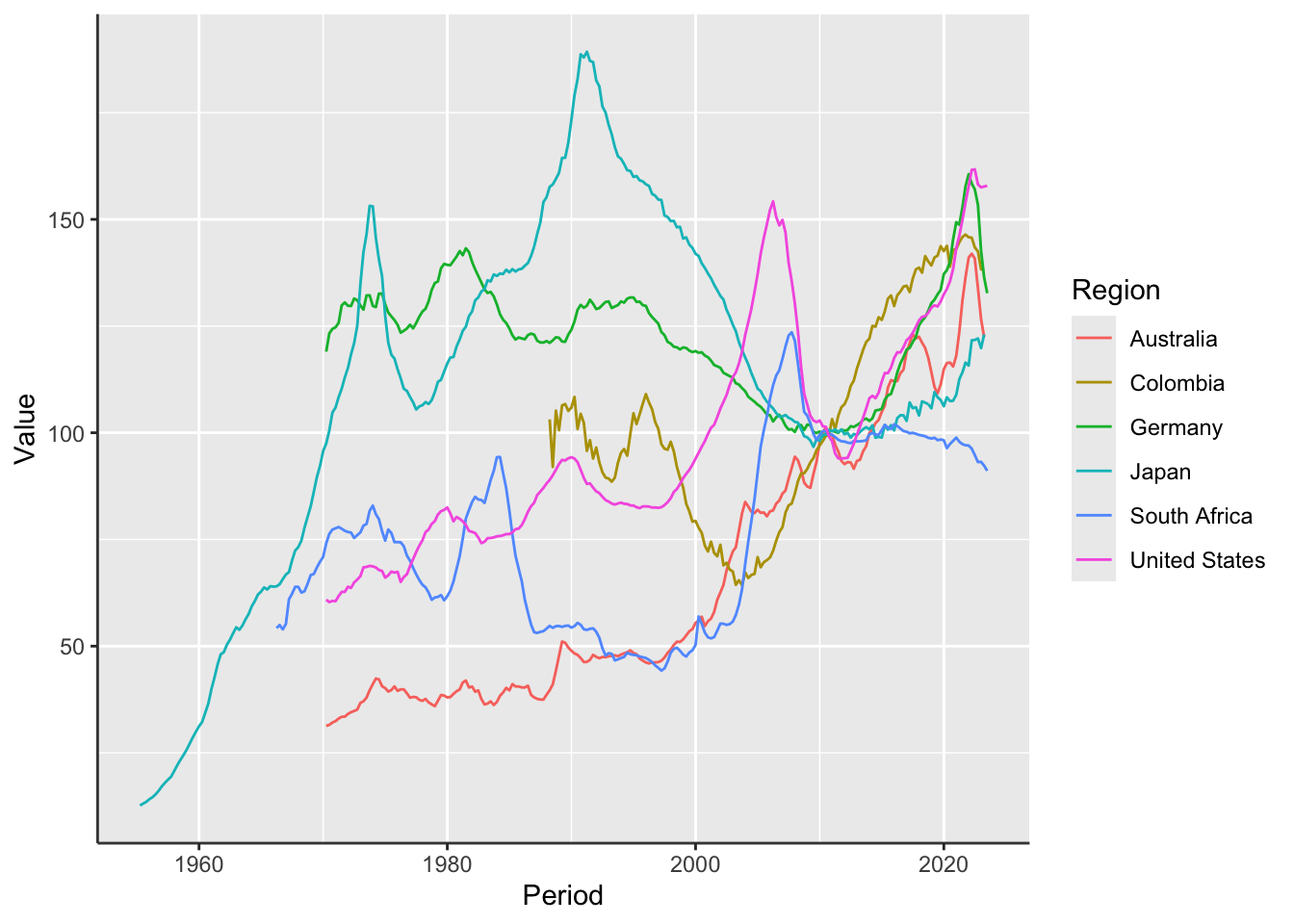
Figure 5.11: Residential Property Prices - Selected Countries
Adding layers for a more complex graph:
# Make line plot
RPP %>%
    filter(Region %in% selected_countries) %>%
    ggplot(aes(x = Period, y = Value, color = Region)) +
    geom_line() +
    facet_grid(rows = vars(Unit), cols = vars(Measure), scales = "free_y")
This R code chunk uses a sequence of operations to create a more complex line plot using the ggplot2 package. Here’s a breakdown:
RPP %>% filter(Region %in% selected_countries) %>%: This part filters theRPPdata frame to include only the regions specified inselected_countries. The%>%operator pipes the filtered data frame into the followingggplot()function.ggplot(aes(x = Period, y = Value, color = Region)): Initializes theggplotwith aesthetic mappings.x = Period: Maps thePeriodvariable to the x-axis.y = Value: Maps theValuevariable to the y-axis.color = Region: Differentiates lines by theRegionvariable, assigning different colors to each region.
geom_line(): Adds the line geometry to the plot, connecting points as defined by theaes()mappings.facet_grid(rows = vars(Unit), cols = vars(Measure), scales = "free_y"): Adds facets (sub-plots) to the plot.rows = vars(Unit): Creates separate rows for each unique value of theUnitvariable.cols = vars(Measure): Creates separate columns for each unique value of theMeasurevariable.scales = "free_y": Allows the y-axis scale to vary between different facets, adapting to the data within each sub-plot.
The + operator is used to combine all these components into a single plot object.
In summary, this code chunk creates a faceted line plot, shown in Figure 5.12, based on the Period, Value, and Region variables. The facets are arranged by unique values of Unit and Measure
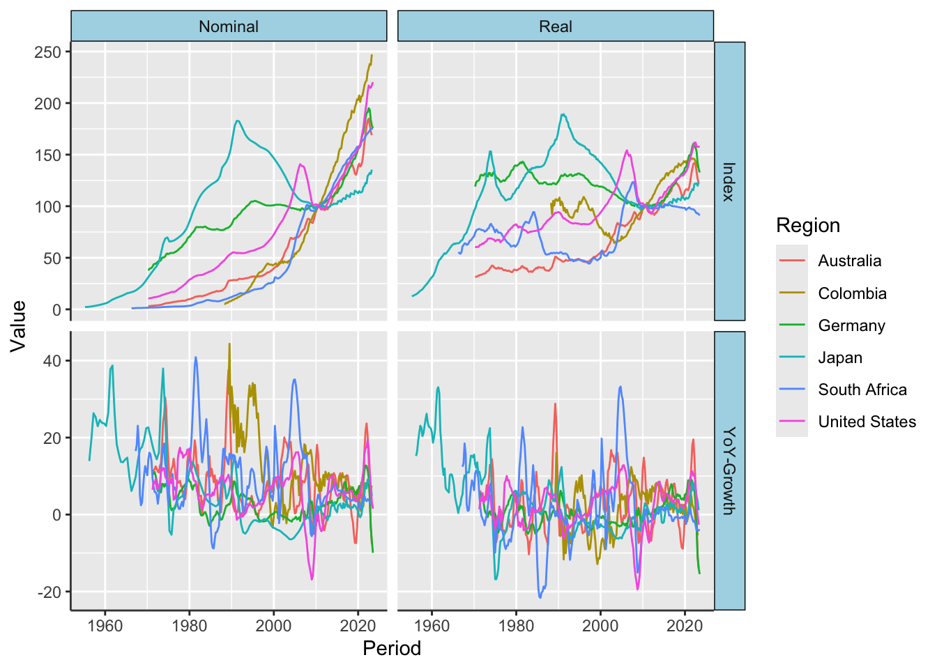
Figure 5.12: Residential Property Prices - Selected Countries
Hence, while matplot() is more straightforward and procedural, it’s less flexible when it comes to layering and typically requires wide-format data. On the other hand, ggplot() offers a more abstract, layered approach to plotting, thrives on long-format data, and allows for more complex and customizable visualizations. The choice between the two often depends on the complexity of the visualization task at hand and the format in which your data exists.
5.3.6 Merge Data
To examine the relationship between residential property prices (RPPs) and policy rates, this section outlines how to import policy rate statistics from Bank for International Settlements (2023a) and merge them with the previously acquired RPP data. Given that policy rates are available on a monthly basis and residential property prices are reported quarterly, data aggregation is a necessary step prior to merging.
Import Policy Rates
Just as with Residential Property Prices (RPP), policy rates are stored in an Excel workbook. The readxl package is used to import the data.
# Import Excel worksheet: "Summary Documentation"
PR_labels <- read_excel(
    path = "files/cbpol.xlsx",
    sheet = "Summary Documentation",
    col_names = TRUE,                # The file has a header row with names
    na = "-"                         # Character string representing NA values
)

# Convert all character vectors to factors
PR_labels <- PR_labels %>%
    mutate(across(where(is.character), as.factor)) %>%
    rename(Region = Country) %>%
    mutate(Measure = factor("Nominal", levels = c("Real", "Nominal")))

# Import Excel worksheet: "Monthly Series"
PR_wide <- read_excel(
    path = "files/cbpol.xlsx",
    sheet = "Monthly Series",
    col_names = TRUE,                # The file has a header row with names
    na = "",                         # Character string representing NA values
    skip = 3                         # Skips the first three rows
)
Reshape Policy Rates
Post-import, the policy rates data is reshaped from wide to long format for easier manipulation and to match the format of the RPP data.
# Reshape from wide to long
PR <- PR_wide  %>%
    pivot_longer(cols = -Period,
                 names_to = "Code",
                 values_to = "Value",
                 values_drop_na = TRUE,
                 names_transform = list(Code = factor))

# Merge with labels
PR <- PR %>%
    left_join(y = PR_labels %>%
                  select(Code, Region, Measure, Unit),
              by = "Code") %>%
    select(-Value, everything(), Value)
Aggregate Policy Rates
The next challenge is to reconcile the different data frequencies. The zoo package by Zeileis, Grothendieck, and Ryan (2023) is used to create a quarterly date variable, which serves as the basis for aggregating monthly policy rates to a quarterly level.
# Load R package
library("zoo")

# Create quarterly period
PR$Quarter <- as.yearqtr(PR$Period)
RPP$Period <- as.yearqtr(RPP$Period)
Then aggregate the policy rates based on this quarterly date variable:
Merge Policy Rates with House Prices
After harmonizing the frequencies, we can now merge the datasets based on their respective time periods.
# Merge RPP and policy rate data
BIS <- RPP %>%
    mutate(Indicator = "Residential Property Prices") %>%
    bind_rows(PR_q %>% mutate(Indicator = "Policy Rate")) %>%
    mutate(Code = factor(Code), Indicator = factor(Indicator)) %>%
    select(Period, Code, Indicator, -Value, everything(), Value)
Here, we also introduce a new column, “Indicator”, to distinguish between Residential Property Prices and Policy Rates, making it easier to visualize them together later.
By completing these steps, the datasets are now merged and ready for deeper analysis, allowing for a comprehensive examination of the relationship between residential property prices and policy rates.
Plot Policy Rates and House Prices
Finally, we visualize the relationship between policy rates and residential property prices for a selection of countries. The ggplot2 package is employed for this visualization.
# Load package
library("ggplot2")

# Choose countries to plot
selected_countries <- c(
    "Australia",     # Oceania
    "Colombia",      # South America
    "Japan",         # Asia
    "Germany",       # Europe
    "South Africa",  # Africa
    "United States"  # North America
)

# Make line plot
BIS %>%
    filter(Region %in% selected_countries) %>%
    filter(Indicator == "Policy Rate" |
               (Indicator == "Residential Property Prices" &
                    Unit == "Index" & Measure == "Real")) %>%
    ggplot(aes(x = Period, y = Value, color = Region)) +
    geom_line() +
    facet_wrap(facets = vars(Indicator), scales = "free_y") +
    theme(legend.position = "bottom",
          legend.justification = "left") +
    guides(color = guide_legend(direction = "vertical", nrow = 2)) +
    xlim(as.numeric(as.yearqtr("1970-01-01")), as.numeric(max(BIS$Period)))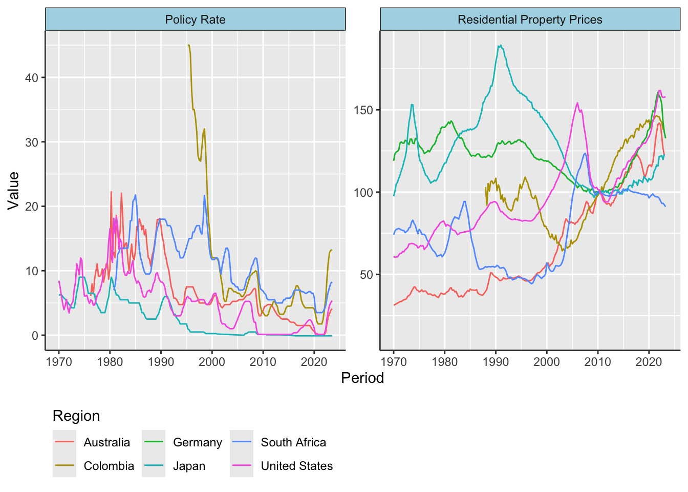
Figure 5.13: RPP and Policy Rates
The resulting plot, shown in Figure 5.13, enables us to compare the trends in residential property prices and policy rates across different countries, providing valuable insights for both policymakers and researchers.
5.3.7 Transform Data
To analyze the dynamics of residential property prices and policy rates, various data transformations are necessary. These transformations are designed to create meaningful metrics for comparative analyses. This section outlines the steps involved in the data transformation process.
Compute Price Level
Real Residential Property Prices (Real RPP) represent the value of residential property after adjusting for general changes in the price level, commonly measured by the Consumer Price Index (CPI). In other words, Real RPP accounts for the effects of inflation, providing a more accurate measure of the change in property value over time.
Mathematically, Real RPP can be expressed as:
\[ R_t = 100 \left(\frac{N_t}{CPI_t} \right) \]
Where:
- \(R_t\): Real RPP at time \(t\)
- \(N_t\): Nominal RPP at time \(t\)
- \(CPI_t\): Consumer Price Index at time \(t\), normalized to 100 at a specific base year.
Given the definition of Real RPP, we can rearrange the formula to solve for the Consumer Price Index:
\[ CPI_t = 100 \left( \frac{N_t}{R_t} \right) \]
Thus, if we have both Real and Nominal RPP, we can easily compute the Consumer Price Index. The code snippet below computes the CPI and adds the new data to the existing data frame BIS.
# Compute CPI
BIS <- BIS %>%
    filter(Indicator == "Residential Property Prices") %>%
    pivot_wider(id_cols = c("Period", "Region", "Unit"),
                names_from = "Measure",
                values_from = c("Value", "Code"),
                names_sep = "__") %>%
    mutate(Indicator = "Consumer Price Index",
           Measure = "Nominal",
           Value = case_when(
               Unit == "YoY-Growth" ~ Value__Nominal - Value__Real,
               Unit == "Index" ~ 100 * Value__Nominal / Value__Real,
               .default = NA),
           Code = case_when(
               !is.na(Code__Nominal) & !is.na(Code__Real) ~
                   paste(Code__Nominal, Code__Real, sep = " & "),
               .default = NA)) %>%
    na.omit() %>%
    select(-contains("__")) %>%
    bind_rows(BIS) %>%
    select(-Value, everything(), Value)
The code performs several steps to compute the Consumer Price Index (CPI) based on the existing BIS data frame, which contains Residential Property Prices (RPP) data. Below are the operations explained step by step:
filter(Indicator == "Residential Property Prices"): Filters rows where theIndicatorcolumn contains “Residential Property Prices.”pivot_wider(...): Converts the data from long format to wide format. It keeps “Period,” “Region,” and “Unit” as identifier columns and transforms the “Measure” column into new columns, specifically generatingValue__NominalandValue__Real. These new columns are used in subsequent calculations to compute the Consumer Price Index (CPI).mutate(Indicator = "Consumer Price Index", ...): Adds a newIndicatorcolumn set to “Consumer Price Index” and conditionally calculates a newValuecolumn based on theUnitcolumn using thecase_when()function:- For
Unit == "YoY-Growth":Value= \(\pi_t = n_t - r_t\) - For
Unit == "Index":Value= \(P_t = 100 \left(\frac{N_t}{R_t}\right)\)
- For
na.omit(): Removes rows with anyNAvalues.select(-contains("__")): Removes columns with names containing double underscores, effectively removingValue__NominalandValue__Realfrom the data frame.bind_rows(BIS): Appends the newly computed CPI data to the originalBISdata frame.select(-Value, everything(), Value): Rearranges the columns, moving the newly computedValuecolumn to the end for better readability.
Each of these steps contributes to the computation of the Consumer Price Index (CPI) based on existing Residential Property Prices (RPP) and then adds this computed data back into the original BIS data frame.
Compute Inflation
In this section, we delve into the calculation of inflation, which is the growth rate of prices. The formula for calculating inflation is as follows:
\[ \% \Delta P_t \equiv 100 \left(\frac{P_t - P_{t-1}}{P_{t-1}}\right) \% \approx 100 \left( \ln P_t - \ln P_{t-1} \right) \% \tag{5.1} \]
To implement this calculation, the code snippet utilizes several functions from the dplyr package. One critical function is group_by(). This function is used to split the data into subsets based on the specified columns (Code, Indicator, Measure, and Region in this case). Subsequent operations are then applied within these subsets.
# Compute growth rates
BIS_transformed <- BIS %>%
    filter(is.na(Unit) | Unit != "YoY-Growth") %>%
    group_by(Code, Indicator, Measure, Region) %>%
    arrange(Period) %>%
    mutate(Level = Value,
           Growth = ifelse(test = Unit == "Index",
                           yes = 400 * (log(Value) - dplyr::lag(log(Value))),
                           no = NA),
           Value = NULL) %>%
    ungroup()
Here’s a detailed breakdown of the code:
filter(is.na(Unit) | Unit != "YoY-Growth"): This line ensures that only the relevant data is considered by excluding rows where theUnitcolumn is “YoY-Growth” and keeping rows whereUnitisNA.group_by(Code, Indicator, Measure, Region): The data is grouped by four variables. This is pivotal for the subsequent operations, which will be performed within these grouped subsets.arrange(Period): This function sorts the data within each group by the time period, ensuring a chronological order.mutate(Level = Value, ...): A new column named “Level” is created, which is a duplicate of theValuecolumn.Growth = ifelse(...): The “Growth” column is calculated based on the logarithmic differences between the current and previous periods. The calculation is done only when theUnitcolumn equals “Index”.Value = NULL: The originalValuecolumn is removed after the new columns “Level” and “Growth” are generated.ungroup(): This last step removes the grouping structure, returning the data frame to its original, ungrouped state.
The use of group_by() ensures that each subset of data, defined by the combination of Code, Indicator, Measure, and Region, is treated as a separate entity. This is important when using functions like lag(), as the calculation would be restricted to within each group, ensuring no values are carried over from one group to another.
In summary, group_by() allows for segmented and independent calculations within a dataset, making it a powerful tool for data manipulation and analysis.
Reshape Transformed Data
Data is then reshaped to make it more convenient for further analysis. The pivot_longer() function from the tidyr package is used to convert the data from wide to long format.
# Reshape from wide to long
BIS_t <- BIS_transformed  %>%
    pivot_longer(cols = c("Level", "Growth"),
                 names_to = "Transformation",
                 values_to = "Value",
                 values_drop_na = TRUE,
                 names_transform = list(Transformation = function(x) factor(
                     x, levels = c("Level", "Growth"))))
Here’s the breakdown of the code snippet:
pivot_longer(cols = c("Level", "Growth"), ...): Specifies the columns “Level” and “Growth” to be converted from wide to long format.names_to = "Transformation": The names of the original columns (“Level” and “Growth”) are stored in a new column named “Transformation.”values_to = "Value": The values of the original columns are stored in a new column called “Value.”values_drop_na = TRUE: AnyNAvalues in the “Level” and “Growth” columns will be dropped.names_transform = list(...): This part reorders the levels of the “Transformation” factor column to have “Level” come before “Growth.”
In summary, the pivot_longer() function is used to streamline the data’s structure. The “Level” and “Growth” columns are folded into a single “Value” column, and a new column “Transformation” is added to specify the original column from which each value originates. This results in a long-format data frame that can be more convenient for downstream data analysis tasks.
Compute Real Interest Rate
The real policy rate is essentially the nominal interest rate adjusted for inflation. It can be mathematically represented as:
\[ \text{Real Policy Rate}_t = \text{Policy Rate}_t - \text{CPI Inflation}_t \]
The real interest rate is a key economic indicator that offers a more accurate measure of the return on investments. It represents the true cost of borrowing, as it accounts for the eroding effects of inflation on the purchasing power of money, making it a critical factor in financial decision-making.
In the following R code, the real interest rate is computed by subtracting the growth of the Consumer Price Index (CPI) from the Policy Rate, providing an interest rate that accounts for inflationary changes.
# Compute real interest rate
BIS_t <- BIS_t %>%
    filter(Indicator %in% "Policy Rate" |
               (Indicator %in% "Consumer Price Index" &
                    Transformation == "Growth")) %>%
    pivot_wider(id_cols = c("Period", "Region"),
                names_from = "Indicator",
                values_from = c("Value", "Code"),
                names_sep = "__") %>%
    mutate(Indicator = "Policy Rate",
           Measure = "Real",
           Transformation = factor("Level", levels = c("Level", "Growth")),
           Value = `Value__Policy Rate` - `Value__Consumer Price Index`,
           Code = paste(`Code__Policy Rate`, `Code__Consumer Price Index`,
                        sep = " & ")) %>%
    na.omit() %>%
    select(-contains("__")) %>%
    bind_rows(BIS_t) %>%
    select(-Value, everything(), Value)
The code snippet computes the real interest rate by performing several transformations on the dataset:
filter(Indicator %in% "Policy Rate" | ...): Filters rows where theIndicatoris either “Policy Rate” or the growth rate of the “Consumer Price Index.”pivot_wider(id_cols = c("Period", "Region"), ...): Converts the data from long format to wide format, using “Period” and “Region” as identifier columns.mutate(Indicator = "Policy Rate", ...): Adds a new column named “Indicator” with the value “Policy Rate” and computes a new columnValueas the difference between the Policy Rate and the Consumer Price Index (CPI) growth.Code = paste(..., sep = " & "): Combines the codes for the Policy Rate and CPI into a single code, separated by ” & “.na.omit(): Removes rows with anyNAvalues.select(-contains("__")): Removes any columns with names that contain double underscores, which in this case are the temporary columnsValue__Policy RateandValue__Consumer Price Index.bind_rows(BIS_t): Appends the new data back to the originalBIS_tdata frame.select(-Value, everything(), Value): Rearranges the columns so that the newValuecolumn is at the end.
By executing these steps, the real interest rate is calculated and added to the dataset, making it available for further analysis.
5.3.8 Stationary Data
Statistical measures like mean, standard deviation, and correlation are meaningful only for stationary time series. A stationary time series maintains constant statistical properties over time, such as a constant mean and variance. Non-stationary time series, where the mean or variance drifts over time, are not suitable for such analysis, as current and past values are not indicative of future behavior.
To illustrate, consider the U.S. house price index and its growth rate, the latter being a stationary series. The following figure contrasts the statistical properties of these two series:
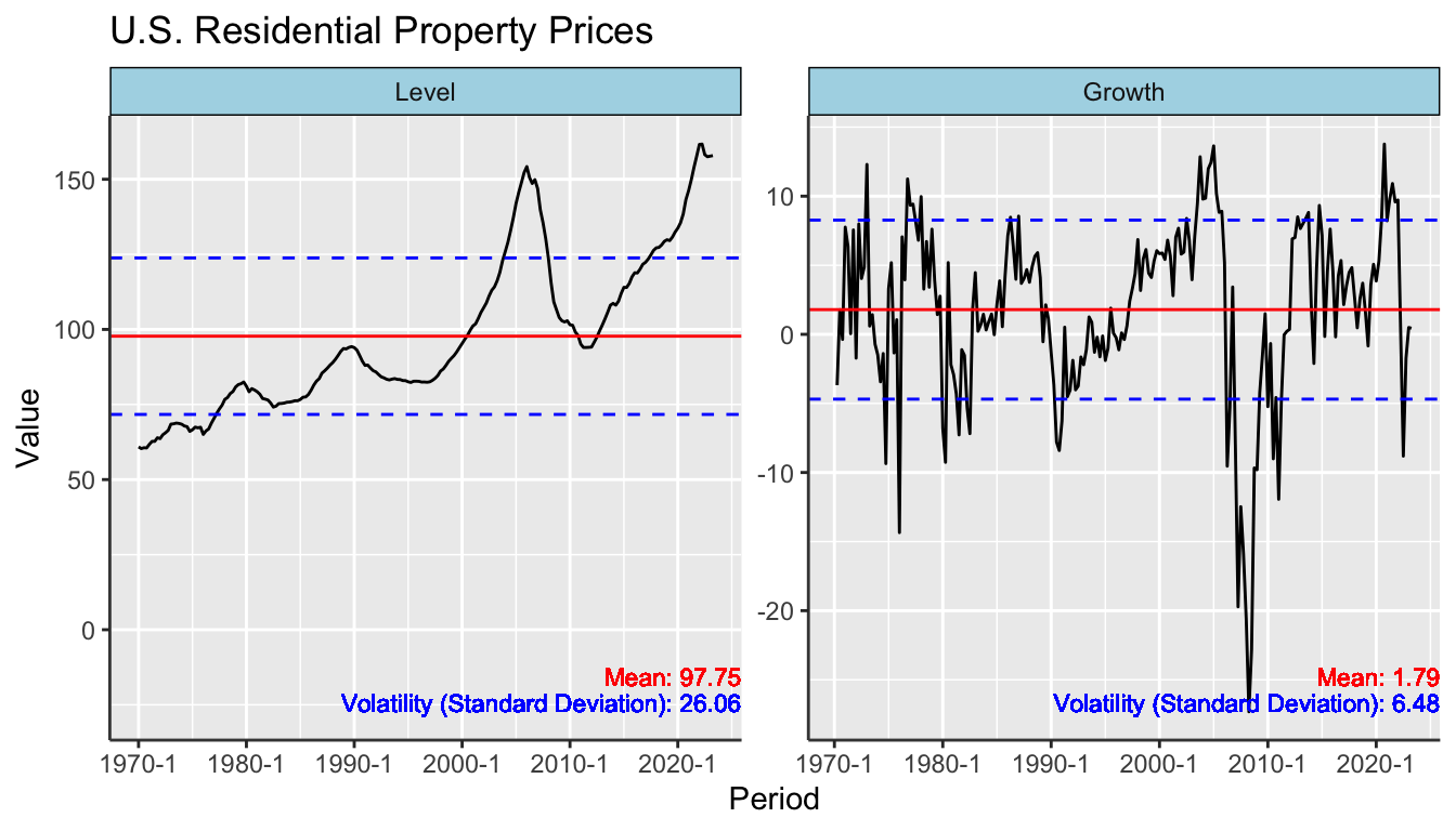
Figure 5.14: U.S. Residential Property Price Index: Non-Stationary Levels and Stationary Growth Rates
Figure 5.14 shows that the mean and volatility for the house price index are not stable, rendering them useless for making predictions or understanding typical behavior. In contrast, the mean and volatility of the growth rate are stable and thus provide insights.
The R code for generating Figure 5.14 is detailed below.
# Load package
library("ggplot2")

BIS_t %>%
    group_by(Region, Indicator, Measure, Transformation) %>%
    mutate(Mean = mean(Value, na.rm = TRUE), SD = sd(Value, na.rm = TRUE)) %>%
    filter(Region == "United States",
           Indicator == "Residential Property Prices",
           Measure == "Real") %>%
    ggplot(aes(x = Period, y = Value)) +
    geom_line() +
    geom_hline(aes(yintercept = Mean), color = "red") +
    geom_hline(aes(yintercept = Mean + SD), color = "blue", linetype = "dashed") +
    geom_hline(aes(yintercept = Mean - SD), color = "blue", linetype = "dashed") +
    geom_text(aes(label = paste("Mean:", round(Mean, 2)),
                  x = Inf, y = min(Value)),
              hjust = 1, vjust = -1.5, size = 3, color = "red") +
    geom_text(aes(label = paste("Volatility (Standard Deviation):", round(SD, 2)),
                  x = Inf, y = min(Value)),
              hjust = 1, vjust = 0, size = 3, color = "blue") +
    facet_wrap(facets = vars(Transformation), scales = "free") +
    ggtitle("U.S. Residential Property Prices")
Here is the explanation of the code step-by-step:
- Load package
library("ggplot2"): Loads the ggplot2 package for data visualization.
- Data Preparation
group_by(Region, Indicator, Measure, Transformation): Groups the data by several variables: “Region,” “Indicator,” “Measure,” and “Transformation.”mutate(Mean = mean(Value, na.rm = TRUE), SD = sd(Value, na.rm = TRUE)): Calculates the mean and standard deviation of ‘Value’ for each group.filter(Region == "United States", Indicator == "Residential Property Prices", Measure == "Real"): Filters the data to include only observations related to real residential property prices in the United States.
- Plotting
ggplot(aes(x = Period, y = Value)): Initializes ggplot and sets ‘Period’ as the x-axis and ‘Value’ as the y-axis.geom_line(): Adds a line to the plot to represent the time series data.geom_hline(...): Adds horizontal lines to indicate the mean and standard deviation.geom_text(...): Adds text to the plot for the mean and standard deviation.facet_wrap(facets = vars(Transformation), scales = "free"): Separates the plot into subplots based on the “Transformation” variable (Level or Growth), allowing for different y-axis scales.ggtitle("U.S. Residential Property Prices"): Adds a title to the plot.
The resulting plot will show the time series data along with red lines indicating the mean and blue dashed lines showing one standard deviation above and below the mean. The purpose is to illustrate that while the growth rate series might be stationary (constant mean and variance over time), the house price index itself is not. Therefore, the latter is not suitable for predictions based on historical mean and volatility.
Because of these considerations, we’ll focus on stationary variables. The BIS_stationary dataset is created to include only these variables. We filter out only the growth transformations for “Residential Property Prices” and “Consumer Price Index,” as well as the level for “Policy Rate.”
# Select stationary variables
BIS_stationary <- BIS_t %>%
    filter((Indicator == "Residential Property Prices" & Transformation == "Growth")|
               (Indicator == "Consumer Price Index" & Transformation == "Growth")|
               (Indicator == "Policy Rate" & Transformation == "Level")) %>%
    mutate(Transformation = NULL,
           Indicator = case_when(
               Indicator == "Residential Property Prices" ~ "RPP Inflation",
               Indicator == "Consumer Price Index" ~ "CPI Inflation",
               .default = Indicator))
To simplify the dataset, we incorporate the information from the Measure column into the variable names and remove the Measure column. This leads to clearer variable names like “Real RPP Inflation” instead of just “RPP Inflation.”
# Create the BIS_core dataset
BIS_stationary <- BIS_stationary %>%
    mutate(Indicator = ifelse(test = Indicator == "CPI Inflation",
                              yes = Indicator,
                              no = paste(Measure, Indicator))) %>%
    select(Period, Indicator, Region, Value)
This approach ensures that our subsequent analyses are based on stationary time series, making the statistical measures meaningful for inference and prediction.
5.3.9 Export Data
This section outlines the methods to export the processed residential property price (RPP) and policy rate data for further analysis or sharing. Three formats are covered: RDS, DSV, and Excel workbooks. Each format has its pros and cons. As discussed previously in Chapter 5.1.6, DSV files are more compatible than RDS files but lack the ability to preserve all data types and attributes, while RDS files do. The advantage of Excel workbooks over DSV files is that they can contain multiple datasets in one file, but they are less efficient and use more storage.
First, we capture the source information for the datasets, using the tribble() function to create a tibble.
# Source of data
BIS_source <- tribble(
    ~Data, ~Source, ~Documentation,
    "Residential Property Prices (RPP) by the Bank for International Settlements",
    "https://www.bis.org/statistics/pp.htm",
    "http://www.bis.org/statistics/pp_selected_documentation.pdf",
    "Policy Rates (PR) by the Bank for International Settlements (BIS)",
    "https://www.bis.org/statistics/cbpol.htm",
    "http://www.bis.org/statistics/cbpol/cbpol_doc.pdf")
RDS
To preserve all attributes and data types of an R object, the saveRDS() function is used. Below, we add the source data as an attribute and then save the object.
# Attach source of data as attributes to the "BIS_stationary" object
attr(BIS_stationary, "source") <- BIS_source

# Create a folder to store exported files
dir.create(path = "exported-files", showWarnings = FALSE)

# Save as RDS file
saveRDS(object = BIS_stationary, file = "exported-files/BIS_stationary.rds")
To validate the saved RDS, we read it back and check for identity with the original object.
# Read saved RDS file
BIS_stationary_loaded <- readRDS(file = "exported-files/BIS_stationary.rds")
identical(BIS_stationary, BIS_stationary_loaded)
## [1] TRUEDSV
For broader software compatibility, DSV formats like CSV or TSV are advantageous. The write.table() or write_delim() functions can be used.
# Load packages
library("readr")

# Create folder for exported files
dir.create(path = "exported-files", showWarnings = FALSE)

# Export BIS data as CSV file
write_delim(x = BIS_stationary,
            file = "exported-files/BIS_stationary.csv",
            delim = ",")
The source information can also be saved as a separate CSV file.
Excel Workbook
Excel workbooks offer the benefit of consolidating multiple datasets into one file. While the readxl package is often used for reading Excel files, it doesn’t support writing. Packages like writexl or openxlsx can be used to write Excel files.
The write_xlsx() function from the writexl package is used to export multiple data frames to an Excel workbook. Each data frame will be saved as a separate sheet in the workbook.
# Load packages
library("writexl")

# Create object with information about Excel sheets
BIS_sheet_content <- tribble(
    ~`Excel Sheet`, ~Content,
    "Content", "Information about Excel sheets",
    "Source", "Information about data source",
    "Raw", "Raw RPP and PR data stored in long format",
    "Transformed", "Transformed data",
    "Stationary", "Stationary data")

# Create folder for exported files
dir.create(path = "exported-files", showWarnings = FALSE)

# Export data
write_xlsx(x = list("Content" = BIS_sheet_content,
                    "Source" = BIS_source,
                    "Raw" = BIS,
                    "Transformed" = BIS_t,
                    "Stationary" = BIS_stationary),
           path = "exported-files/BIS_stationary.xlsx")
Here’s what each parameter is doing:
x = list(...): This list contains the data frames to be exported, each with a name that will become the Excel sheet name."Content" = BIS_sheet_content: Exports the data frameBIS_sheet_contentto a sheet named “Content”."Source" = BIS_source: Exports the data frameBIS_sourceto a sheet named “Source”."Raw" = BIS: Exports the data frameBISto a sheet named “Raw”."Transformed" = BIS_t: Exports the data frameBIS_tto a sheet named “Transformed”."Stationary" = BIS_stationary: Exports the data frameBIS_stationaryto a sheet named “Stationary”.
path = "exported-files/BIS_stationary.xlsx": Specifies the directory and the name of the Excel workbook file to be created.
So, the code will create an Excel workbook named BIS_stationary.xlsx in the exported-files directory. The workbook will contain five sheets: “Content”, “Source”, “Raw”, “Transformed”, and “Stationary”, each populated with the corresponding data frame.
Both writexl and openxlsx have merits. While writexl is simpler and more straightforward, openxlsx offers more features, such as advanced formatting and the inclusion of charts or images. Your choice between the two should depend on your specific needs.
Thus, you have multiple options for exporting your data, each with its own set of advantages and limitations. Choose the one that best suits your project requirements.
5.3.10 Organize Data
For focused analysis, we concentrate on three essential variables: Real RPP Inflation, CPI Inflation, and Real Policy Rate. We also narrow down the geographical scope to four key economic regions: the United States, the Euro Area, China, and Emerging Markets. This subset of the data will be stored in a new tibble, BIS_core.
It’s important to properly order and name categorical variables at this stage. Default sorting in tables or graphs is often alphabetical, which may not be ideal for our analytical purposes. To ensure meaningful representation in subsequent analyses, we convert the ‘Region’ and ‘Indicator’ columns into ordered factors.
Here’s how this is implemented:
# Define regions of interest and their desired names
selected_regions = c(
    "United States" = "United States",
    "Euro area" = "Euro Area",
    "China" = "China",
    "Emerging market economies (aggregate)" = "Emerging Markets"
)

# Define variables of interest and their desired names
selected_variables = c("Real RPP Inflation" = "Real RPP Inflation",
                       "CPI Inflation" = "CPI Inflation",
                       "Real Policy Rate" = "Real Policy Rate")

# Create the BIS_core dataset
BIS_core <- BIS_stationary %>%
    filter(Region %in% names(selected_regions),
           Indicator %in% names(selected_variables)) %>%
    mutate(Region = factor(x = Region,
                           levels = names(selected_regions),
                           ordered = TRUE),
           Indicator = factor(x = Indicator,
                              levels = names(selected_variables),
                              ordered = TRUE)) %>%
    arrange(Indicator, Region)

# Rename factor levels
levels(BIS_core$Region) <- selected_regions[levels(BIS_core$Region)]
levels(BIS_core$Indicator) <- selected_variables[levels(BIS_core$Indicator)]
In summary, the BIS_core tibble now comprises only the variables and regions that are pertinent for subsequent analysis, and these are appropriately ordered and efficiently renamed for effective data presentation and interpretation.
5.3.11 Univariate Statistics
In this section, we present univariate statistics across different regions for CPI inflation, real home price inflation, and real policy rates. In the context of statistics, the term “univariate” refers to the analysis of a single variable without consideration of any other variables. Metrics like mean, standard deviation, minimum, and maximum are univariate statistics because they describe features of one variable in isolation. They summarize the central tendency, variability, and range of possible values for that single variable.
In contrast, associative statistics examine relationships between two or more variables, which will be discussed in the next section. Correlation coefficients, covariances, and regression coefficients are examples of associative statistics. These metrics help us understand how variables interact with each other or how one variable might predict another.
For the univariate statistics, we group the data by region, variable, and measure, then calculate summary statistics for each group, consisting of the time span, mean, and volatility.
# Compute univariate statistics
BIS_univariate_stats <- BIS_core %>%
    group_by(Indicator, Region) %>%
    summarize(
        `Time Span` = paste(range(Period), collapse = " - "),
        Mean = mean(Value, na.rm = TRUE),
        Volatility = sd(Value, na.rm = TRUE)
    ) %>%
    ungroup()
In this R code block, the goal is to calculate univariate statistics for the dataset BIS_core:
group_by(Indicator, Region): This function groups the data by theIndicatorandRegionvariables. This ensures that the following calculations are done separately for each combination ofIndicatorandRegion.summarize(): This function is used to compute summary statistics for each group. Three statistics are calculated:Time Span: It calculates the range of thePeriodfor which data exists. Thepaste()andcollapsefunctions are used to concatenate the minimum and maximum period into a string.Mean: The mean of theValuecolumn is calculated withna.rm = TRUE, which means that missing values are ignored.Volatility: The standard deviation (a measure of volatility) of theValuecolumn is also calculated, ignoring missing values (na.rm = TRUE).
ungroup(): Finally, theungroup()function removes the grouping, resulting in a new tibbleBIS_univariate_statsthat contains the computed univariate statistics for eachIndicatorandRegioncombination.
By the end of this operation, the BIS_univariate_stats tibble will have a comprehensive view of univariate statistics across the selected indicators and regions, facilitating a straightforward interpretation of each variable’s central tendency and variability within specific economic contexts.
We use the kable() and kableExtra() functions from the knitr (Xie 2023) and kableExtra (Zhu 2024) packages to display the univariate statistics in a table. The metrics are rounded to two decimal places for better readability.
# Load packages
library("knitr")
library("kableExtra")

# Render table using kable and kableExtra
BIS_univariate_stats %>%
    mutate(Mean = round(Mean, 2),
           Volatility = round(Volatility, 2)) %>%
    rename(`Indicator$^*$` = Indicator) %>%
    kable(caption = "Univariate Statistics",
          booktabs = TRUE) %>%
    kable_styling(full_width = FALSE,
                  latex_options = c("hold_position")) %>%
    add_footnote(label = "$^*$Annualized Quarterly Rates in Percent",
                 notation = "none")
Here’s a breakdown of the code:
library("knitr")andlibrary("kableExtra")load the necessary packages for table rendering and customization.mutate(Mean = round(Mean, 2), Volatility = round(Volatility, 2)): Rounds theMeanandVolatilityto two decimal places for better readability.rename('Indicator$^*$' = Indicator): Renames theIndicatorcolumn for special footnote notation.kable(caption = "Univariate Statistics", booktabs = TRUE): Uses thekable()function to create the initial table. Thecaptionparameter adds a title to the table andbooktabs = TRUEimproves the table’s aesthetics.kable_styling(full_width = FALSE, latex_options = c("hold_position")): Adjusts the table’s layout and positioning for PDF output.add_footnote(label = "$^*$Annualized Quarterly Rates in Percent", notation = "none"): Adds a footnote to clarify that the rates are annualized and expressed in percentages.
| Indicator\(^*\) | Region | Time Span | Mean | Volatility |
|---|---|---|---|---|
| Real RPP Inflation | United States | 1970 Q2 - 2023 Q2 | 1.79 | 6.48 |
| Real RPP Inflation | Euro Area | 1975 Q2 - 2023 Q1 | 1.26 | 4.68 |
| Real RPP Inflation | China | 2005 Q3 - 2023 Q1 | 0.96 | 5.84 |
| Real RPP Inflation | Emerging Markets | 2008 Q1 - 2023 Q1 | 1.27 | 2.86 |
| CPI Inflation | United States | 1970 Q2 - 2023 Q2 | 3.91 | 3.40 |
| CPI Inflation | Euro Area | 1975 Q2 - 2023 Q1 | 3.77 | 3.74 |
| CPI Inflation | China | 2005 Q3 - 2023 Q1 | 2.44 | 3.74 |
| CPI Inflation | Emerging Markets | 2008 Q1 - 2023 Q1 | 4.27 | 2.39 |
| Real Policy Rate | United States | 1970 Q2 - 2023 Q2 | 1.02 | 3.49 |
| Real Policy Rate | Euro Area | 1999 Q1 - 2023 Q1 | -0.50 | 3.24 |
| Real Policy Rate | China | 2005 Q3 - 2023 Q1 | 2.77 | 3.65 |
| \(^*\)Annualized Quarterly Rates in Percent |
The resulting Table 5.10 summarizes the annualized quarterly percentage rates for key economic variables in selected regions. These univariate statistics offer a fundamental understanding of individual variable behavior across different regions, setting the stage for more nuanced analyses. The subsequent analysis will involve comparing these variables using associative statistics.
5.3.12 Associative Statistics
This section outlines methods for exploring associative statistics within economic data, focusing on relationships across the dimensions of “Period,” “Indicator,” and “Region.”
Types of Relationships
The data is categorized into three primary dimensions: “Period”, “Indicator”, and “Region.” These categories allow us to examine relationships in different ways:
Relationships Between Regions by Indicator Across Time Periods: This type of relationship examines how a single economic indicator, such as inflation, varies between different regions over multiple time periods. For instance, one might explore how inflation rates in the United States relate to those in the Euro area over a span of several years.
Relationships Between Indicators by Region Across Time Periods: This focuses on a specific region and analyzes how different indicators are interrelated within it. Time-series data is again used to estimate these relationships. As an example, within the United States, one could investigate the relationship between inflation and interest rates over time.
Relationships Between Indicators by Time Period Across Regions: This approach focuses on a single time period and assesses how different indicators correlate across multiple regions. Unlike the previous types, this uses cross-sectional data from different regions for a specific period. For example, in Q1 of 2023, you could analyze how inflation rates correlate with unemployment rates across different regions.
Additional types of relationships are possible; any combination of “Period,” “Indicator,” and “Region” can be explored. The first type will be the focus of this section.
Cross-join Data
To carry out the analysis, a cross-join is needed to restructure the data. This operation pairs every data point in one region with every data point in another region for each time period and indicator.
Table 5.11 shows the data in its original long format, while Table 5.12 illustrates the cross-joined data, which allows us to compute associative statistics between regions.
| Period | Indicator | Region | Value |
|---|---|---|---|
| 2023 Q1 | Real RPP Inflation | United States | 0.49 |
| 2023 Q1 | Real RPP Inflation | Euro Area | -5.21 |
| 2023 Q1 | Real RPP Inflation | China | -2.71 |
| 2023 Q1 | Real RPP Inflation | Emerging Markets | -1.85 |
| Period | Indicator | Region X | Region Y | Value X | Value Y |
|---|---|---|---|---|---|
| 2023 Q1 | Real RPP Inflation | United States | Euro Area | 0.49 | -5.21 |
| 2023 Q1 | Real RPP Inflation | United States | China | 0.49 | -2.71 |
| 2023 Q1 | Real RPP Inflation | United States | Emerging Markets | 0.49 | -1.85 |
| 2023 Q1 | Real RPP Inflation | Euro Area | China | -5.21 | -2.71 |
| 2023 Q1 | Real RPP Inflation | Euro Area | Emerging Markets | -5.21 | -1.85 |
| 2023 Q1 | Real RPP Inflation | China | Emerging Markets | -2.71 | -1.85 |
A cross-join in database terminology is an operation that combines each row of the first table with every row of the second table. In the context of our analysis, a cross-join pairs every data point for a given economic indicator in one region with every data point for the same indicator in another region for each time period, as displayed in Table 5.12.
To execute a cross-join, first determine the shared columns between the tables to be joined. In this case, “Period” and “Indicator” serve as the common columns. After identifying these columns, use a merge function, such as inner_join() from the dplyr package, to merge a copy of the dataset with itself based on these columns.
For instance, to produce Table 5.12 from Table 5.11, use the following code:
# Cross-join regions by period & indicator
BIS_scatter_by_period_indicator <- BIS_core %>%
    inner_join(BIS_core,
               by = c("Period", "Indicator"),
               suffix = c(" X", " Y"),
               relationship = "many-to-many") %>%
    select(-`Value X`, -`Value Y`, everything())
Here’s a breakdown of what the code is doing:
BIS_core %>%: This part takes the originalBIS_coredata table and pipes (%>%) it into the following operations.inner_join(BIS_core, by = c("Period", "Indicator"), suffix = c(" X", " Y"), relationship = "many-to-many"): This line executes the cross-join. The first argument specifies that the table should join with itself. Thebyargument specifies that “Period” and “Indicator” are the common columns. Thesuffixargument adds a suffix (” X” or ” Y”) to the columns from each table to differentiate them. Therelationship = "many-to-many"clarifies that multiple rows from the second table can be joined to a single row from the first table and vice versa.select(-`Value X`, -`Value Y`, everything()): This line rearranges the columns after the join, positioningValue XandValue Yat the end.
The end result is stored in a new variable called BIS_scatter_by_period_indicator, which will contain the cross-joined data. This new table can then be used for subsequent analyses, such as computing correlations between different regions based on various economic indicators.
Since the goal here is to compute correlations, the order in which the regions appear doesn’t matter. In other words, a correlation between Region X as the U.S. and Region Y as China would yield the same result as one between Region X as China and Region Y as the U.S. Moreover, the correlation of a region with itself is always one and can be skipped. Therefore, subsequent data filtering is needed to eliminate such redundant pairings.
# Remove duplicate combinations
BIS_scatter_by_period_indicator <- BIS_scatter_by_period_indicator %>%
    filter(`Region Y` > `Region X`)
The R code filters the BIS_scatter_by_period_indicator table to retain rows where the categorical value in Region Y is greater than that in Region X, as these are ordered factors. This step removes duplicate pairs, ensuring only one combination of any two regions remains, thus reducing redundancy.
Compute Correlations
After restructuring the data, we can proceed to compute the correlation statistics.
# Compute associative statistics across regions
BIS_scatter_by_period_indicator <- BIS_scatter_by_period_indicator %>%
    group_by(Indicator, `Region X`, `Region Y`) %>%
    mutate(`Time Span` = paste(range(Period), collapse = " - "),
           Correlation = cor(x = `Value X`, y = `Value Y`)) %>%
    ungroup()
The R code calculates associative statistics for each combination of “Indicator,” “Region X,” and “Region Y” in the BIS_scatter_by_period_indicator table.
group_by(Indicator, `Region X`, `Region Y`): Groups the data by the “Indicator,” “Region X,” and “Region Y” columns. This ensures that subsequent operations are performed within these groups.mutate(...): Within each group, two new columns are created:`Time Span` = paste(range(Period), collapse = " - "): Combines the minimum and maximum values of thePeriodcolumn into a single string, separated by a dash.Correlation = cor(x = `Value X`, y = `Value Y`)): Computes the correlation betweenValue XandValue Y.
ungroup(): Removes the groupings, returning the data to its original structure but with the newly calculated columns added.
The modified dataset, BIS_scatter_by_period_indicator, now includes columns for time spans and correlation coefficients.
To present these statistics in a table, the following R code is used:
# Load packages
library("knitr")
library("kableExtra")

# Render table using kable and kableExtra
BIS_scatter_by_period_indicator %>%
    select(-Period, -`Value X`, -`Value Y`)  %>%
    group_by(`Indicator`, `Region X`, `Region Y`) %>%
    slice(1) %>%
    mutate(Correlation = round(Correlation, 2)) %>%
    rename(`Indicator$^*$` = Indicator) %>%
    kable(caption = "Correlations Between Regions by Indicator Across Time Periods",
          booktabs = TRUE) %>%
    kable_styling(full_width = FALSE,
                  latex_options = c("hold_position")) %>%
    add_footnote(label = "$^*$Annualized Quarterly Rates in Percent",
                 notation = "none")
The R code carries out the following operations:
select(-Period, -`Value X`, -`Value Y`)omits the columnsPeriod,Value X, andValue Y, focusing solely onCorrelationandTime Span.group_by(Indicator, `Region X`, `Region Y`)sorts the data byIndicator,Region X, andRegion Y.slice(1)selects the first row within each group, asCorrelationandTime Spanvalues are constant across the group.mutate(Correlation = round(Correlation, 2))roundsCorrelationto two decimal places.rename(Indicator$^*$ = Indicator)renamesIndicatorto include a star for footnote annotation.kable() and kable_styling()employ thekableandkableExtrapackages to format the table, including its caption and style.add_footnote()adds a footnote to the table.
| Indicator\(^*\) | Region X | Region Y | Time Span | Correlation |
|---|---|---|---|---|
| Real RPP Inflation | United States | Euro Area | 1975 Q2 - 2023 Q1 | 0.31 |
| Real RPP Inflation | United States | China | 2005 Q3 - 2023 Q1 | -0.02 |
| Real RPP Inflation | United States | Emerging Markets | 2008 Q1 - 2023 Q1 | 0.21 |
| Real RPP Inflation | Euro Area | China | 2005 Q3 - 2023 Q1 | 0.15 |
| Real RPP Inflation | Euro Area | Emerging Markets | 2008 Q1 - 2023 Q1 | 0.03 |
| Real RPP Inflation | China | Emerging Markets | 2008 Q1 - 2023 Q1 | 0.73 |
| CPI Inflation | United States | Euro Area | 1975 Q2 - 2023 Q1 | 0.70 |
| CPI Inflation | United States | China | 2005 Q3 - 2023 Q1 | 0.02 |
| CPI Inflation | United States | Emerging Markets | 2008 Q1 - 2023 Q1 | 0.52 |
| CPI Inflation | Euro Area | China | 2005 Q3 - 2023 Q1 | -0.29 |
| CPI Inflation | Euro Area | Emerging Markets | 2008 Q1 - 2023 Q1 | 0.27 |
| CPI Inflation | China | Emerging Markets | 2008 Q1 - 2023 Q1 | 0.67 |
| Real Policy Rate | United States | Euro Area | 1999 Q1 - 2023 Q1 | 0.63 |
| Real Policy Rate | United States | China | 2005 Q3 - 2023 Q1 | -0.01 |
| Real Policy Rate | Euro Area | China | 2005 Q3 - 2023 Q1 | -0.24 |
| \(^*\)Annualized Quarterly Rates in Percent |
The generated table, referred to as Table 5.13, displays the computed correlations between regions for different indicators over time.
By computing these statistics, we can identify how different economic indicators relate to each other across various dimensions: time periods, regions, and indicators themselves. This process forms the basis for more complex econometric analyses.
5.3.13 Layered Scatter Plots
The correlations presented in Table 5.13 warrant further investigation. To gain deeper insights and evaluate the influence of outliers, we employ scatter plots generated using the ggplot2 package in R.
# Load package
library("ggplot2")

# Global minimum and maximum value
global_min_max <- range(BIS_scatter_by_period_indicator$`Value X`)

# Make scatter plots between regions by indicator
BIS_scatter_by_period_indicator %>%
    mutate(Decade = factor(10 * floor(as.numeric(format(Period, "%Y")) / 10),
                           ordered = TRUE),
           Decade = factor(Decade, levels = rev(levels(Decade)))) %>%
    filter(`Region X` == "United States") %>%
    ggplot(aes(x = `Value X`, y = `Value Y`, color = Decade)) +
    geom_smooth(method = "lm", se = FALSE, color = "red", linetype = "dashed") +
    geom_point(size = .2) +
    facet_grid(rows = vars(`Region Y`),
               cols = vars(`Indicator`, `Region X`),
               scales = "fixed") +
    theme(legend.position = "right",
          legend.justification = "left") +
    guides(color = guide_legend(direction = "vertical", ncol = 1)) +
    geom_text(data = . %>% group_by(`Region Y`, `Region X`, `Indicator`) %>% slice(1),
              aes(label = paste("Correlation: ", sprintf("%.2f", Correlation)),
                  x = Inf, y = -Inf),
              hjust = 1.1, vjust = -1, col = "red", size = 3) +
    xlim(global_min_max[1], global_min_max[2]) +
    ylim(global_min_max[1], global_min_max[2])
Here’s what each part of the code does:
library("ggplot2"): Loads theggplot2package for data visualization.global_min_max <- range(BIS_scatter_by_period_indicator$Value X): Determines the global minimum and maximum forValue Xto set plot limits.mutate(Decade = factor(...)): Creates a new columnDecade, categorizing each period into its respective decade.filter(`Region X` == "United States"): Filters the data to only include rows whereRegion Xis the United States.ggplot(aes(...)): Initiates the ggplot object, setting the aesthetics for plottingValue XandValue Y, colored byDecade.geom_smooth(...): Adds a linear model (lm) smooth line to the scatter plot.geom_point(...): Adds points to the scatter plot.facet_grid(...): Facets the plot byRegion YandIndicator, keepingRegion Xas a constant (United States in this case).theme(...)andguides(...): Adjusts the legend and its position.geom_text(...): Adds text labels displaying the correlation coefficient for each plot.xlim(...)andylim(...): Sets the x and y limits of the plots based on the global min-max values.
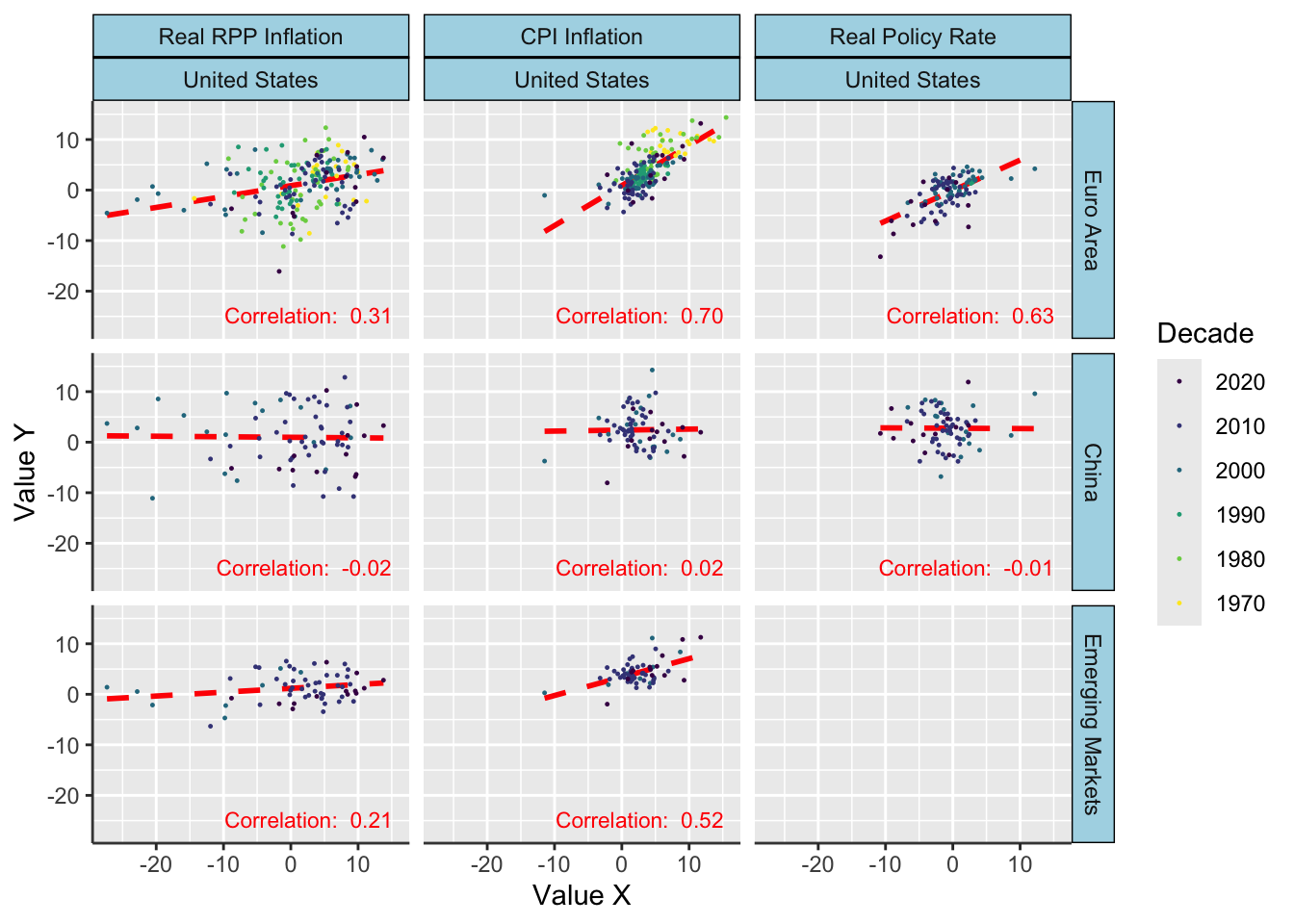
Figure 5.15: Correlations Between Regions by Indicator Across Time Periods
The result, shown in Figure 5.15, is a multi-faceted scatter plot organized by regions and indicators, providing a more comprehensive view of how economic variables correlate with each other over time. Each scatter plot has a text label indicating its correlation value, and the color scheme represents different decades, offering additional layers of analysis.
5.4 Resources
This chapter has provided insights into multiple ways of importing, saving, and downloading data using various APIs. To further enhance your knowledge and skills in importing data in R, consider the following DataCamp courses:
- Importing and Managing Financial Data in R: Gain a solid understanding of how to import and manage financial data in R.
- Intermediate Importing Data in R: Build upon your data importing skills and learn how to handle larger and more complex datasets.
- Working with Web Data in R: Learn to process and analyze data from the web using R.
- Importing and Managing Financial Data in R: Learn to download financial or economic time series data using Web APIs.