Chapter 13 Data Transformation
In Economics and Finance, it is common to transform raw data into meaningful indicators. One common transformation is per capita GDP, where a country’s GDP is divided by its population. This gives a more comparable measure of economic performance across different countries. Similarly, inflation transforms the price index into a growth rate of prices, which helps us understand price distortions, interest rates, and evaluate monetary policy. While these transformations enhance data comparability, they can also introduce complexity. This chapter explores common data transformations in Economics and Finance and offers insights on their interpretation.
Throughout this chapter, we will explore the following transformed measures:
- Growth: This term refers to how an economic variable changes compared to its original value over a set period. Often, it’s expressed as a percentage.
- Differentiation: Differentiation measures the change between an economic variable’s current value and its preceding value. This offers insights into the degree and direction of change.
- Natural Logarithm (Log): Logarithms have many uses, like simplifying data that shows exponential growth or quantifying proportional changes.
- Ratio: Ratio measures calculate the ratio between two variables, such as per capita GDP or unemployment rate. They provide information on the relative size or magnitude of one variable in relation to another.
- Gap: Gap measures calculate the distance between two variables, highlighting disparities.
- Filtering: These measures remove noise or specific fluctuations from the data, providing a clearer view of specific patterns.
By the end of this chapter, you will gain a solid understanding of these transformations and learn how to correctly interpret each one. But before we dive into the details, let’s first prepare some example data that we’ll use to illustrate these transformations throughout this chapter.
13.1 Example Data
For our example data, we leverage key macroeconomic indicators from the U.S. economy, which we source from the FRED database maintained by the Federal Reserve Bank of St. Louis. These indicators provide critical insights into the economic state of the nation, informing various financial, investment, and policy decisions.
The following indicators will be used as examples, where the symbols in parenthesis represent the FRED symbols for downloading the data in R:
- Gross Domestic Product (GDP) (
GDP): This metric denotes the total market value of all the finished goods and services produced in the United States in a specific time period. - Unemployment Rate (
UNRATE): This measures the percentage of the total U.S. labor force that is unemployed but actively seeking employment and willing to work. - GDP Deflator (Aggregate Price Level) (
GDPDEF): This is a measure of the price level of all domestically produced, final goods and services in the United States. - 3-Month Treasury Bill Rate (
TB3MS): This represents the return on investment for the U.S. government’s short-term debt obligation that matures in three months. - NASDAQ Composite Index (
NASDAQCOM): This encompasses a broad range of the securities listed on the NASDAQ stock market and is typically viewed as an indicator of the performance of technology and growth companies. - Population (
B230RC0Q173SBEA): This refers to the total number of individuals residing within the United States.
We employ the getSymbols() function from the quantmod package in R to access the data. This function enables direct data download as delineated in Chapter ??. To use the getSymbols() function for data download, set the Symbols parameter of the function as "GDP" or "UNRATE" (the characters enclosed within the parentheses) and the src (source) parameter as "FRED", corresponding to the FRED website:
# Load quantmod package
library("quantmod")

# Start date
start_date <- as.Date("1971-02-05")

# Download data
getSymbols("GDP", src = "FRED", from = start_date)
getSymbols("UNRATE", src = "FRED", from = start_date)
getSymbols("GDPDEF", src = "FRED", from = start_date)
getSymbols("TB3MS", src = "FRED", from = start_date)
getSymbols("NASDAQCOM", src = "FRED", from = start_date)
getSymbols("B230RC0Q173SBEA", src = "FRED", from = start_date)

# De-annualize GDP & use quarterly instead of monthly index
GDP <- GDP / 4
index(GDP) <- as.yearqtr(index(GDP))

# Remove missing NASDAQCOM values
NASDAQCOM <- na.omit(NASDAQCOM)
## [1] "GDP"
## [1] "UNRATE"
## [1] "GDPDEF"
## [1] "TB3MS"
## [1] "NASDAQCOM"
## [1] "B230RC0Q173SBEA"The code block above, as discussed in Chapter ??, is responsible for data acquisition. The line start_date <- as.Date("1971-02-05") initializes a variable start_date with the date value of February 5, 1971. The function as.Date() converts the string input "1971-02-05" into a format that R can interpret and manipulate as a date object. This conversion process is explained in Chapter ??. Within the getSymbols() function, the argument from = start_date stipulates that data should be retrieved starting from the date encapsulated in the start_date variable, which in this instance is from February 5, 1971 onward. The data fetched by this function is returned as xts objects, a time series data format described in Chapter 4.8.
The following code block visualizes the data:
# Put all plots into one
par(mfrow = c(rows = 3, columns = 2),
    mar = c(b = 2, l = 4, t = 2, r = 1))

# Plot U.S. macro indicators, SA = seasonally adjusted
plot.zoo(x = GDP, main = "Gross Domestic Product (GDP)",
         xlab = "", ylab = "Billion-USD, SA")
plot.zoo(x = UNRATE, main = "Unemployment Rate",
         xlab = "", ylab = "Percent, SA")
plot.zoo(x = GDPDEF, main = "GDP Deflator (Aggregate Price Level)",
         xlab = "", ylab = "Index, 2012 = 100, SA")
plot.zoo(x = TB3MS, main = "3-Month Treasury Rate",
         xlab = "", ylab = "Percent")
plot.zoo(x = NASDAQCOM, main = "Nasdaq Composite Index",
         xlab = "", ylab = "Index, Feb 2, 1971 = 100")
plot.zoo(x = B230RC0Q173SBEA, main = "Population",
         xlab = "", ylab = "Thousands")
The above code block uses two main functions:
par(): This is a base R function used to set or query graphical parameters. Parameters can be set for the duration of a single R session and influence the visual aspect of your plots. Here, it’s being used in two ways:mfrow = c(rows = 3, columns = 2): This sets up the plotting area as a matrix of 3 rows and 2 columns. This means up to six plots can be displayed on the same plotting area, arranged in three rows and two columns.mar = c(b = 2, l = 4, t = 2, r = 1): This is setting the margin sizes around the plots. Themarparameter takes a numeric vector of length 4, indicating the margin size for the bottom, left, top, and right sides of the plot. The numbers are the line widths for the margins.
plot.zoo(): This function comes from thezoopackage in R, which is a package for working with ordered observations like time series data such asxtsobjects. Theplot.zoo()function is used to create time series plots.x =: This parameter is used to pass the time series data you want to plot. For example,x = GDPmeans it’s plotting the GDP data.main =: This is used to set the title of each plot.xlab = ""andylab =: These are used to set the labels for the x and y axes. In this case, the x-axis labels are left blank (""), and the y-axis labels are set to various units of measurement relevant to the data being plotted.
In summary, this script is creating a \(3\times 2\)-matrix of time series plots for six different macroeconomic indicators with specific title and y-axis labels, and specific margin sizes around each plot.
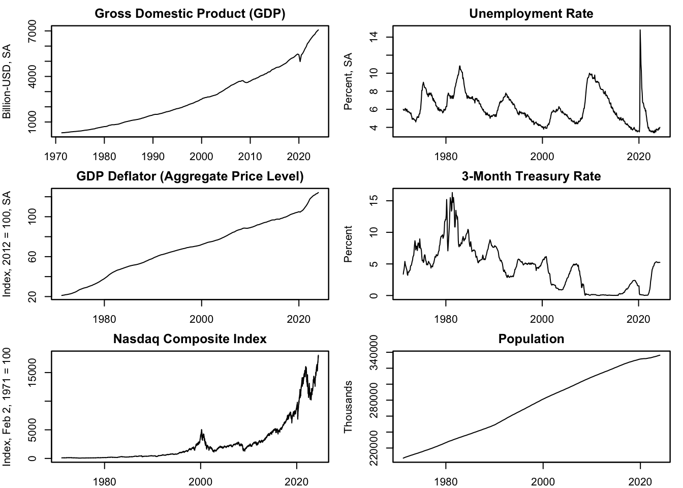
Figure 13.1: Example Data
Figure 13.1 displays the six economic indicators selected to demonstrate the various transformations covered in this chapter. The Gross Domestic Product (GDP) quantifies the U.S. total economic output in billions of U.S. dollars. This GDP series undergoes seasonal adjustment (SA), a transformation discussed in Chapter 13.7.3. The Unemployment Rate (UNRATE), depicted as a percentage, signifies the fraction of the U.S. workforce actively seeking employment but currently unemployed; this series is also seasonally adjusted (SA). The GDP deflator (GDPDEF) measures the aggregate price level in the U.S. and is conveyed as an index number standardized to the average of 2012 Q1 - Q4 equating to 100, which is also seasonally adjusted (SA). See Chapter @ref(index-vs.-absolute-data) for an overview on index measures. The 3-Month Treasury Bill Rate (TB3MS), measured as an annual percentage rate, represents the yield on investments in short-term U.S. government debt obligations. The NASDAQ Composite Index (NASDAQCOM) captures the performance of over 3,000 listed equities on the NASDAQ stock market, reflected through a market capitalization-weighted index value, where the index is normalized to 100 on February 2, 1971. Lastly, Population (B230RC0Q173SBEA) lists the number of people living in the United States, reported in thousands of people.
13.2 Growth
13.2.1 Definition
The growth rate or %-change is the relative increase or decrease in a variable from one time period to the next, typically expressed as a percentage: \[ \%\Delta x_t =\frac{x_t-x_{t-1}}{x_{t-1}} =100 \left( \frac{x_t-x_{t-1}}{x_{t-1}} \right) \% \] Here, \(t\) represents the current period, and \(t-1\) denotes the preceding period.
Consider the U.S. GDP growth rate in 2024 Q1 as an example. It’s calculated as follows: \[ \begin{aligned} \text{GDP Growth}_{2024 Q1} = &\ \frac{ \text{GDP}_{2024 Q1} - \text{GDP}_{2023 Q4} }{ \text{GDP}_{2023 Q4} } \\ = &\ \frac{ 7067 \ \text{Billion USD} - 6989 \ \text{Billion USD} }{ 6989 \ \text{Billion USD} } \\ = &\ 1.12 \% \end{aligned} \] This illustrates that growth rates aren’t influenced by the units of measurement: billion USD, a point we’ll delve into later in Chapter 13.2.3.
13.2.2 Log Approximation
Growth rates can be approximated using the difference in the natural logarithm of the series: \[ \frac{x_t-x_{t-1}}{x_{t-1}} \approx \ln(x_{t})- \ln(x_{t-1}) = 100 \Big( \ln(x_{t})- \ln(x_{t-1}) \Big) \% \] This approximation is accurate as long as growth rates remain small. However, the approximation loses precision when growth rates exceed 20% or -20%.
To illustrate this, let’s plot the growth rate of GDP alongside the difference in its log values in percent:
# Compute GDP growth in percent and its log approximation
GDP_growth <- 100 * (GDP - lag.xts(GDP)) / lag.xts(GDP)
GDP_logdiff <- 100 * (log(GDP) - lag.xts(log(GDP)))

# Plot the two series
plot.zoo(x = merge(GDP_growth, GDP_logdiff), plot.type = "single",
         col = c(5, 1), lwd = c(5, 1.5), lty = c(1, 2),
         xlab = "", ylab = "%")
legend("topleft", legend = c("Real GDP Growth", "Log Difference"),
       col = c(5, 1), lwd = c(5, 1.5), lty = c(1, 2),
       horiz = TRUE, bty = 'n')
This code block computes two different forms of growth for the GDP time series and plots them together for comparison:
GDP_growth <- 100 * (GDP - lag.xts(GDP)) / lag.xts(GDP): This line of code computes the percentage growth of the GDP, which is the difference between the current and previous GDP values, divided by the previous GDP value. Thelag.xts(GDP)function generates a new series where each data point is shifted one time unit into the future, effectively getting the GDP value from the previous time period. This is then multiplied by 100 to convert it into a percentage. The result is stored in the variableGDP_growth.GDP_logdiff <- 100 * (log(GDP) - lag.xts(log(GDP))): This line of code calculates the log difference of GDP. It first applies a natural logarithm transformation to the GDP (log(GDP)) and then computes the difference with the lagged log-transformed GDP (lag.xts(log(GDP))). This log difference approximates the growth rate when the changes in GDP are relatively small. The result is then multiplied by 100 to convert it into a percentage. The result is stored in the variableGDP_logdiff.plot.zoo(): This function is used to create a time series plot. Thex = merge(GDP_growth, GDP_logdiff)argument tells the function to plot the two series together. Theplot.type = "single"argument makes both series appear on a single plot. Thecol = c(5, 1)argument sets the color of the two lines (5 for magenta and 1 for black),lwd = c(5, 1.5)sets the line width, andlty = c(1, 2)sets the line type (1 for solid, 2 for dashed). Thexlabandylabarguments are used to label the x and y-axes, respectively.legend(): This function adds a legend to the plot. The"topleft"argument places the legend at the top left corner of the plot. Thelegend = c("Real GDP Growth", "Log Difference")argument specifies the names of the series. The remaining arguments (col,lwd,lty,horiz, andbty) set the color, line width, line type, horizontal layout, and box type of the legend, respectively.
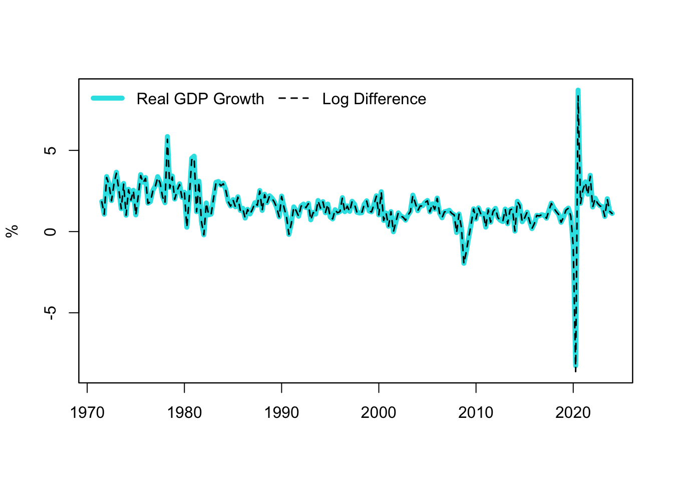
Figure 13.2: GDP Growth and Log Approximation
Figure 13.2 generated from this code block shows the real GDP growth and the log difference of GDP over time, providing a visual comparison of these two methods of computing growth. As quarterly GDP growth in the U.S. has remained relatively stable, the log approximation aligns almost perfectly with the actual growth rate.
13.2.3 Relativity
Growth rates eliminate the units of measurement, making it easier to compare variables of different scales or units. When we examine economic performance using GDP growth, for example, we don’t need to standardize each country’s GDP into a single currency. This is because growth rates focus on the proportional changes, not the absolute values. Thus, regardless of whether the GDP is measured in US dollars, Euros, or any other currency, the GDP growth rate can be directly compared across countries.
Additionally, growth rates provide a relative measure, measuring the change with respect to an initial level. This feature makes it an effective tool for comparing economies of different sizes. For instance, a small economy might have a lower absolute GDP than a larger one, but it could be growing at a significantly faster pace. Therefore, using growth rates allows us to observe this relative performance more clearly, irrespective of the initial level of GDP.
13.2.4 Return and Inflation
Note that when the concept of “growth rate” is applied to prices, it’s often referred to as “return” or “inflation.” The choice of terminology depends on the context. In the financial world, when we discuss the percentage increase in the price of a financial asset such as a stock or a bond over time, we usually refer to the growth rate as a return. This usage reflects the perspective of investors who buy assets with the expectation that their value will increase over time, thus yielding a positive return on their investment.
The term inflation refers to the overall increase in prices in an economy. When economists calculate the rate at which the general level of prices for goods and services is rising, and subsequently, the purchasing power of currency is falling, they refer to this as the inflation rate.
Despite this terminology, both return and inflation fundamentally represent a form of growth rate, but applied in different contexts.
Now, let’s compute and plot the growth rates of the prices from the example data using their log approximation:
# Compute growth rates of prices using log approximation
Inflation <- 100 * (log(GDPDEF) - lag.xts(log(GDPDEF)))
Nasdaq_return <- 100 * (log(NASDAQCOM) - lag.xts(log(NASDAQCOM)))

# Put all plots into one
par(mfrow = c(rows = 2, columns = 1),
    mar = c(b = 2, l = 4, t = 2, r = 1))

# Plot growth rates of prices
plot.zoo(x = Inflation, main = "U.S. Inflation",
         xlab = "", ylab = "%")
plot.zoo(x = Nasdaq_return, main = "Nasdaq Stock Market Return",
         xlab = "", ylab = "%")
The functions used in the above code chunk have been explained earlier in Chapters 13.2.1 and 13.2.2.
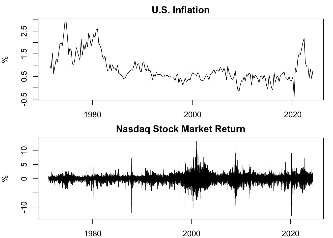
Figure 13.3: Growth Rate of Prices
Figure 13.3 is the output of this code block. It displays the growth rate of two price indices: the GDP deflator and the Nasdaq composite index. Since the GDP deflator measures overall price changes in an economy, its growth rate is referred to as inflation. Since the Nasdaq indices represent assets that can be invested in, the growth rates of these prices are termed as returns.
13.2.5 Applicability
Not all data are suitable for transformation into growth rates. Growth rates are most meaningful for ratio scale variables, which measure quantities that have a clear, absolute zero and uniform intervals between numbers (see Chapter 12.3 for an overview on nominal, ordinal, interval, and ratio scale variables). In such cases, growth rates offer insights about the pace of a variable’s change over time. This is why we commonly see growth rates for economic output (GDP), prices, population, etc., quantities for which it makes sense to ask, “By what percentage did this quantity change?”
Conversely, some variables, often percentages or rates themselves, are not meaningful to describe in terms of growth rates. Their movements over time are better described in terms of differentiation. This includes variables like unemployment rates, interest rates, or inflation rates.
Specifically, if variables exhibit one or more of the following characteristics, computing growth rates may lead to more confusion than insight:
- They are expressed as a ratio or percentage.
- They don’t have a meaningful absolute zero.
- The difference between two values isn’t meaningful.
- The ratio of two values is usually not meaningful or not interpreted.
This is a general guideline, and exceptions certainly exist, particularly when delving into specialized domains or specific use cases.
Since the U.S. unemployment rate and the 3-month Treasury bill (T-bill) rate from the example data are expressed in percentages, their growth rates are not calculated here. However, we will compute their first differences in Chapter 13.3. Interestingly, the 3-month T-bill rate is, in fact, already a growth rate: the values in the time series represent the (annualized) returns of holding a 3-month T-bill until maturity at different dates.
13.3 Differentiation
13.3.1 Definition
The first difference signifies the variation in a variable from one time point to the subsequent one: \[ \Delta x_t =x_t-x_{t-1} \] In this equation, \(t\) symbolizes the current period, while \(t-1\) signifies the preceding one.
Take the first difference of U.S. GDP in 2024 Q1 for instance. It is computed as follows: \[ \begin{aligned} \Delta \text{GDP}_{2024 Q1} = &\ \text{GDP}_{2024 Q1} - \text{GDP}_{2023 Q4} \\ = &\ 7067 \ \text{Billion USD} - 6989 \ \text{Billion USD} \\ = &\ 78.04 \ \text{Billion USD} \end{aligned} \] This shows that in contrast with growth rates, differentiation does not remove the units of measurement, with the first difference still presented in billion USD. This could pose some challenges when the underlying unit is a percentage, as outlined in Chapter 13.3.2.
The second difference is the variation of the first difference: \[ \Delta^2 x_t =\Delta x_t-\Delta x_{t-1} \] and the \(k\)th difference is the difference of the \((k-1)\)th difference: \[ \Delta^k x_t =\Delta^{k-1} x_t-\Delta^{k-1} x_{t-1} \]
Differentiation beyond the second difference is not commonly observed in Economics and Finance. Differentiation is frequently employed to eliminate trends in data to concentrate on business cycles.
13.3.2 Percentage Points (pp)
As noted, the units of measurements do not disappear when differentiating. This could create confusion when the underlying unit of measurement is a percentage, for example, when obtaining the first difference of an unemployment rate. This confusion occurs because if the unemployment rate increases by 5%, it implies that the growth is 5%, rather than the difference being 5%. That’s why the term percentage points was devised, to avert this confusion. Adding “points” to “percentage” clarifies that it is not 5% growth but rather the first difference is 5%.
Formally, a percent change (%-change) is a relative measure, demonstrating the change in one value relative to its initial value (see Chapter 13.2): \[ \% \Delta Y_t =100 \left( \frac{Y_t-Y_{t-1}}{Y_{t-1}} \right) \% =100 \left( \frac{5\%-4\%}{4\%} \right) \% =25\% \] while percentage point change (pp-change) is an absolute measure, reflecting the difference between two percentage values: \[ \Delta Y_t =Y_t-Y_{t-1} =5\%-4\%=1pp \] In this context, \(Y_t\) is a measure represented in percentages, like the unemployment rate, inflation, GDP growth, stock return, or interest rate. The example illustrates that moving from 4% to 5% is a 25% increase, but only a 1pp increase; therefore, confusing these two units of measurements can cause significant errors.
To illustrate, let’s calculate both the %-change and pp-change of the unemployment rate from the example-data, and compare the two measures. Note, however, that as per Chapter 13.2, it is unusual to compute growth rates (%-change) of measures expressed in percent; hence, when writing about %-change of unemployment, the reader will be confused, and likely believe you mixed up %-change with pp-change; thus, I do not recommend actually calculating the %-change of the unemployment rate in practice. This is purely for illustrative purposes:
# Compute %-change of unemployment rate
UNRATE_percent_pp <- 100 * (UNRATE - lag.xts(UNRATE)) / UNRATE
names(UNRATE_percent_pp) <- "percent"

# Compute pp-change of unemployment rate
UNRATE_percent_pp$pp <- UNRATE - lag.xts(UNRATE)

# Put all plots into one
par(mfrow = c(rows = 2, columns = 1),
    mar = c(b = 2, l = 4, t = 2, r = 1))

# Plot %-change and pp-change of unemployment rate
plot.zoo(x = UNRATE_percent_pp, plot.type = "single",
         xlab = "", ylab = "% vs. pp", main = "Change in Unemployment Rate",
         ylim = c(-22, 22), col = c(5, 1), lwd = c(1.5, 1))
legend(x = "topleft", legend = c("%-change", "pp-change"),
      col = c(5, 1), lwd = c(1.5, 1), horiz = TRUE)

# Zoom in using the ylim-input
plot.zoo(x = UNRATE_percent_pp,  plot.type = "single",
         xlab = "", ylab = "% vs. pp", main = "(Zoomed In)",
         ylim = c(-2.2, 2.2), col = c(5, 1), lwd = c(1.5, 1))
legend(x = "topleft", legend = c("%-change", "pp-change"),
      col = c(5, 1), lwd = c(1.5, 1), horiz = TRUE)
The functions used in the above code chunk have been explained earlier in Chapters 13.2.1 and 13.2.2. What we haven’t used before is the ylim input, here ylim = c(-22, 22), which defines the limits of the y-axis and allows to zoom in. Note that the xlim input does the same for limiting the x-axis.
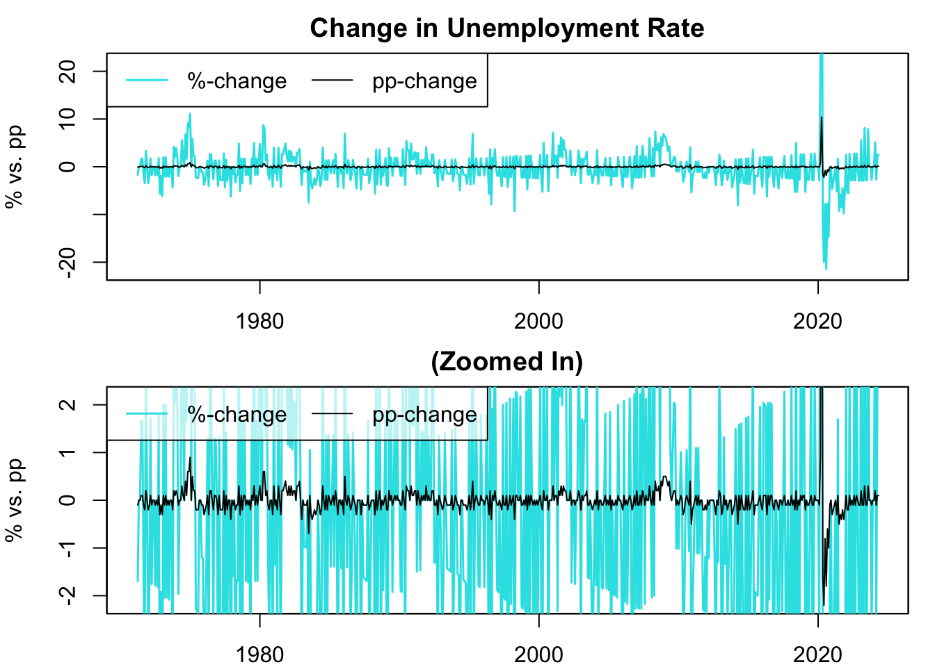
Figure 13.4: Percent vs. Percentage Point Change of Unemployment Rate
Figure 13.4 plots the %-change and pp-change of the unemployment rate. The variance of the %-change is significantly larger than that of the pp-change because the unemployment rates are one or two-digit numbers, so an increase results in a larger relative increase than an absolute increase. Note that if the underlying time series were three or higher digit numbers, it would be reversed: the variance of the pp-change would be larger than that of the %-change.
13.3.3 Basis Points (bp)
Changes in economic and financial data, particularly at a high frequency, often appear in small increments. For instance, monthly changes in interest rates often involve subtle shifts like 0.04pp or -0.24pp. For clarity and ease of reading, these changes are commonly expressed in basis points (bp) rather than percentage points (pp), with 1pp equivalent to 100bp.
To formalize, a basis point (bp) change is calculated by multiplying the difference between two percentage values by 100: \[ \Delta Y_t = 100 \left(Y_t-Y_{t-1}\right) =5\%-4\%=1pp=100bp \] In this formula, \(Y_t\) represents a measure in percentages, like stock returns or interest rates.
Now, let’s compute the basis point change for the 3-month Treasury bill rate and visualize it:
# Calculate basis point (bp) change in 3-month T-bill rate
dTB3MS_bp <- 100 * (TB3MS - lag.xts(TB3MS))

# Plot the time series
plot.zoo(x = dTB3MS_bp["1990/"], plot.type = "single",
         xlab = "", ylab = "Basis Point (bp)", ylim = c(-150, 150),
         main = "Change in 3-Month Treasury Bill Rate")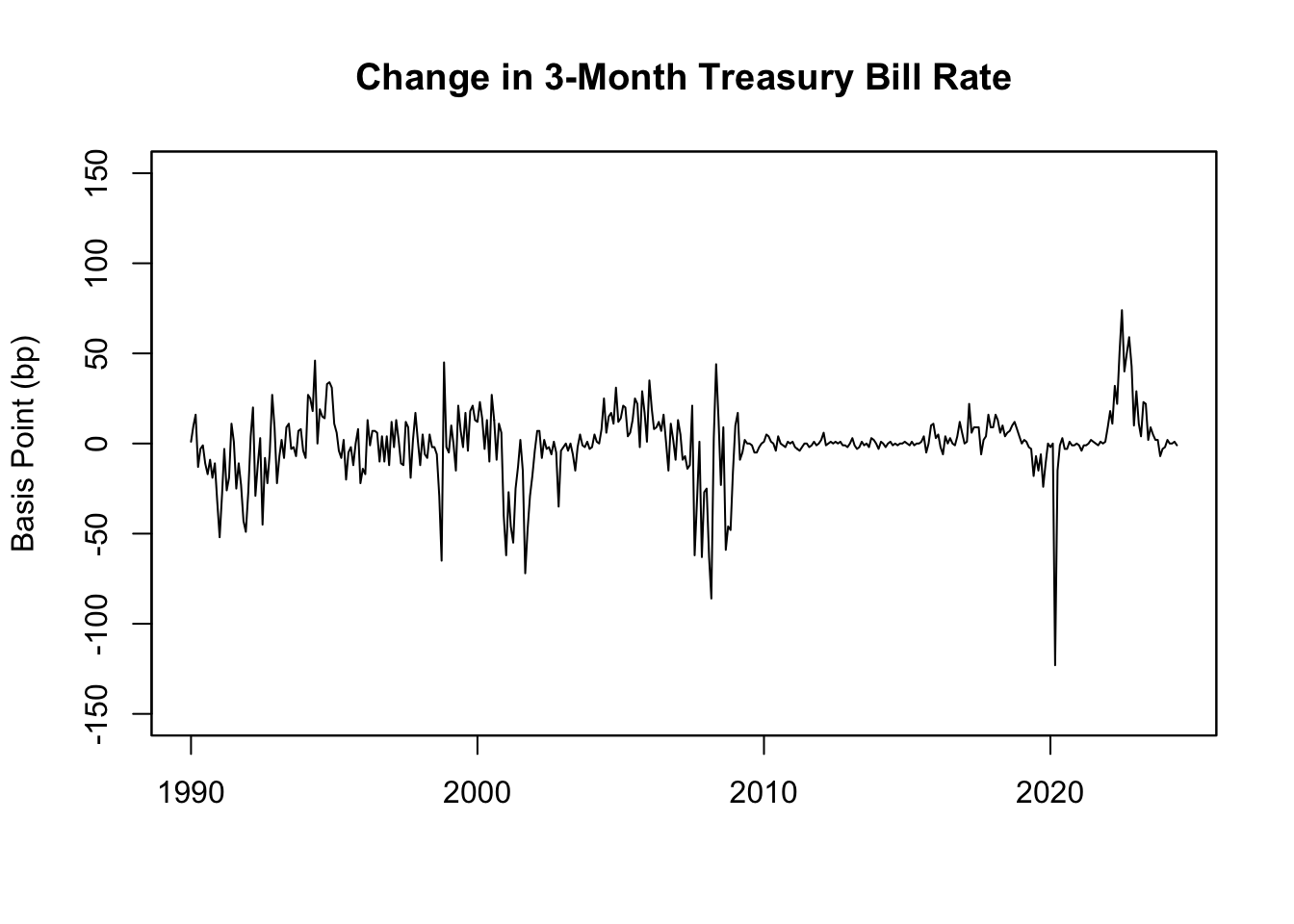
Figure 13.5: Basis Point Changes in 3-Month Treasury Bill Rate
As shown in Figure 13.5, the bp-change of the 3-month T-bill rate demonstrates that U.S. interest rates typically exhibit gradual increases during economic boom periods and sharp declines during recessions, leading to larger negative changes.
13.4 Natural Logarithm
13.4.1 Definition
The natural logarithm, often written as \(\ln(x)\), \(\log_e(x)\), or \(\log(x)\), is the inverse operation to exponentiation with base \(e\), where \(e\) is the natural base or Euler’s number and approximately equal to \(2.7182818\). In other words, if \(y = e^x\), then \(x = \ln(y)\), which defines the natural logarithm.
This relationship can be expressed as: \[ \ln(e^x) = x \] and \[ e^{\ln(x)} = x \] These equations hold true for any positive number \(x\). The natural logarithm function \(\ln(x)\) is the power to which \(e\) must be raised to get \(x\).
Here’s an example of how you can calculate the natural logarithm in R:
## [1] 1And here’s how you could calculate the natural logarithm of an array of numbers:
# Create an array of numbers
numbers <- c(1, 2, 3, 4, 5)

# Calculate the natural logarithm of the array of numbers
log(numbers)
## [1] 0.0000000 0.6931472 1.0986123 1.3862944 1.6094379Now, consider trying to find the natural logarithm of zero, \(\ln(0)\). Is there a power to which you can raise \(e\) to get zero? The answer is no. Even if we raise \(e\) to a very large negative power, the result approaches zero, but never quite gets there. This is why \(\ln(0)\) is considered undefined or negative infinity if such number is defined:
## [1] -InfNext, consider trying to find the natural logarithm of a negative number. The constant \(e\) raised to any real number always results in a positive value. Therefore, there’s no real number that you can raise \(e\) to that would result in a negative number. Because of this, the natural logarithm of a negative number is considered undefined when dealing with real numbers:
## Warning in log(-5): NaNs produced## [1] NaNThe natural logarithm has many useful properties. For example, one such property is that the natural logarithm of a product equals the sum of the natural logarithms of each individual number: \[ \ln(ab) = \ln(a) + \ln(b) \]
## [1] 2.484907
## [1] 2.484907
Another property is that the natural logarithm of a number raised to a power is the product of the power and the natural logarithm of the number: \[ \ln(a^n) = n \ln(a) \]
## [1] 4.394449
## [1] 4.394449
These unique properties of natural logarithm make it particularly valuable in simplifying mathematical expressions and solving exponential and logarithmic equations.
13.4.2 Motivation
Logarithmic measures aid in making the visualization and interpretation of exponentially growing data simpler. For instance, stock prices, which often exhibit exponential growth, can make long-term historical data appear flat when graphed. Using a logarithmic transformation can convert this exponential growth into linear growth, thus making patterns and shifts over time more evident. Logarithmic measures are also easy to interpret as changes in the log approximate the growth rate (as discussed in Chapter 13.2.2).
To illustrate this, let’s graph the Nasdaq composite index from the example-data and its natural log:
# Calculate natural logarithm of Nasdaq composite index
Nasdaq_log <- log(NASDAQCOM)

# Set up subplots
par(mfrow = c(rows = 2, columns = 1),
    mar = c(b = 2, l = 4, t = 2, r = 1))

# Plot original time series
plot.zoo(x = NASDAQCOM,
         xlab = "", ylab = "Index, Feb 2, 1971 = 100",
         main = "Nasdaq Composite Index")

# Plot natural log of time series
plot.zoo(x = Nasdaq_log,
         xlab = "", ylab = "Log",
         main = "Log of Nasdaq Composite Index")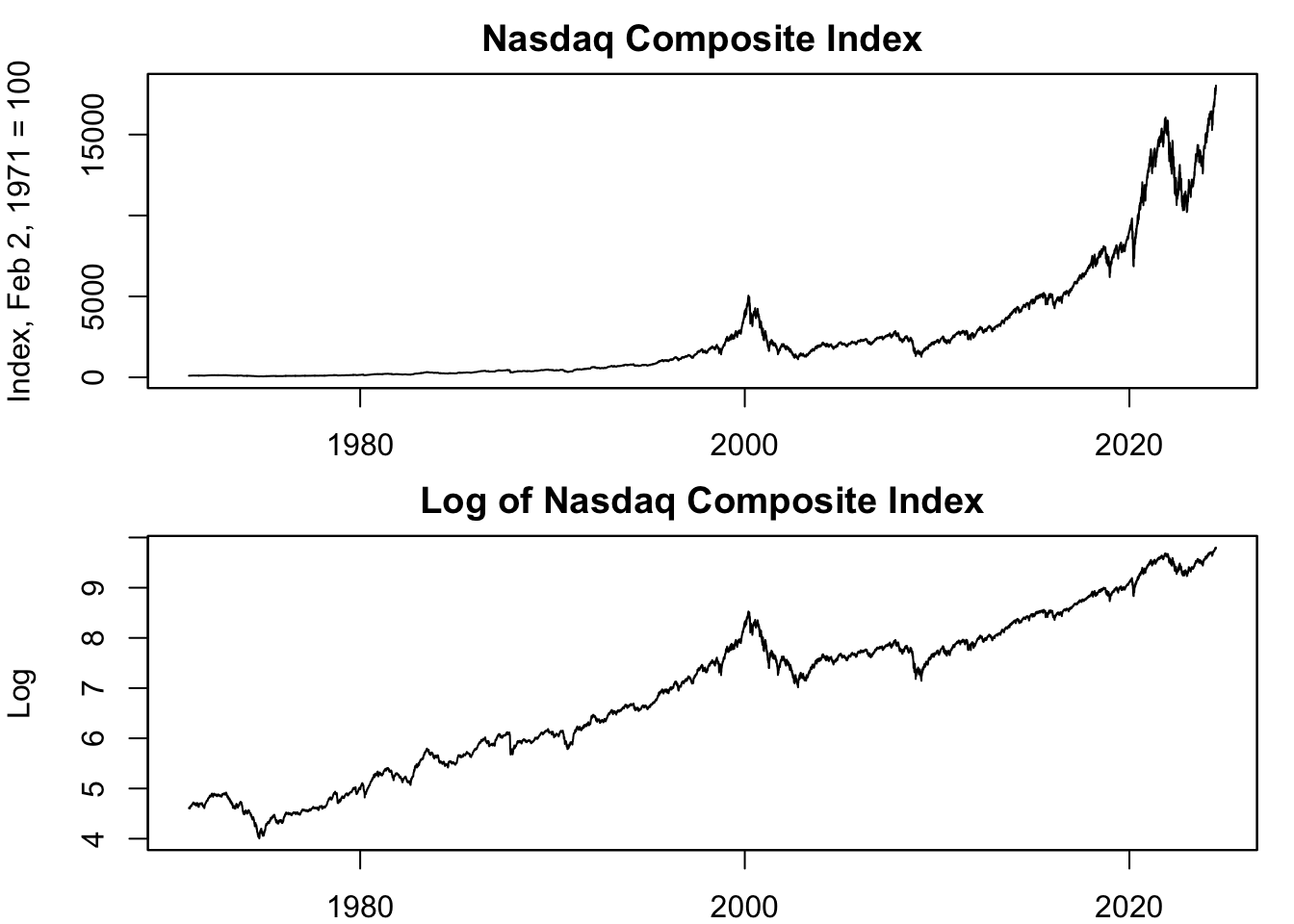
Figure 13.6: Log Transformation of Nasdaq Composite Index
Figure 13.6 shows that the Nasdaq stock market index appears stagnant in the early sample. However, the logarithmic transformation uncovers significant growth and contraction periods throughout the sample, highlighting the changes in the earlier years. This is because stock prices often demonstrate exponential growth, with value increasing proportional to the current value. Therefore, even substantial %-changes early in a stock’s history may appear small due to a lower starting price. In contrast, smaller %-changes later on appear large because they started from a higher price. This can distort how we view a stock’s past ups and downs.
The second panel of Figure 13.6 presents the natural logarithm of the Nasdaq stock market index. This transformation helps visualize the exponential growth in stock prices as a linear increase, with the slope of the line representing the growth rate. Crucially, changes in the log of the price correspond directly to percentage changes in the price. For instance, a 0.01 increase in the log price equates to a 1% rise in the original price (see Chapter 13.2.2). This characteristic enables a direct comparison of price changes over time, aiding in the interpretation of these shifts in terms of relative growth or contraction.
You might wonder why we plot the log of a series, which interprets change as growth rate, instead of directly plotting the growth rate. This is because the natural logarithm of a variable often offers more insight into long-term trends than the growth rate itself. To understand this better, use the fact that changes in the log approximate the growth rate. As a result, the log series embodies the cumulated growth rates – the sum of all growth rates from the beginning of the dataset to the present. When the growth rate fluctuates extensively, it can be tough to discern whether positive or negative growth rates predominate over time. However, when you plot the logarithm, these growth rates are cumulative, making it clear whether a variable is growing or not.
Let’s compare the growth rate and the natural logarithm of the Nasdaq composite index from the example-data to demonstrate this:
# Calculate growth rate of Nasdaq composite index
Nasdaq_return <- 100 * (log(NASDAQCOM) - lag.xts(log(NASDAQCOM)))

# Set up subplots
par(mfrow = c(rows = 2, columns = 1),
    mar = c(b = 2, l = 4, t = 2, r = 1))

# Plot growth rate
plot.zoo(x = Nasdaq_return,
         xlab = "", ylab = "%",
         main = "Nasdaq Stock Market Return (Growth Rate)")

# Plot natural log
plot.zoo(x = Nasdaq_log,
         xlab = "", ylab = "Log",
         main = "Log of Nasdaq Composite Index (Cumulated Growth Rate)")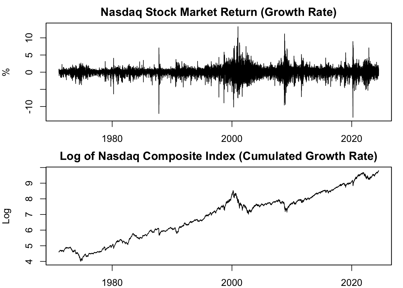
Figure 13.7: Growth vs. Log of Nasdaq Composite Index
The first panel of figure 13.7 shows the highly volatile stock market returns (growth rate), making it difficult to assess overall performance. The second panel, on the other hand, depicts the log transformation of the Nasdaq stock market index. This transformation accumulates the stock market returns from the first panel from the beginning to the current period on the x-axis. It clearly shows whether stock prices grow or contract over time, providing a more reliable perspective on the market’s performance.
13.4.3 Applicability
Not all data are suitable for transformation into natural logarithm. Essentially, if the concept of a growth rate is nonsensical or irrelevant for the data at hand, then it would also be inappropriate to compute its natural logarithm. This is because the natural logarithm essentially represents cumulative growth rates, and therefore presupposes that a concept of ‘growth’ is meaningful for the data in question. Specific cases where the application of the growth rate may or may not be appropriate are discussed in Chapter 13.2.5.
13.5 Ratio
13.5.1 Definition
A ratio is a mathematical expression that represents the relationship between two quantities or variables, represented as a fraction. It’s often used to provide insights into relative magnitudes or proportions between the two variables.
Ratio measures can be calculated as follows: \[ \text{Ratio Measure} = \frac{\text{Variable 1}}{\text{Variable 2}} \]
Ratio measures can provide useful insights into how the two variables relate to each other. For instance, a company’s debt-to-equity ratio compares its total debt to its total equity, offering a sense of the company’s financial leverage. A high debt-to-equity ratio might indicate a risky financial situation, whereas a lower ratio may suggest a more stable financial position.
In the financial sector, another common ratio measure is the price-to-earnings (P/E) ratio. This ratio compares a company’s stock price to its earnings per share, giving investors a sense of how much they’re paying for each dollar of earnings.
It’s important to clarify that the term “ratio” defined in this context is not to be confused with “ratio scale” variables defined in Chapter 12.3.4. The “ratio” in the current context refers to the mathematical comparison of two quantities, “a to b”. On the other hand, a “ratio scale” variable refers to a type of variable where the difference between any two values is meaningful and it has a true zero point. This means that zero indicates the absence of the quantity being measured, and ratios between numbers on the scale are meaningful. Therefore, despite sharing a common term, these two concepts have fundamental differences. However, calculating a ratio measure only makes sense if the underlying variables are indeed ratio scale variables.
13.5.2 Per Capita
Per capita measures are a specific type of ratio measure that calculate the average value of a particular variable per person within a given population. These measures are typically obtained by dividing a macroeconomic variable, such as Gross Domestic Product (GDP) or income, by the population size of a region: \[ \text{Per Capita Measure} = \frac{\text{Variable}}{\text{Population Size}} \]
Per capita measures play a significant role in economics and finance. One prominent example is GDP per capita, which calculates the average economic output per person in a country. This measure enables meaningful comparisons of the average standard of living and economic well-being across nations, regardless of population size. It provides insights into the relative well-being of individuals within different countries.
In the field of finance, per capita measures are also valuable. For instance, credit card debt per capita offers insights into the average debt burden carried by individuals in a specific region. By dividing the total credit card debt by the population, analysts can assess the average level of indebtedness and make comparisons across different areas. This measure helps in understanding the credit behavior and financial health of individuals within various regions.
To calculate GDP per capita in the U.S., we divide the GDP series (GDP) of the example-data by the population (B230RC0Q173SBEA) of the country:
For example, U.S. GDP per capita in 2024 Q1 is calculated as follows: \[ \begin{aligned} \text{GDP Per Capita}_{2024 Q1} = &\ \frac{ \text{GDP}_{2024 Q1} }{ \text{Population}_{2024 Q1} } \\ = &\ \frac{ 7,067 \ \text{Billion USD} }{ 336,308 \ \text{Thousands} } \\ = &\ \frac{ 7,067,293,500,000 \ \text{USD} }{ 336,308,000 } \\ = &\ 21,014.35 \ \text{USD} \end{aligned} \] This division yields the average economic output per person in USD. Therefore, in the U.S., the average income per person was 21,014.35 USD in 2024 Q1, taking into account all sources of income, including wages, dividends, and profits.
Next, let’s visualize GDP per capita:
# Plot GDP per capita
plot.zoo(x = GDP_per_capita,
         xlab = "Date", ylab = "USD",
         main = "GDP Per Capita in the United States")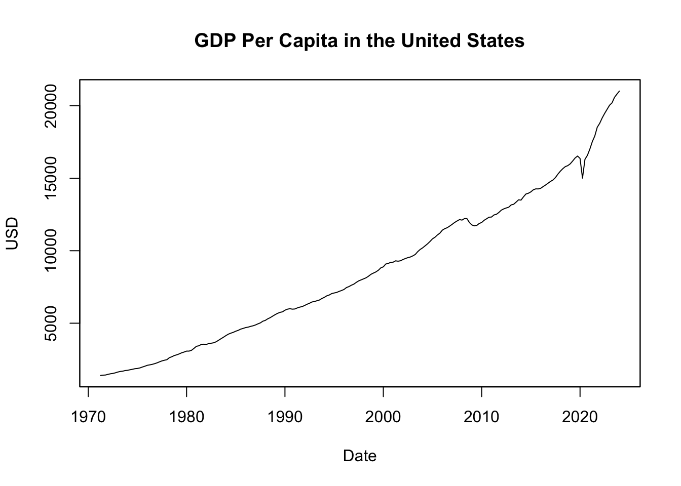
Figure 13.8: GDP Per Capita in the United States
Figure 13.8 illustrates GDP per capita in the United States, representing the average income per person in USD over time. The plot shows a consistent increase in average income, indicating economic growth. However, it’s important to note that prices have also steadily increased during this period. Therefore, to accurately evaluate changes in the standard of living, it becomes necessary to consider these price changes. In the next chapter, we will delve into the concept of real measures, which account for such changes and provide a more accurate representation of living standards.
13.5.3 Real vs. Nominal
Real measures are ratio measures that adjust for changes in prices by dividing the variable by the price index. In contrast, nominal measures are the counterparts of real measures, remaining unadjusted for inflation: \[ \text{Real Measure} = 100 \left(\frac{\text{Nominal Measure}}{\text{Price Index}} \right) \] In this equation, the ratio is multiplied by 100 due to the normalization of price indices at 100 during a specific period. For example, if the price index is normalized at 100 in 2012, then the real measure is interpreted as the nominal measure in terms of 2012 prices.
Real variables measure the physical quantity of goods and services by accounting for changes in the price level. They provide a more accurate representation of economic trends. Examples include real GDP, real income, and real wages. These measures eliminate the impact of price changes, enabling comparisons of economic performance over time or across regions.
On the other hand, nominal measures, which are not adjusted for price changes, represent the monetary value of goods and services at current prices. Hence, unlike real values that adjust for inflation, nominal values do not.
It’s essential to distinguish between the “nominal measure” discussed here and the “nominal scale” variables outlined in Chapter 12.3.1. In this context, “nominal measure” refers to values not adjusted for price changes, whereas “nominal scale” variables are a type of categorical data where different categories do not indicate any order or hierarchy.
To calculate real GDP in the U.S., the GDP series (GDP) of the example-data is divided by a price index - specifically, the U.S. GDP deflator index (GDPDEF):
The resulting data is returned as an xts object. You can compare the real GDP measure RGDP with the nominal measure GDP, which is the GDP measure unadjusted for price changes:
# Merge nominal and real GDP
GDP_nominal_real <- merge(GDP, RGDP)

# Print merged data
tail(GDP_nominal_real)
## GDP GDP.1
## 2022 Q4 6602.101 5497.490
## 2023 Q1 6703.400 5528.076
## 2023 Q2 6765.753 5556.356
## 2023 Q3 6902.532 5622.694
## 2023 Q4 6989.249 5669.825
## 2024 Q1 7067.293 5689.703Visualize the two GDP series using the plot.zoo() function:
# Plot nominal vs. real GDP
plot.zoo(x = GDP_nominal_real, plot.type = "single",
         col = c(1, 2), lwd = 2, lty = c(1, 2),
         main = "Nominal vs. Real GDP in the United States",
         xlab = "Date", ylab = "Billions of USD")
legend(x = "topleft", legend = c("Nominal GDP", "Real GDP"),
       col = c(1, 2), lwd = 2, lty = c(1, 2))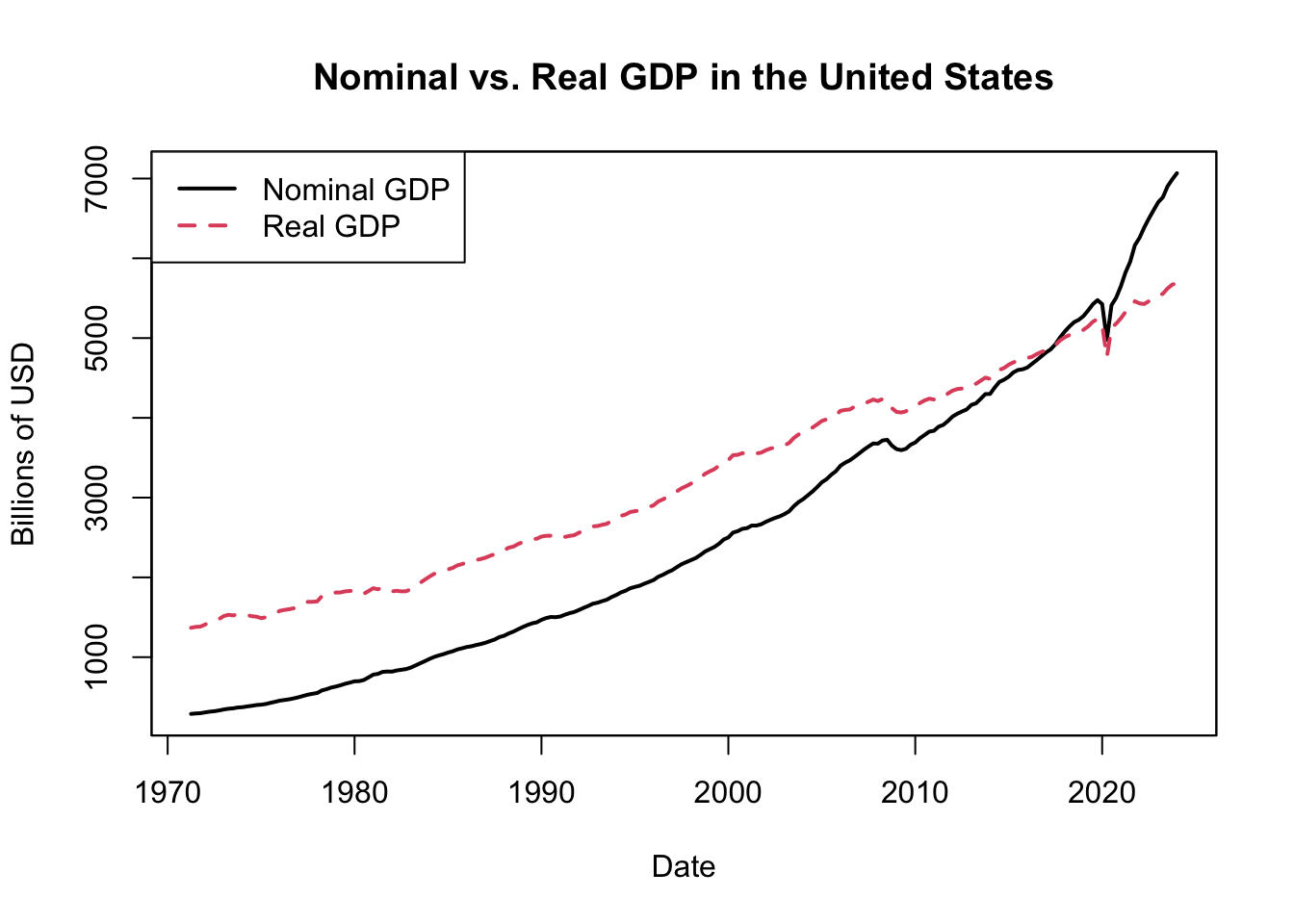
Figure 13.9: Nominal vs. Real GDP in the United States
Figure 13.9 displayes U.S. GDP for each quarter since 1947, contrasting the nominal and real measures. In 2012, nominal and real GDP align because the real GDP is defined in terms of 2012 prices, and the nominal GDP (measured in current prices) is also based on 2012 prices for that year. The fact that nominal GDP has grown more than real GDP reflects the influence of inflation, which causes nominal GDP to inflate while real GDP provides a more accurate measure of economic growth.
In summary, nominal GDP quantifies the total value of goods and services produced within an economy, calculated using the market prices at the time of measurement. As such, if prices increase due to inflation, nominal GDP might rise even without an actual increase in goods and services produced. Conversely, real GDP adjusts for inflation and represents economic output in terms of “constant prices” from a chosen base year - like calculating today’s economic output as if prices had remained at their 2012 levels. This inflation-adjusted measure enables more accurate comparisons of economic growth over different periods.
13.5.4 Growth of Ratios
The growth rate of a ratio can be calculated based on the growth rate of the variables that form it.
Define \(x_t = y_t/p_t\) as the ratio of interest (e.g., real GDP), \(y_t\) as the numerator (e.g., nominal GDP), and \(p_t\) as the denominator (e.g., the price level). The growth rate of the ratio can then be formulated as follows:
\[ \begin{aligned} \%\Delta x_{t} = &\ \frac{x_{t} -x_{t-1}}{x_{t-1}} =\frac{\frac{y_{t}}{p_{t}} -\frac{y_{t-1}}{p_{t-1}}}{\frac{y_{t-1}}{p_{t-1}}} =\frac{p_{t-1}}{p_{t}}\frac{y_{t}}{y_{t-1}} -1=\frac{1+\%\Delta y_{t}}{1+\%\Delta p_{t}} -1 \end{aligned} \]
This formula links the growth rate of the ratio measure \(\%\Delta x_t\) with the growth rates of the constituent variables \(\%\Delta y_t\) and \(\%\Delta p_t\).
Consider the case of real versus nominal growth, yielding the following equation:
\[ \begin{aligned} 1+\text{Real Growth}_{t} = &\ \frac{1+\text{Nominal Growth}_{t}}{1+\text{Inflation}_{t}} \end{aligned} \]
Another approach to approximate the growth rate of a ratio is through the use of logarithms:
\[ \begin{aligned} \%\Delta x_{t} \approx &\ \ln( x_{t}) -\ln( x_{t-1})\\ = &\ \ln\left(\frac{y_{t}}{p_{t}}\right) -\ln\left(\frac{y_{t-1}}{p_{t-1}}\right)\\ = &\ \Bigl(\ln( y_{t}) -\ln( y_{t-1})\Bigr) -\Bigl(\ln( p_{t}) -\ln( p_{t-1})\Bigr)\\ = &\ \%\Delta y_{t} -\%\Delta p_{t} \end{aligned} \]
The growth rate of the ratio measure is approximately the difference between the growth rates of the two underlying variables. In terms of real growth, this yields the following approximation:
\[ \begin{aligned} \text{Real Growth}_{t} \approx &\ \text{Nominal Growth}_{t} -\text{Inflation}_{t} \end{aligned} \]
To illustrate, consider the interest rate as a nominal growth variable. The interest rate is a growth rate when it serves as a discount rate or yield to maturity, as illustrated by the 3-month Treasury bill data from the example-data section, which captures the total return on a security over a year. However, if the interest rate is understood as a coupon rate that doesn’t account for capital gain, then the interest rate is not a growth rate. The above formula can then be used to calculate the (ex-post) real interest rate, representing the return on the security in real terms: \[ r_t \approx i_t - \pi_t \] Where \(r_t\) is the real interest rate, \(i_t\) is the (nominal) interest rate, and \(\pi_t\) is the inflation rate. The real interest rate is essentially the quantity of goods and services one could purchase in a year by holding this security for that duration.
Applying this to data:
# Compute ex post real interest rates
Inflation_annual_rate <- 4 * Inflation
EXPOSTREAL <- TB3MS - Inflation_annual_rate

# Plot ex post real interest rate
plot.zoo(x = na.omit(merge(TB3MS, Inflation_annual_rate, EXPOSTREAL)),
         plot.type = "single", ylim = c(-16, 16),
         lwd = c(4, 2, 1.5), lty = c(1, 3, 1), col = c(5, 2, 1),
         ylab = "", xlab = "",
         main = "Real 3-Month Treasury Bill Rate")
legend(x = "bottomleft",
       legend = c("Nominal Rate", "Inflation", "Real Rate"),
       lwd = c(4, 2, 1.5), lty = c(1, 3, 1), col = c(5, 2, 1),
       bty = 'n', horiz = TRUE)
abline(h = 0, lty = 2)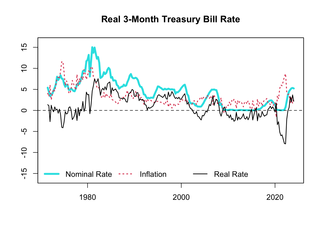
Figure 13.10: Real 3-Month Treasury Bill Rate
Figure 13.10 shows that real and nominal rates typically move in tandem, but not always. For example, in the 1970s, even though the nominal rates in the U.S. were high, the real rates were surprisingly low, and sometimes even negative. If you just looked at the high nominal rates, you might think it was tough to get credit because it was costly to borrow. However, the negative real rates tell us that this was not actually the case.
13.6 Gap
A gap is a term that refers to the difference between two variables. You can calculate a gap measure as follows: \[ \text{Gap Measure} = \text{Variable 1} - \text{Variable 2} \]
This gap measure might be referred to by different names, depending on the context. For example, in Finance, the term spread is used to indicate the gap between two interest rates. In the field of Economics, the term disparity is often used to describe the gap between the highest and lowest income levels within a population or group, while the gap between revenues and expenditures is known as net revenue.
13.7 Filtering
Filtering techniques play a vital role in the fields of economics and finance by helping to extract meaningful insights from noisy data. They are primarily used to isolate certain components of time-series data such as trends, cycles, or seasonal patterns. This chapter will introduce and delve into the concepts of filtering specific frequencies, detrending, and seasonal adjustment.
13.7.1 Frequency Filtering
In some instances, analysts are interested in isolating components of a time series that oscillate at specific frequencies. For example, business cycle analysis often focuses on fluctuations that recur every 2 to 8 years. To isolate these components, one can apply filters that attenuate (reduce the amplitude of) frequencies outside this range.
A well-known filter in economics is the band-pass filter, which only allows frequencies within a certain band to pass through. The Baxter-King filter, for instance, is a widely used band-pass filter in economics. Another popular approach is the wavelet transform, which can provide a time-varying view of different frequencies.
13.7.2 Detrending
Detrending is another important tool for analyzing time series data. In many economic series, there is often a long-term trend or direction in which the series is headed, such as the general upward trend of GDP or stock market indices. Detrending is the process of removing this underlying trend to study the cyclical and irregular components of the series.
Several methods exist for detrending data, from simple approaches such as subtracting the linear trend estimated by least squares, to more sophisticated methods like the Hodrick-Prescott (HP) filter, which estimates and removes a smooth trend component.
13.7.3 Seasonal Adjustment
In many economic time series, patterns tend to repeat at regular intervals. This repetition is referred to as seasonality. Examples include increased retail sales during the holiday season, or fluctuations in employment rates due to seasonal industries. Seasonal adjustment is the process of removing these recurring patterns to better understand the underlying trend and cyclical behavior of the series.
Methods for seasonal adjustment include moving-average methods, like the Census Bureau’s X-13ARIMA-SEATS, and model-based methods such as the popular STL (Seasonal and Trend decomposition using Loess) procedure. By implementing these techniques, researchers and policymakers can make more accurate comparisons over time and across different series, free from the distortion of seasonal effects.
For instance, consider seasonally adjusted (SA) GDP. It is a modified GDP measure that eliminates seasonal variation effects like holidays, weather patterns, or specific events. These adjustments allow economists to focus on analyzing underlying economic trends and business cycles. For example, in a seasonally adjusted GDP series, a significant increase in output from Q3 to Q4 can be attributed to actual economic growth rather than the higher consumption typically associated with holiday seasons.
Seasonally adjusted GDP data can be obtained from various sources, including government statistical agencies or international organizations. In the United States, the Bureau of Economic Analysis (BEA) provides seasonally adjusted GDP data, which can be accessed through the BEA website or economic data platforms like FRED. In R, there are packages available that perform such seasonal adjustment. The stats package offers functions such as decompose() and stl() for seasonal decomposition and filtering, while the seasonal package provides tools for estimating and removing seasonal components from time series data. These packages enable users to perform seasonal adjustment by analyzing the time series patterns of the same series or incorporating information from related series, such as export or import data. However, it is recommended to first check for pre-existing seasonally adjusted data available from the BEA or other reliable sources before attempting to create your own adjustments, as they may have access to more advanced tools and methodologies.
In the example data, the GDP series (GDP) is already seasonally adjusted, the common default option, as most economists focus more on business cycles than seasonal cycles. To access non-seasonally adjusted U.S. GDP data, visit FRED and search “U.S. GDP”. The first suggestion would be “Gross Domestic Product” subtitled “Billions of Dollars, Quarterly, Seasonally Adjusted Annual Rate”. Although this is the correct variable, we require the original, not seasonally adjusted (NSA) GDP series. To retrieve this, click on “6 other formats”, and select “Quarterly, Millions of Dollars, Not Seasonally Adjusted”. The resulting graph will be titled “Gross Domestic Product (NA000334Q)”. To download the data, use the getSymbols() function with Symbols parameter as "NA000334Q" and the src (source) parameter as "FRED":
# Download GDP: Quarterly, Millions of Dollars, Not Seasonally Adjusted
getSymbols("NA000334Q", src = "FRED")
## [1] "NA000334Q"After rescaling the non-seasonally adjusted GDP to billions, we can compare the seasonally adjusted (SA) GDP measure GDP with the non-seasonally adjusted (NSA) measure NA000334Q:
# Rescale the not seasonally adjusted GDP to billions
GDP_nsa <- NA000334Q / 1000

# Merge seasonally adjusted and not seasonally adjusted GDP
GDP_sa_nsa <- merge(GDP, GDP_nsa)

# Print merged data
tail(GDP_sa_nsa)
## GDP NA000334Q
## 2022 Q4 6602.101 6701.519
## 2023 Q1 6703.400 6546.655
## 2023 Q2 6765.753 6802.375
## 2023 Q3 6902.532 6927.581
## 2023 Q4 6989.249 7081.776
## 2024 Q1 7067.293 6925.169Visualization of both GDP series:
# Plot U.S. seasonally adjusted vs. not seasonally adjusted GDP
plot.zoo(x = GDP_sa_nsa["1970/"], plot.type = "single",
         col = c(5, 1), lwd = c(4, 1),
         main = "SA vs. NSA U.S. GDP",
         xlab = "Date", ylab = "Billions of USD")
legend(x = "topleft", legend = c("Seasonally Adjusted (SA)", "Not Seasonally Adjusted (NSA)"),
       col = c(5, 1), lwd = c(4, 1))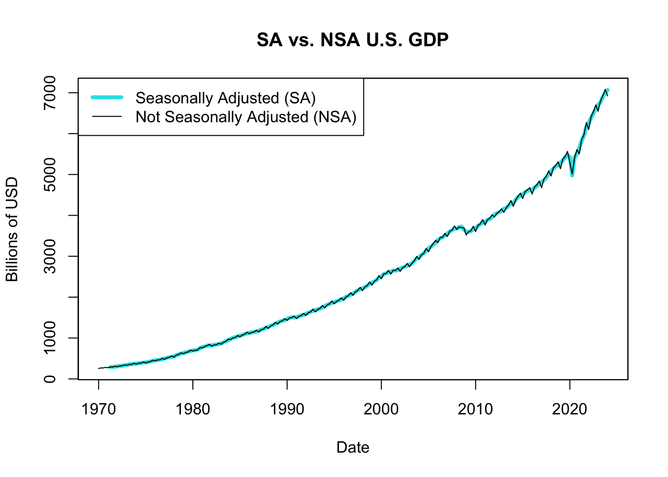
Figure 13.11: SA vs. NSA U.S. GDP
Figure 13.11 displays U.S. GDP for each quarter since 1970, comparing the seasonally adjusted with the not seasonally adjusted measure. The seasonally adjusted GDP series removes the effects of seasonal variations, allowing for a clearer analysis of underlying trends and business cycles. On the other hand, the not seasonally adjusted GDP series reflects the raw, unadjusted data and includes the impact of seasonal variations. This series provides a more detailed view of the quarterly fluctuations in economic activity, which can be influenced by factors like holiday spending or seasonal industries.