Chapter 11 Financial Market Indicators
This chapter provides a comprehensive overview of key financial market indicators that offer insights into the performance and stability of financial markets. It covers the financial theories behind these indicators, their relevance, and the methodologies used to measure them. By examining interest rates, stock market indices, commodity prices, yield curves, and credit spreads, readers will understand how these indicators are determined and interpreted, and how they can be used to forecast future economic conditions.
11.1 Interest Rates
This chapter demonstrates how to import Treasury yield curve rates data from a CSV file. Treasury yield curve data represents interest rates on U.S. government loans for different maturities. By comparing rates at various maturities, such as 1-month, 1-year, 5-year, 10-year, and 30-year, we gain insights into market expectations. An upward sloping yield curve, where interest rates for longer-term loans (30-year) are significantly higher than those for short-term loans (1-month), often indicates economic growth. Conversely, a downward sloping or flat curve may suggest the possibility of a recession. This data is crucial in making informed decisions regarding borrowing, lending, and understanding the broader economic landscape.
To obtain the yield curve data, follow these steps:
- Visit the U.S. Treasury’s data center by clicking here.
- Click on “Data” in the menu bar, then select “Daily Treasury Par Yield Curve Rates.”
- On the data page, select “Download CSV” to obtain the yield curve data for the current year.
- To access all the yield curve data since 1990, choose “All” under the “Select Time Period” option, and click “Apply.” Please note that when selecting all periods, the “Download CSV” button may not be available.
- If the “Download CSV” button is not available, click on the link called Download interest rates data archive. Then, select yield-curve-rates-1990-2021.csv to download the daily yield curve data from 1990-2021.
- To add the more recent yield curve data since 2022, go back to the previous page, choose the desired years (e.g., “2022”, “2023”) under the “Select Time Period,” and click “Apply.”
- Manually copy the additional rows of yield curve data and paste them into the yield-curve-rates-1990-2021.csv file.
- Save the file as “yieldcurve.csv” in a location of your choice, ensuring that it is saved in a familiar folder for easy access.
Following these steps will allow you to obtain the yield curve data, including both historical and recent data, in a single CSV file named “yieldcurve.csv.”
11.1.1 Import CSV File
CSV (Comma Separated Values) is a common file format used to store tabular data. As the name suggests, the values in each row of a CSV file are separated by commas. Here’s an example of how data is stored in a CSV file:
- Male,8,100,3
- Female,9,20,3
To import the ‘yieldcurve.csv’ CSV file in R, install and load the readr package. Run install.packages("readr") in the console and include the package at the top of your R script. You can then use the read_csv() or read_delim() function to import the yield curve data:
# Load the package
library("readr")

# Import CSV file
yc <- read_csv(file = "files/yieldcurve.csv", col_names = TRUE)

# Import CSV file using the read_delim() function
yc <- read_delim(file = "files/yieldcurve.csv", col_names = TRUE, delim = ",")
In the code snippets above, the read_csv() and read_delim() functions from the readr package are used to import a CSV file named “yieldcurve.csv”. The col_names = TRUE argument indicates that the first row of the CSV file contains column names. The delim = "," argument specifies that the columns are separated by commas, which is the standard delimiter for CSV (Comma Separated Values) files. Either one of the two functions can be used to read the CSV file and store the data in the variable yc for further analysis.
To inspect the first few rows of the data, print the yc object in the console. For an overview of the entire dataset, use the View() function, which provides an interface similar to viewing the CSV file in Microsoft Excel:
## # A tibble: 8,382 × 14
##    Date    `1 Mo` `2 Mo` `3 Mo` `4 Mo` `6 Mo` `1 Yr` `2 Yr` `3 Yr` `5 Yr` `7 Yr`
##    <chr>   <chr>  <chr>   <dbl> <chr>   <dbl>  <dbl>  <dbl>  <dbl>  <dbl>  <dbl>
##  1 01/02/… N/A    N/A      7.83 N/A      7.89   7.81   7.87   7.9    7.87   7.98
##  2 01/03/… N/A    N/A      7.89 N/A      7.94   7.85   7.94   7.96   7.92   8.04
##  3 01/04/… N/A    N/A      7.84 N/A      7.9    7.82   7.92   7.93   7.91   8.02
##  4 01/05/… N/A    N/A      7.79 N/A      7.85   7.79   7.9    7.94   7.92   8.03
##  5 01/08/… N/A    N/A      7.79 N/A      7.88   7.81   7.9    7.95   7.92   8.05
##  6 01/09/… N/A    N/A      7.8  N/A      7.82   7.78   7.91   7.94   7.92   8.05
##  7 01/10/… N/A    N/A      7.75 N/A      7.78   7.77   7.91   7.95   7.92   8
##  8 01/11/… N/A    N/A      7.8  N/A      7.8    7.77   7.91   7.95   7.94   8.01
##  9 01/12/… N/A    N/A      7.74 N/A      7.81   7.76   7.93   7.98   7.99   8.07
## 10 01/16/… N/A    N/A      7.89 N/A      7.99   7.92   8.1    8.13   8.11   8.18
## # ℹ 8,372 more rows
## # ℹ 3 more variables: `10 Yr` <dbl>, `20 Yr` <chr>, `30 Yr` <chr>Both the read_csv() and read_delim() functions convert the CSV file into a tibble (tbl_df), a modern version of the R data frame discussed in Chapter 4.6. Remember, a data frame stores data in separate columns, each of which must be of the same data type. Use the class(yc) function to check the data type of the entire dataset, and sapply(yc, class) to check the data type of each column:
## [1] "spec_tbl_df" "tbl_df" "tbl" "data.frame"## Date 1 Mo 2 Mo 3 Mo 4 Mo 6 Mo
## "character" "character" "character" "numeric" "character" "numeric"
## 1 Yr 2 Yr 3 Yr 5 Yr 7 Yr 10 Yr
## "numeric" "numeric" "numeric" "numeric" "numeric" "numeric"
## 20 Yr 30 Yr
## "character" "character"When importing data in R, it’s possible that R assigns incorrect data types to some columns. For example, the Date column is treated as a character column even though it contains dates, and the 30 Yr column is treated as a character column even though it contains interest rates. To address this issue, you can convert the first column to a date type and the remaining columns to numeric data types using the following three steps:
- Replace “N/A” with
NA, which represents missing values in R. This step is necessary because R doesn’t recognize “N/A”, and if a column includes “N/A”, R will consider it as a character vector instead of a numeric vector.
- Convert all yield columns to numeric data types:
The as.numeric() function converts a data object into a numeric type. In this case, it converts columns with character values like “3” and “4” into the numeric values 3 and 4. The sapply() function applies the as.numeric() function to each of the selected columns. This converts all the interest rates to numeric data types.
- Convert the date column to a date object, recognizing that the date format is Month/Day/Year or
%m/%d/%Y:
## [1] "01/02/90" "01/03/90" "01/04/90" "01/05/90" "01/08/90" "01/09/90"# Convert to date format
yc$Date <- as.Date(yc$Date, format = "%m/%d/%y")
# Sort data according to date
yc <- yc[order(yc$Date), ]
# Print first 5 observations of date column
head(yc$Date)## [1] "1990-01-02" "1990-01-03" "1990-01-04" "1990-01-05" "1990-01-08"
## [6] "1990-01-09"## [1] "2023-06-23" "2023-06-26" "2023-06-27" "2023-06-28" "2023-06-29"
## [6] "2023-06-30"Hence, we have successfully imported the yield curve data and performed the necessary conversions to ensure that all columns are in their correct formats:
## # A tibble: 8,382 × 14
##    Date       `1 Mo` `2 Mo` `3 Mo` `4 Mo` `6 Mo` `1 Yr` `2 Yr` `3 Yr` `5 Yr`
##    <date>      <dbl>  <dbl>  <dbl>  <dbl>  <dbl>  <dbl>  <dbl>  <dbl>  <dbl>
##  1 1990-01-02     NA     NA   7.83     NA   7.89   7.81   7.87   7.9    7.87
##  2 1990-01-03     NA     NA   7.89     NA   7.94   7.85   7.94   7.96   7.92
##  3 1990-01-04     NA     NA   7.84     NA   7.9    7.82   7.92   7.93   7.91
##  4 1990-01-05     NA     NA   7.79     NA   7.85   7.79   7.9    7.94   7.92
##  5 1990-01-08     NA     NA   7.79     NA   7.88   7.81   7.9    7.95   7.92
##  6 1990-01-09     NA     NA   7.8      NA   7.82   7.78   7.91   7.94   7.92
##  7 1990-01-10     NA     NA   7.75     NA   7.78   7.77   7.91   7.95   7.92
##  8 1990-01-11     NA     NA   7.8      NA   7.8    7.77   7.91   7.95   7.94
##  9 1990-01-12     NA     NA   7.74     NA   7.81   7.76   7.93   7.98   7.99
## 10 1990-01-16     NA     NA   7.89     NA   7.99   7.92   8.1    8.13   8.11
## # ℹ 8,372 more rows
## # ℹ 4 more variables: `7 Yr` <dbl>, `10 Yr` <dbl>, `20 Yr` <dbl>, `30 Yr` <dbl>
Here, <dbl> stands for double, which is the R data type for decimal numbers, also known as numeric type. Converting the yield columns to dbl ensures that the values are treated as numeric and can be used for calculations, analysis, and visualization.
11.1.2 Plotting Historical Yields
Let’s use the plot() function to visualize the imported yield curve data. In this case, we will plot the 3-month Treasury rate over time, using the Date column as the x-axis and the 3 Mo column as the y-axis:
# Plot the 3-month Treasury rate over time
plot(x = yc$Date, y = yc$`3 Mo`, type = "l",
     xlab = "Date", ylab = "%", main = "3-Month Treasury Rate")
In the code snippet above, plot() is the R function used to create the plot. It takes several arguments to customize the appearance and behavior of the plot:
xrepresents the data to be plotted on the x-axis. In this case, it corresponds to theDatecolumn from the yield curve data.yrepresents the data to be plotted on the y-axis. Here, it corresponds to the3 Mocolumn, which represents the 3-month Treasury rate.type = "l"specifies the type of plot to create. In this case, we use"l"to create a line plot.xlab = "Date"sets the label for the x-axis to “Date”.ylab = "%"sets the label for the y-axis to “%”.main = "3-Month Treasury Rate"sets the title of the plot to “3-Month Treasury Rate”.
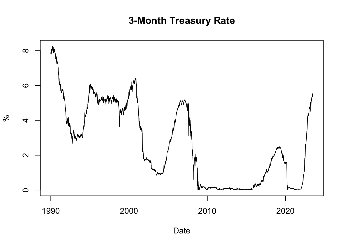
Figure 11.1: 3-Month Treasury Rate
The resulting plot, shown in Figure 11.1, displays the historical evolution of the 3-month Treasury rate since 1990. It allows us to observe how interest rates have changed over time, with low rates often observed during recessions and high rates during boom periods. Recessions are typically characterized by reduced borrowing and investment activities, leading to decreased demand for credit and lower interest rates. Conversely, boom periods are associated with strong economic growth and increased credit demand, which can drive interest rates upward.
Furthermore, inflation plays a significant role in influencing interest rates through the Fisher effect. When inflation is high, lenders and investors are concerned about the diminishing value of money over time. To compensate for the erosion of purchasing power, lenders typically demand higher interest rates on loans. These higher interest rates reflect the expectation of future inflation and act as a safeguard against the declining value of the money lent. Conversely, when inflation is low, lenders may offer lower interest rates due to reduced concerns about the erosion of purchasing power.
11.1.3 Plotting Yield Curve
Next, let’s plot the yield curve. The yield curve is a graphical representation of the relationship between the interest rates (yields) and the time to maturity of a bond. It provides insights into market expectations regarding future interest rates and economic conditions.
To plot the yield curve, we will select the most recently available data from the dataset, which corresponds to the last row. We will extract the interest rates as a numeric vector and the column names (representing the time to maturity) as labels for the x-axis:
# Extract the interest rates of the last row
yc_most_recent_data <- as.numeric(tail(yc[, -1], 1))
yc_most_recent_data
## [1] 5.24 5.39 5.43 5.50 5.47 5.40 4.87 4.49 4.13 3.97 3.81 4.06 3.85# Extract the column names of the last row
yc_most_recent_labels <- colnames(tail(yc[, -1], 1))
yc_most_recent_labels## [1] "1 Mo" "2 Mo" "3 Mo" "4 Mo" "6 Mo" "1 Yr" "2 Yr" "3 Yr" "5 Yr"
## [10] "7 Yr" "10 Yr" "20 Yr" "30 Yr"# Plot the yield curve
plot(x = yc_most_recent_data, xaxt = 'n', type = "o", pch = 19,
xlab = "Time to Maturity", ylab = "Treasury Rate in %",
main = paste("Yield Curve on", format(tail(yc$Date, 1), format = '%B %d, %Y')))
axis(side = 1, at = seq(1, length(yc_most_recent_labels), 1),
labels = yc_most_recent_labels)In the code snippet above, plot() is the R function used to create the yield curve plot. Here are the key inputs and arguments used in the function:
x = yc_most_recent_datarepresents the interest rates of the most recent yield curve data, which will be plotted on the x-axis.xaxt = 'n'specifies that no x-axis tick labels should be displayed initially. This is useful because we will customize the x-axis tick labels separately using theaxis()function.type = "o"specifies that the plot should be created as a line plot with points. This will display the yield curve as a connected line with markers at each data point.pch = 19sets the plot symbol to a solid circle, which will be used as markers for the data points on the yield curve.xlab = "Time to Maturity"sets the label for the x-axis to “Time to Maturity”, indicating the variable represented on the x-axis.ylab = "Treasury Rate in %"sets the label for the y-axis to “Treasury Rate in %”, indicating the variable represented on the y-axis.main = paste("Yield Curve on", format(tail(yc$Date, 1), format = '%B %d, %Y'))sets the title of the plot to “Yield Curve on” followed by the date of the most recent yield curve data.
Additionally, the axis() function is used to customize the x-axis tick labels. It sets the tick locations using at = seq(1, length(yc_most_recent_labels), 1) to evenly space the ticks along the x-axis. The labels = yc_most_recent_labels argument assigns the column names of the last row (representing maturities) as the tick labels on the x-axis.
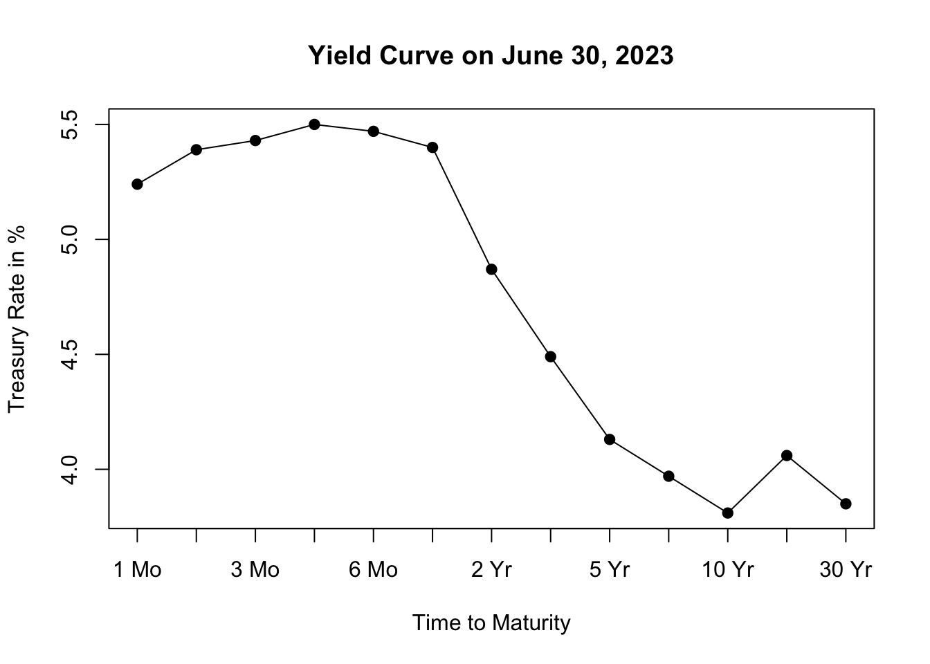
Figure 11.2: Yield Curve on June 30, 2023
The resulting plot, shown in Figure 11.2, depicts the yield curve based on the most recent available data, allowing us to visualize the relationship between interest rates and the time to maturity. The x-axis represents the different maturities of the bonds, while the y-axis represents the corresponding treasury rates.
Analyzing the shape of the yield curve can provide insights into market expectations and can be useful for assessing economic conditions and making investment decisions. The yield curve can take different shapes, such as upward-sloping (normal), downward-sloping (inverted), or flat, each indicating different market conditions and expectations for future interest rates.
An upward-sloping yield curve, where longer-term interest rates are higher than shorter-term rates, is often seen during periods of economic expansion. This shape suggests that investors expect higher interest rates in the future as the economy grows and inflationary pressures increase. It reflects an optimistic outlook for economic conditions, as borrowing and lending activity are expected to be robust.
In contrast, a downward-sloping or inverted yield curve, where shorter-term interest rates are higher than longer-term rates, is often considered a predictor of economic slowdown or recession. This shape suggests that investors anticipate lower interest rates in the future as economic growth slows and inflationary pressures decrease. It reflects a more cautious outlook for the economy, as investors seek the safety of longer-term bonds amid expectations of lower returns and potential economic downturn.
Inflation expectations also influence the shape of the yield curve. When there are high inflation expectations for the long term, the yield curve tends to slope upwards. This occurs because lenders demand higher interest rates for longer maturities to compensate for anticipated inflation. However, when there is currently high inflation but expectations are that the central bank will successfully control inflation in the long term, the yield curve may slope downwards. In this case, long-term interest rates are lower than short-term rates, as average inflation over the long term is expected to be lower than in the short term.