5 Importing Data in R
R is a software specialized for data analysis. To analyze data using R, the data must first be imported into the R environment. R offers robust functionality for importing data in a variety of formats. This chapter explores how to import data from CSV, TSV, and Excel files. Before we dive into specifics, let’s ensure RStudio can locate the data stored on your computer.
5.1 Working Directory
The working directory in R is the folder where R starts when it’s looking for files to read or write. If you’re not sure where your current working directory is, you can use the getwd() (get working directory) command in R to find out:
## [1] "/Users/julianludwig/Library/CloudStorage/Dropbox/Economics/teaching/4300_2023/daer"To change your working directory, use the setwd() (set working directory) function:
Be sure to replace "your/folder/path" with the actual path to your folder.
When your files are stored in the same directory as your working directory, defined using the setwd() function, you can directly access these files by their names. For instance, read_csv("yieldcurve.csv") will successfully read the file if “yieldcurve.csv” is in the working directory. If the file is located in a subfolder within the working directory, for example a folder named files, you would need to specify the folder in the file path when calling the file: read_csv("files/yieldcurve.csv").
To find out the folder path for a specific file or folder on your computer, you can follow these steps:
For Windows:
- Navigate to the folder using the File Explorer.
- Once you are in the folder, click on the address bar at the top of the File Explorer window. The address bar will now show the full path to the folder. This is the path you can set in R using the
setwd()function.
An example of a folder path on Windows might look like this: C:/Users/YourName/Documents/R.
For MacOS:
- Open Finder and navigate to the folder.
- Once you are in the folder, Command-click (or right-click and hold, if you have a mouse) on the folder’s name at the top of the Finder window. A drop-down menu will appear showing the folder hierarchy.
- Hover over each folder in the hierarchy to show the full path, then copy this path.
An example of a folder path on macOS might look like this: /Users/YourName/Documents/R.
Remember, when setting the working directory in R, you need to use forward slashes (/) in the folder path, even on Windows where the convention is to use backslashes (\).
5.2 Yield Curve
This chapter demonstrates how to import Treasury yield curve rates data from a CSV file. Treasury yield curve data represents interest rates on U.S. government loans for different maturities. By comparing rates at various maturities, such as 1-month, 1-year, 5-year, 10-year, and 30-year, we gain insights into market expectations. An upward sloping yield curve, where interest rates for longer-term loans (30-year) are significantly higher than those for short-term loans (1-month), often indicates economic growth. Conversely, a downward sloping or flat curve may suggest the possibility of a recession. This data is crucial in making informed decisions regarding borrowing, lending, and understanding the broader economic landscape.
To obtain the yield curve data, follow these steps:
- Visit the U.S. Treasury’s data center by clicking here.
- Click on “Data” in the menu bar, then select “Daily Treasury Par Yield Curve Rates.”
- On the data page, select “Download CSV” to obtain the yield curve data for the current year.
- To access all the yield curve data since 1990, choose “All” under the “Select Time Period” option, and click “Apply.” Please note that when selecting all periods, the “Download CSV” button may not be available.
- If the “Download CSV” button is not available, click on the link called Download interest rates data archive. Then, select yield-curve-rates-1990-2021.csv to download the daily yield curve data from 1990-2021.
- To add the more recent yield curve data since 2022, go back to the previous page, choose the desired years (e.g., “2022”, “2023”) under the “Select Time Period,” and click “Apply.”
- Manually copy the additional rows of yield curve data and paste them into the yield-curve-rates-1990-2021.csv file.
- Save the file as “yieldcurve.csv” in a location of your choice, ensuring that it is saved in a familiar folder for easy access.
Following these steps will allow you to obtain the yield curve data, including both historical and recent data, in a single CSV file named “yieldcurve.csv.”
5.2.1 Import CSV File
CSV (Comma Separated Values) is a common file format used to store tabular data. As the name suggests, the values in each row of a CSV file are separated by commas. Here’s an example of how data is stored in a CSV file:
- Male,8,100,3
- Female,9,20,3
To import the ‘yieldcurve.csv’ CSV file in R, install and load the readr package. Run install.packages("readr") in the console and include the package at the top of your R script. You can then use the read_csv() or read_delim() function to import the yield curve data:
# Load the package
library("readr")

# Import CSV file
yc <- read_csv(file = "files/yieldcurve.csv", col_names = TRUE)

# Import CSV file using the read_delim() function
yc <- read_delim(file = "files/yieldcurve.csv", col_names = TRUE, delim = ",")
In the code snippets above, the read_csv() and read_delim() functions from the readr package are used to import a CSV file named “yieldcurve.csv”. The col_names = TRUE argument indicates that the first row of the CSV file contains column names. The delim = "," argument specifies that the columns are separated by commas, which is the standard delimiter for CSV (Comma Separated Values) files. Either one of the two functions can be used to read the CSV file and store the data in the variable yc for further analysis.
To inspect the first few rows of the data, print the yc object in the console. For an overview of the entire dataset, use the View() function, which provides an interface similar to viewing the CSV file in Microsoft Excel:
## # A tibble: 8,382 × 14
##    Date   `1 Mo` `2 Mo` `3 Mo` `4 Mo` `6 Mo` `1 Yr` `2 Yr` `3 Yr`
##    <chr>  <chr>  <chr>   <dbl> <chr>   <dbl>  <dbl>  <dbl>  <dbl>
##  1 01/02… N/A    N/A      7.83 N/A      7.89   7.81   7.87   7.9
##  2 01/03… N/A    N/A      7.89 N/A      7.94   7.85   7.94   7.96
##  3 01/04… N/A    N/A      7.84 N/A      7.9    7.82   7.92   7.93
##  4 01/05… N/A    N/A      7.79 N/A      7.85   7.79   7.9    7.94
##  5 01/08… N/A    N/A      7.79 N/A      7.88   7.81   7.9    7.95
##  6 01/09… N/A    N/A      7.8  N/A      7.82   7.78   7.91   7.94
##  7 01/10… N/A    N/A      7.75 N/A      7.78   7.77   7.91   7.95
##  8 01/11… N/A    N/A      7.8  N/A      7.8    7.77   7.91   7.95
##  9 01/12… N/A    N/A      7.74 N/A      7.81   7.76   7.93   7.98
## 10 01/16… N/A    N/A      7.89 N/A      7.99   7.92   8.1    8.13
## # ℹ 8,372 more rows
## # ℹ 5 more variables: `5 Yr` <dbl>, `7 Yr` <dbl>, `10 Yr` <dbl>,
## # `20 Yr` <chr>, `30 Yr` <chr>Both the read_csv() and read_delim() functions convert the CSV file into a tibble (tbl_df), a modern version of the R data frame discussed in Chapter 4.6. Remember, a data frame stores data in separate columns, each of which must be of the same data type. Use the class(yc) function to check the data type of the entire dataset, and sapply(yc, class) to check the data type of each column:
## [1] "spec_tbl_df" "tbl_df" "tbl" "data.frame"## Date 1 Mo 2 Mo 3 Mo 4 Mo
## "character" "character" "character" "numeric" "character"
## 6 Mo 1 Yr 2 Yr 3 Yr 5 Yr
## "numeric" "numeric" "numeric" "numeric" "numeric"
## 7 Yr 10 Yr 20 Yr 30 Yr
## "numeric" "numeric" "character" "character"When importing data in R, it’s possible that R assigns incorrect data types to some columns. For example, the Date column is treated as a character column even though it contains dates, and the 30 Yr column is treated as a character column even though it contains interest rates. To address this issue, you can convert the first column to a date type and the remaining columns to numeric data types using the following three steps:
- Replace “N/A” with
NA, which represents missing values in R. This step is necessary because R doesn’t recognize “N/A”, and if a column includes “N/A”, R will consider it as a character vector instead of a numeric vector.
- Convert all yield columns to numeric data types:
The as.numeric() function converts a data object into a numeric type. In this case, it converts columns with character values like “3” and “4” into the numeric values 3 and 4. The sapply() function applies the as.numeric() function to each of the selected columns. This converts all the interest rates to numeric data types.
- Convert the date column to a date object, recognizing that the date format is Month/Day/Year or
%m/%d/%Y:
## [1] "01/02/90" "01/03/90" "01/04/90" "01/05/90" "01/08/90"
## [6] "01/09/90"
# Convert to date format
yc$Date <- as.Date(yc$Date, format = "%m/%d/%y")
# Sort data according to date
yc <- yc[order(yc$Date), ]
# Print first 5 observations of date column
head(yc$Date)## [1] "1990-01-02" "1990-01-03" "1990-01-04" "1990-01-05"
## [5] "1990-01-08" "1990-01-09"## [1] "2023-06-23" "2023-06-26" "2023-06-27" "2023-06-28"
## [5] "2023-06-29" "2023-06-30"Hence, we have successfully imported the yield curve data and performed the necessary conversions to ensure that all columns are in their correct formats:
## # A tibble: 8,382 × 14
##    Date       `1 Mo` `2 Mo` `3 Mo` `4 Mo` `6 Mo` `1 Yr` `2 Yr`
##    <date>      <dbl>  <dbl>  <dbl>  <dbl>  <dbl>  <dbl>  <dbl>
##  1 1990-01-02     NA     NA   7.83     NA   7.89   7.81   7.87
##  2 1990-01-03     NA     NA   7.89     NA   7.94   7.85   7.94
##  3 1990-01-04     NA     NA   7.84     NA   7.9    7.82   7.92
##  4 1990-01-05     NA     NA   7.79     NA   7.85   7.79   7.9
##  5 1990-01-08     NA     NA   7.79     NA   7.88   7.81   7.9
##  6 1990-01-09     NA     NA   7.8      NA   7.82   7.78   7.91
##  7 1990-01-10     NA     NA   7.75     NA   7.78   7.77   7.91
##  8 1990-01-11     NA     NA   7.8      NA   7.8    7.77   7.91
##  9 1990-01-12     NA     NA   7.74     NA   7.81   7.76   7.93
## 10 1990-01-16     NA     NA   7.89     NA   7.99   7.92   8.1
## # ℹ 8,372 more rows
## # ℹ 6 more variables: `3 Yr` <dbl>, `5 Yr` <dbl>, `7 Yr` <dbl>,
## #   `10 Yr` <dbl>, `20 Yr` <dbl>, `30 Yr` <dbl>
Here, <dbl> stands for double, which is the R data type for decimal numbers, also known as numeric type. Converting the yield columns to dbl ensures that the values are treated as numeric and can be used for calculations, analysis, and visualization.
5.2.2 Plotting Historical Yields
Let’s use the plot() function to visualize the imported yield curve data. In this case, we will plot the 3-month Treasury rate over time, using the Date column as the x-axis and the 3 Mo column as the y-axis:
# Plot the 3-month Treasury rate over time
plot(x = yc$Date, y = yc$`3 Mo`, type = "l",
     xlab = "Date", ylab = "%", main = "3-Month Treasury Rate")
In the code snippet above, plot() is the R function used to create the plot. It takes several arguments to customize the appearance and behavior of the plot:
xrepresents the data to be plotted on the x-axis. In this case, it corresponds to theDatecolumn from the yield curve data.yrepresents the data to be plotted on the y-axis. Here, it corresponds to the3 Mocolumn, which represents the 3-month Treasury rate.type = "l"specifies the type of plot to create. In this case, we use"l"to create a line plot.xlab = "Date"sets the label for the x-axis to “Date”.ylab = "%"sets the label for the y-axis to “%”.main = "3-Month Treasury Rate"sets the title of the plot to “3-Month Treasury Rate”.
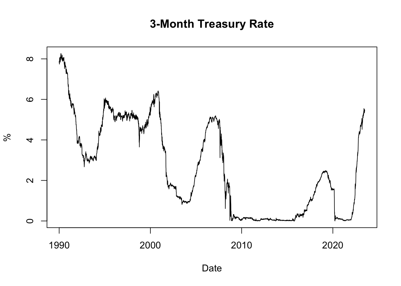
Figure 5.1: 3-Month Treasury Rate
The resulting plot, shown in Figure 5.1, displays the historical evolution of the 3-month Treasury rate since 1990. It allows us to observe how interest rates have changed over time, with low rates often observed during recessions and high rates during boom periods. Recessions are typically characterized by reduced borrowing and investment activities, leading to decreased demand for credit and lower interest rates. Conversely, boom periods are associated with strong economic growth and increased credit demand, which can drive interest rates upward.
Furthermore, inflation plays a significant role in influencing interest rates through the Fisher effect. When inflation is high, lenders and investors are concerned about the diminishing value of money over time. To compensate for the erosion of purchasing power, lenders typically demand higher interest rates on loans. These higher interest rates reflect the expectation of future inflation and act as a safeguard against the declining value of the money lent. Conversely, when inflation is low, lenders may offer lower interest rates due to reduced concerns about the erosion of purchasing power.
5.2.3 Plotting Yield Curve
Next, let’s plot the yield curve. The yield curve is a graphical representation of the relationship between the interest rates (yields) and the time to maturity of a bond. It provides insights into market expectations regarding future interest rates and economic conditions.
To plot the yield curve, we will select the most recently available data from the dataset, which corresponds to the last row. We will extract the interest rates as a numeric vector and the column names (representing the time to maturity) as labels for the x-axis:
# Extract the interest rates of the last row
yc_most_recent_data <- as.numeric(tail(yc[, -1], 1))
yc_most_recent_data
## [1] 5.24 5.39 5.43 5.50 5.47 5.40 4.87 4.49 4.13 3.97 3.81 4.06
## [13] 3.85# Extract the column names of the last row
yc_most_recent_labels <- colnames(tail(yc[, -1], 1))
yc_most_recent_labels## [1] "1 Mo" "2 Mo" "3 Mo" "4 Mo" "6 Mo" "1 Yr" "2 Yr"
## [8] "3 Yr" "5 Yr" "7 Yr" "10 Yr" "20 Yr" "30 Yr"# Plot the yield curve
plot(x = yc_most_recent_data, xaxt = 'n', type = "o", pch = 19,
xlab = "Time to Maturity", ylab = "Treasury Rate in %",
main = paste("Yield Curve on", format(tail(yc$Date, 1), format = '%B %d, %Y')))
axis(side = 1, at = seq(1, length(yc_most_recent_labels), 1),
labels = yc_most_recent_labels)In the code snippet above, plot() is the R function used to create the yield curve plot. Here are the key inputs and arguments used in the function:
x = yc_most_recent_datarepresents the interest rates of the most recent yield curve data, which will be plotted on the x-axis.xaxt = 'n'specifies that no x-axis tick labels should be displayed initially. This is useful because we will customize the x-axis tick labels separately using theaxis()function.type = "o"specifies that the plot should be created as a line plot with points. This will display the yield curve as a connected line with markers at each data point.pch = 19sets the plot symbol to a solid circle, which will be used as markers for the data points on the yield curve.xlab = "Time to Maturity"sets the label for the x-axis to “Time to Maturity”, indicating the variable represented on the x-axis.ylab = "Treasury Rate in %"sets the label for the y-axis to “Treasury Rate in %”, indicating the variable represented on the y-axis.main = paste("Yield Curve on", format(tail(yc$Date, 1), format = '%B %d, %Y'))sets the title of the plot to “Yield Curve on” followed by the date of the most recent yield curve data.
Additionally, the axis() function is used to customize the x-axis tick labels. It sets the tick locations using at = seq(1, length(yc_most_recent_labels), 1) to evenly space the ticks along the x-axis. The labels = yc_most_recent_labels argument assigns the column names of the last row (representing maturities) as the tick labels on the x-axis.
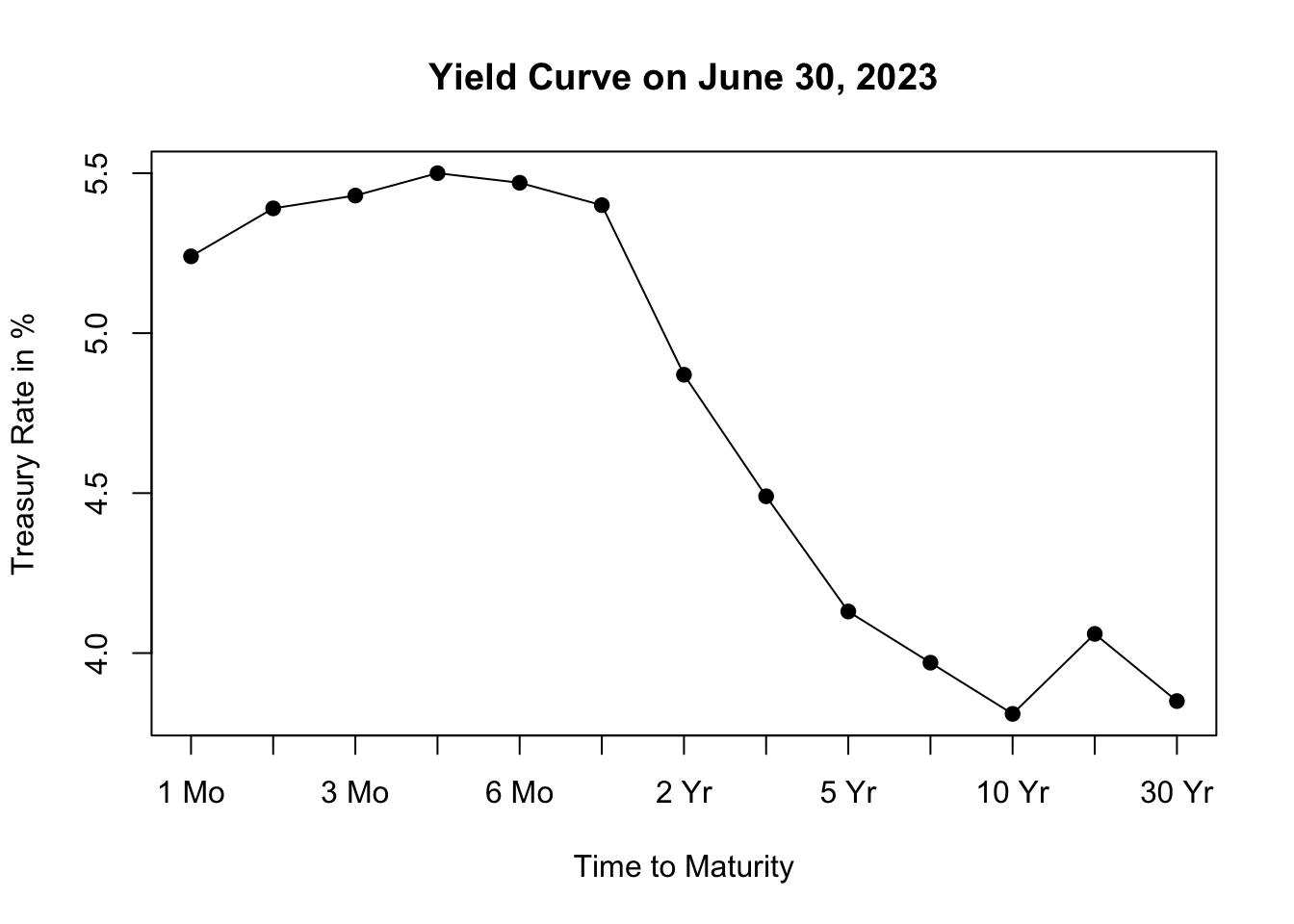
Figure 5.2: Yield Curve on June 30, 2023
The resulting plot, shown in Figure 5.2, depicts the yield curve based on the most recent available data, allowing us to visualize the relationship between interest rates and the time to maturity. The x-axis represents the different maturities of the bonds, while the y-axis represents the corresponding treasury rates.
Analyzing the shape of the yield curve can provide insights into market expectations and can be useful for assessing economic conditions and making investment decisions. The yield curve can take different shapes, such as upward-sloping (normal), downward-sloping (inverted), or flat, each indicating different market conditions and expectations for future interest rates.
An upward-sloping yield curve, where longer-term interest rates are higher than shorter-term rates, is often seen during periods of economic expansion. This shape suggests that investors expect higher interest rates in the future as the economy grows and inflationary pressures increase. It reflects an optimistic outlook for economic conditions, as borrowing and lending activity are expected to be robust.
In contrast, a downward-sloping or inverted yield curve, where shorter-term interest rates are higher than longer-term rates, is often considered a predictor of economic slowdown or recession. This shape suggests that investors anticipate lower interest rates in the future as economic growth slows and inflationary pressures decrease. It reflects a more cautious outlook for the economy, as investors seek the safety of longer-term bonds amid expectations of lower returns and potential economic downturn.
Inflation expectations also influence the shape of the yield curve. When there are high inflation expectations for the long term, the yield curve tends to slope upwards. This occurs because lenders demand higher interest rates for longer maturities to compensate for anticipated inflation. However, when there is currently high inflation but expectations are that the central bank will successfully control inflation in the long term, the yield curve may slope downwards. In this case, long-term interest rates are lower than short-term rates, as average inflation over the long term is expected to be lower than in the short term.
5.3 Michigan Survey
In this chapter, we’ll demonstrate how to import a TSV file using real-world consumer survey data collected by the University of Michigan. This data is gathered through surveys that ask people about their opinions and feelings regarding the economy. It helps to understand how consumers perceive the current economic conditions and their expectations for the future. The data provides valuable insights into consumer behavior and helps economists, policymakers, and businesses make informed decisions.
To obtain the Michigan consumer survey data, follow these steps:
- Visit the website of University of Michigan’s surveys of consumers by clicking here.
- Click on “DATA” in the menu bar, then select “Time Series.”
- On the data page, under Table, select “All: All Tables (Tab-delimited or CSV only)” to obtain the consumer survey data on all topics.
- To access all the consumer survey data since 1978, type “1978” under the “Oldest Year” option.
- Click on “Tab-Deliminated (Excel)” under the “format” option.
- Save the TSV file in a location of your choice, ensuring that it is saved in a familiar folder for easy access.
The dataset contains 360 variables with coded column names such as ics_inc31 or pago_dk_all. To understand the meaning of these columns, you can visit the same website here and click on SURVEY INFORMATION. From there, select the Time-Series Variable Codebook which is a PDF document that provides detailed explanations for all the column names. By referring to this codebook, you can gain a better understanding of the variables and their corresponding meanings in the dataset.
5.3.1 Import TSV File
TSV (Tab Separated Values) is a common file format used to store tabular data. As the name suggests, the values in each row of a TSV file are separated by tabs. Here’s an example of how data is stored in a TSV file:
- Male 8 100 3
- Female 9 20 3
To import the consumer survey TSV file, you need to install and load the readr package if you haven’t done so already. Once the package is loaded, you can use either the read_tsv() or read_delim() function to read the TSV (Tab-Separated Values) file.
# Load the package
library("readr")

# Import TSV file
cs <- read_tsv(file = "files/sca-tableall-on-2023-Jul-01.tsv", skip = 1)

# Import TSV file using the read_delim() function
cs <- read_delim(file = "files/sca-tableall-on-2023-Jul-01.tsv", skip = 1,
                 col_names = TRUE, delim = "\t")
In the provided code snippets, the file input specifies the file path or URL of the TSV file to be imported. The skip input is used to specify the number of rows to skip at the beginning of the file. In this case, skip = 1 indicates that the first line of the TSV file, which contains the title “All Tables”, should be skipped. The col_names input is set to TRUE to indicate that the second line of the TSV file (after skipping 1 row) contains the column names. Lastly, the delim input is set to "\t" to specify that the columns in the TSV file are separated by tabs, which is the standard delimiter for TSV (Tab Separated Values) files.
Note that if the file is neither CSV nor TSV, but rather has an exotic format where columns are separated by a different character that is neither a comma nor a tab, such as “/”, you can use the read_delim() function with the delim = "/" argument to specify the custom delimiter.
To inspect the first few rows of the data, print the cs object in the console. For an overview of the entire dataset, execute View(cs).
## # A tibble: 545 × 360
##    Month  yyyy ics_all ics_inc31 ics_inc32 ics_inc33 ics_a1834
##    <dbl> <dbl>   <dbl>     <dbl>     <dbl>     <dbl>     <dbl>
##  1     1  1978    83.7        NA        NA        NA      93.7
##  2     2  1978    84.3        NA        NA        NA      99.7
##  3     3  1978    78.8        NA        NA        NA      91.7
##  4     4  1978    81.6        NA        NA        NA      91.8
##  5     5  1978    82.9        NA        NA        NA      95.1
##  6     6  1978    80          NA        NA        NA      91.7
##  7     7  1978    82.4        NA        NA        NA      92.2
##  8     8  1978    78.4        NA        NA        NA      87.8
##  9     9  1978    80.4        NA        NA        NA      86.6
## 10    10  1978    79.3        NA        NA        NA      90.6
## # ℹ 535 more rows
## # ℹ 353 more variables: ics_a3554 <dbl>, ics_a5597 <dbl>,
## #   ics_ne <dbl>, ics_nc <dbl>, ics_s <dbl>, ics_w <dbl>,
## #   icc_all <dbl>, ice_all <dbl>, pago_f_all <dbl>,
## #   pago_s_all <dbl>, pago_u_all <dbl>, pago_dk_all <dbl>,
## #   pago_r_all <dbl>, pagorn_hy_all <dbl>, pagorn_ha_all <dbl>,
## #   pagorn_ld_all <dbl>, pagorn_ly_all <dbl>, …
Use sapply(cs, class) to check the data type of each column, to make sure all columns are indeed numeric:
##
## logical numeric
##       1     359
Here, since there are 360 columns, the summary() function is applied, which reveals that there are 359 numerical columns, and 1 logical column, which makes sense.
Instead of a date column, the consumer survey has a year (yyyy) and a month (Month) column. To create a date column from the year and month columns, combine them with the paste() function to create a date format of the form Year-Month-Day or %Y-%m-%d:
## [1] "1978-01-01" "1978-02-01" "1978-03-01" "1978-04-01"
## [5] "1978-05-01" "1978-06-01"
5.3.2 Plotting Consumer Indices
The Michigan Consumer Survey consists of a wide range of survey responses from a sample of households collected every month. These survey responses are gathered to produce indices about how consumers feel each period. The University of Michigan produces three main indices: the Index of Consumer Confidence (ICC), the Index of Current Economic Conditions (ICE), and the Index of Consumer Sentiment (ICS). These indices are designed to measure different aspects of consumer attitudes and perceptions regarding the economy.
Index of Consumer Confidence (ICC): The ICC reflects consumers’ expectations about future economic conditions and their overall optimism or pessimism. It is based on consumers’ assessments of their future financial prospects, job availability, and economic outlook. A higher ICC value indicates greater consumer confidence and positive expectations for the economy.
Index of Current Economic Conditions (ICE): The ICE assesses consumers’ perceptions of the current economic environment. It reflects their evaluations of their personal financial situation, job security, and their perception of whether it is a good time to make major purchases. The ICE provides insights into the current economic conditions as perceived by consumers.
Index of Consumer Sentiment (ICS): The ICS combines both the ICC and ICE to provide an overall measure of consumer sentiment. It takes into account consumers’ expectations for the future as well as their assessment of the present economic conditions. The ICS is often used as an indicator of consumer behavior and their likelihood of making purchases and engaging in economic activities.
These indices are calculated based on survey responses from a sample of households, and they serve as important indicators of consumer sentiment and economic trends. They are widely followed by economists, policymakers, and financial markets as they provide valuable insights into consumers’ attitudes and perceptions, which can impact their spending behavior and overall economic activity.
Let’s use the plot() function to visualize the imported Michigan consumer survey data. In this case, we will plot the three key indices: ICC, ICE, and ICS over time, using the Date column as the x-axis and the three indices as the y-axis:
# Plot ICC, ICE, and ICS over time
plot(x = cs$Date, y = cs$icc_all, type = "l", col = 5, lwd = 3, ylim = c(40, 140),
     xlab = "Date", ylab = "Index",
     main = "Key Indices of the Michigan Consumer Survey")
lines(x = cs$Date, y = cs$ice_all, col = 2, lwd = 2)
lines(x = cs$Date, y = cs$ics_all, col = 1, lwd = 1.5)
legend(x = "topleft", legend = c("ICC", "ICE", "ICS"),
       col = c(5, 2, 1), lwd = c(3, 2, 1.5), horiz = TRUE)
In the code snippet provided, the appearance and behavior of the plot are customized using several functions and arguments:
x: This argument specifies the data to be used for the x-axis of the plot. In this case, it iscs$Date, indicating the “Date” column of the Michigan consumer survey data.y: This argument specifies the data to be used for the y-axis of the plot. In this case, it iscs$icc_all,cs$ice_all, andcs$ics_all, representing the ICC, ICE, and ICS indices from the Michigan consumer survey data.type: This argument determines the type of plot to be created. In this case, it is set to"l", which stands for “line plot”. This will create a line plot of the data points.col: This argument specifies the color of the lines in the plot. In the code snippet, different colors are used for each index:5for ICC,2for ICE, and1for ICS.lwd: This argument controls the line width of the plot. It is set to3for ICC,2for ICE, and1.5for ICS, indicating different line widths for each index.ylim: This argument sets the limits of the y-axis. In this case, it is set toc(40, 140), which defines the range of the y-axis from 40 to 140.xlab: This argument specifies the label for the x-axis of the plot. In the code snippet, it is set to"Date".ylab: This argument specifies the label for the y-axis of the plot. In the code snippet, it is set to"Index".main: This argument specifies the main title of the plot. In the code snippet, it is set to"Key Indices of the Michigan Consumer Survey".lines: This function is used to add additional lines to the plot.legend: This function adds a legend to the plot. It is used to create a legend in the top-left corner (x = "topleft") with labels corresponding to each index ("ICC","ICE","ICS") and their respective line colors and widths.
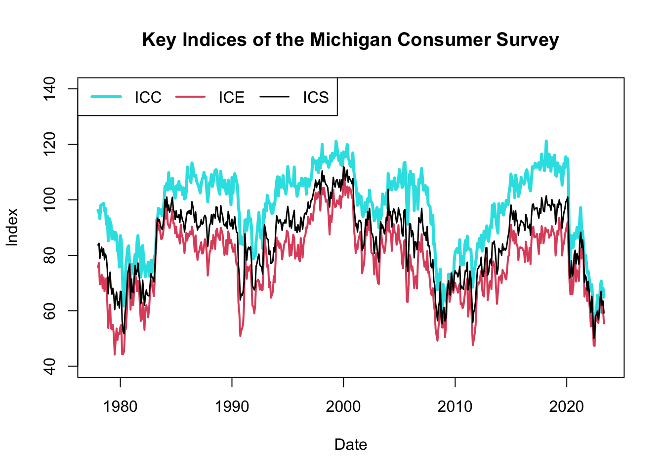
Figure 5.3: Key Indices of the Michigan Consumer Survey
The resulting plot, shown in Figure 5.3, displays the historical evolution of the three Michigan consumer survey indices: ICC, ICE, and ICS. These indices are considered leading indicators because they provide early signals about changes in consumer sentiment and economic conditions. They often reflect consumers’ expectations and attitudes before these changes are fully manifested in traditional economic indicators, such as unemployment rates or GDP growth.
Consumer sentiment plays a crucial role in shaping consumer behavior, including spending patterns, saving habits, and investment decisions. When consumer confidence is high, individuals are more likely to spend and invest, stimulating economic growth. Conversely, low consumer confidence can lead to reduced spending and investment, potentially dampening economic activity. Hence, these indices can serve as an early warning system for potential shifts in economic activity.
By incorporating the consumer survey indices alongside traditional economic indicators, policymakers and analysts can gain a more comprehensive understanding of the economic landscape. While traditional indicators like unemployment rates provide objective measures of economic conditions, the consumer survey indices offer a subjective perspective, reflecting consumers’ beliefs, expectations, and intentions. This subjective insight can provide additional context and help anticipate changes in consumer behavior and overall economic activity.
Therefore, by monitoring both traditional economic indicators and the Michigan consumer survey indices, policymakers and analysts can obtain a more holistic view of the economy, enabling them to make more informed decisions and implement timely interventions to support economic stability and growth.
5.4 Tealbook
In this chapter, we’ll demonstrate how to import an Excel workbook (xls or xlsx) by importing projections data from Tealbooks (formerly known as Greenbooks). Tealbooks are an important resource as they consist of economic forecasts created by the research staff at the Federal Reserve Board of Governors. These forecasts are prepared before each meeting of the Federal Open Market Committee (FOMC), which is a key decision-making body responsible for determining U.S. monetary policy. The Tealbooks’ projections provide valuable insights into the expected performance of the economy, including indicators such as inflation, GDP growth, unemployment rates, and interest rates. The data from Tealbooks are made available to the public with a five-year lag, allowing researchers and analysts to examine past economic forecasts and compare them to actual outcomes. By importing and analyzing this data, we can gain a deeper understanding of the economic outlook as perceived by the Federal Reserve’s research staff and the FOMC prior to their policy meetings.
To obtain the Tealbook forecasts, perform the following steps:
- Visit the website of the Federal Reserve Bank of Philadelphia by clicking here.
- Navigate to SURVEYS & DATA, select Real-Time Data Research, choose Tealbook (formerly Greenbook) Data Sets, and finally select Philadelphia Fed’s Tealbook (formerly Greenbook) Data Set.
- On the data page, download Philadelphia Fed’s Tealbook/Greenbook Data Set: Row Format.
- Save the Excel workbook as ‘GBweb_Row_Format.xlsx’ in a familiar location for easy retrieval.
The Excel workbook contains multiple sheets, each representing different variables. The sheet gRGDP, for example, holds real GDP growth forecasts. Columns gRGDPF1 to gRGDPF9 represent one- to nine-quarter-ahead forecasts, gRGDPF0 represents the nowcast, and gRGDPB1 to gRGDPB4 represent one- to four-quarter-behind backcasts.
5.4.1 Import Excel Workbook
An Excel workbook (xlsx) is a file that contains one or more spreadsheets (worksheets), which are the separate “pages” or “tabs” within the file. An Excel worksheet, or simply a sheet, is a single spreadsheet within an Excel workbook. It consists of a grid of cells formed by intersecting rows (labeled by numbers) and columns (labeled by letters), which can hold data such as text, numbers, and formulas.
To import the Tealbook, which is an Excel workbook, install and load the readxl package by running install.packages("readxl") in the console and include the package at the beginning of your R script. You can then use the excel_sheets() function to print the names of all Excel worksheets in the workbook, and the read_excel() function to import a particular worksheet:
# Load the package
library("readxl")

# Get names of all Excel worksheets
sheet_names <- excel_sheets(path = "files/GBweb_Row_Format.xlsx")
sheet_names
## [1] "Documentation" "gRGDP" "gPGDP"
## [4] "UNEMP" "gPCPI" "gPCPIX"
## [7] "gPPCE" "gPPCEX" "gRPCE"
## [10] "gRBF" "gRRES" "gRGOVF"
## [13] "gRGOVSL" "gNGDP" "HSTART"
## [16] "gIP"# Import one of the Excel worksheets: "gRGDP"
gRGDP <- read_excel(path = "files/GBweb_Row_Format.xlsx", sheet = "gRGDP")
gRGDP## # A tibble: 466 × 16
## DATE gRGDPB4 gRGDPB3 gRGDPB2 gRGDPB1 gRGDPF0 gRGDPF1 gRGDPF2
## <dbl> <dbl> <dbl> <dbl> <dbl> <dbl> <dbl> <dbl>
## 1 1967. 5.9 1.9 4 4.5 0.5 1 NA
## 2 1967. 1.9 4 4.5 0 1.6 4.1 NA
## 3 1967. 1.9 4 4.5 -0.3 1.4 4.7 NA
## 4 1967. 1.9 4 4.5 -0.3 2.3 4.5 NA
## 5 1967. 3.4 3.8 -0.2 2.4 4.3 NA NA
## 6 1967. 3.4 3.8 -0.2 2.4 4.2 4.5 NA
## 7 1967. 3.4 3.8 -0.2 2.4 4.8 6.4 NA
## 8 1967. 3.4 3.8 -0.2 2.4 4.9 6.4 NA
## 9 1967. 3.8 -0.2 2.4 4.2 6.1 NA NA
## 10 1967. 3.8 -0.2 2.4 4.2 5.1 NA NA
## # ℹ 456 more rows
## # ℹ 8 more variables: gRGDPF3 <dbl>, gRGDPF4 <dbl>,
## # gRGDPF5 <dbl>, gRGDPF6 <dbl>, gRGDPF7 <dbl>, gRGDPF8 <dbl>,
## # gRGDPF9 <dbl>, GBdate <dbl>To import all sheets, use the following code:
# Import all worksheets of Excel workbook
TB <- lapply(sheet_names, function(x)
    read_excel(path = "files/GBweb_Row_Format.xlsx", sheet = x))
names(TB) <- sheet_names

# Summarize the list containing all Excel worksheets
summary(TB)
## Length Class Mode
## Documentation 2 tbl_df list
## gRGDP 16 tbl_df list
## gPGDP 16 tbl_df list
## UNEMP 16 tbl_df list
## gPCPI 16 tbl_df list
## gPCPIX 16 tbl_df list
## gPPCE 16 tbl_df list
## gPPCEX 16 tbl_df list
## gRPCE 16 tbl_df list
## gRBF 16 tbl_df list
## gRRES 16 tbl_df list
## gRGOVF 16 tbl_df list
## gRGOVSL 16 tbl_df list
## gNGDP 16 tbl_df list
## HSTART 16 tbl_df list
## gIP 16 tbl_df listIn the provided code snippet, the lapply() function is used to apply the read_excel() function to each element in the sheet_names list, returning a list that is the same length as the input. Consequently, the TB object becomes a list in which each element is a tibble corresponding to an individual Excel worksheet. For instance, to access the worksheet that contains unemployment forecasts, you would use the following code:
## # A tibble: 466 × 16
##     DATE UNEMPB4 UNEMPB3 UNEMPB2 UNEMPB1 UNEMPF0 UNEMPF1 UNEMPF2
##    <dbl>   <dbl>   <dbl>   <dbl>   <dbl>   <dbl>   <dbl>   <dbl>
##  1 1967.     3.8     3.8     3.8     3.7     3.8     4.1      NA
##  2 1967.     3.8     3.8     3.7     3.7     4       4.1      NA
##  3 1967.     3.8     3.8     3.7     3.7     3.9     4        NA
##  4 1967.     3.8     3.8     3.7     3.7     3.9     3.9      NA
##  5 1967.     3.8     3.7     3.7     3.8     3.9    NA        NA
##  6 1967.     3.8     3.7     3.7     3.8     3.9     3.8      NA
##  7 1967.     3.8     3.7     3.7     3.8     3.8     3.6      NA
##  8 1967.     3.8     3.7     3.7     3.8     3.8     3.6      NA
##  9 1967.     3.7     3.7     3.8     3.9     3.8    NA        NA
## 10 1967.     3.7     3.7     3.8     3.9     4      NA        NA
## # ℹ 456 more rows
## # ℹ 8 more variables: UNEMPF3 <dbl>, UNEMPF4 <dbl>,
## #   UNEMPF5 <dbl>, UNEMPF6 <dbl>, UNEMPF7 <dbl>, UNEMPF8 <dbl>,
## #   UNEMPF9 <dbl>, GBdate <chr>
5.4.2 Nowcast and Backcast
Let’s explore the forecaster data, interpreting the information provided in the Tealbook Documentation file. This file is accessible on the same page as the data, albeit further down. The data set extends beyond simple forecasts, encompassing nowcasts and backcasts as well.
The imported Excel workbook GBweb_Row_Format.xlsx includes multiple sheets, each one representing distinct variables. Take, for instance, the sheet gPGDP, which contains forecasts for inflation (GDP deflator). Columns gPGDPF1 through gPGDPF9 represent forecasts for one to nine quarters ahead respectively, while gPGDPF0 denotes the nowcast. The columns gPGDPB1 to gPGDPB4, on the other hand, symbolize backcasts for one to four quarters in the past.
##  [1] "DATE"    "gPGDPB4" "gPGDPB3" "gPGDPB2" "gPGDPB1" "gPGDPF0"
##  [7] "gPGDPF1" "gPGDPF2" "gPGDPF3" "gPGDPF4" "gPGDPF5" "gPGDPF6"
## [13] "gPGDPF7" "gPGDPF8" "gPGDPF9" "GBdate"
A nowcast (gPGDPF0) effectively serves as a present-time prediction. Given the delay in the release of economic data, nowcasting equips economists with the tools to make informed estimates about what current data will ultimately reveal once it is officially published.
Conversely, a backcast (gPGDPB1 through gPGDPB4) is a forecast formulated for a time period that has already transpired. This might seem counterintuitive, but it’s necessary because the initial estimates of economic data are often revised significantly as more information becomes available.
It is noteworthy that financial data typically doesn’t experience such revisions, since interest rates or asset prices are directly observed on exchanges, eliminating the need for revisions. In contrast, inflation is not directly observable and requires deduction from a wide array of information sources. These sources can encompass export data, industrial production statistics, retail sales data, employment figures, consumer spending metrics, and capital investment data, among others.
In summary, while forecasting seeks to predict future economic scenarios, nowcasting aspires to deliver an accurate snapshot of the current economy, and backcasting strives to enhance our understanding of historical economic conditions.
5.4.3 Information Date and Realization Date
The imported Excel workbook GBweb_Row_Format.xlsx is structured in a row format as opposed to a column format. As clarified in the Tealbook Documentation file, this arrangement means that (1) each row corresponds to a specific Tealbook publication date, and (2) the columns represent the forecasts generated for that particular Tealbook. The forecast horizons include, at most, the four quarters preceding the nowcast quarter, the nowcast quarter itself, and up to nine quarters into the future. Thus, all the values in a single row refer to the same forecast date, yet different forecast horizons.
Let’s define information date as the specific date when a forecast is generated, and realization date as the exact time period the forecast is referring to. In the row format data structure, each row in the data set corresponds to a specific information date, with the columns indicating different forecast horizons, and hence, different realization dates. This allows a comparative view of how the forecast relates to both current and past data. For instance, if a GDP growth forecast exceeds the nowcast, it suggests an optimistic outlook on that particular information date.
However, it is often useful to compare different information dates that all correspond to the same realization date. For example, the forecast error is calculated by comparing a forecast from an earlier information date with a backcast created at a later information date, while both the forecast and backcast relate to the same realization date. If the data is organized in column format, then each row pertains to a certain realization date, and the columns correspond to different information dates. Regardless of whether we import the data in row or column format, we need to be able to manipulate the data set to compare both different information and realization dates with each other.
5.4.4 Plotting Forecasts
Let’s use the plot() function to visualize some of the real GDP growth forecasts. We will plot the Tealbook forecasts for three different information dates, where the x-axis represents the realization date and the y-axis represents the real GDP growth forecasts made at the information date:
# Extract the real GDP growth worksheet
gRGDP <- TB[["gRGDP"]]

# Create a date column capturing the information date
gRGDP$date_info <- as.Date(as.character(gRGDP$GBdate), format = "%Y%m%d")

# Select information dates to plot
dates <- as.Date(c("2008-06-18", "2008-12-10", "2009-08-06"))

# Plot forecasts of second information date
plot(x = as.yearqtr(dates[2]) + seq(-4, 9) / 4,
     y = as.numeric(gRGDP[gRGDP$date_info == dates[2], 2:15]),
     type = "l", col = 5, lwd = 5, lty = 1, ylim = c(-7, 5),
     xlim = as.yearqtr(dates[2]) + c(-6, 8) / 4,
     xlab = "Realization Date", ylab = "%",
     main = "Back-, Now-, and Forecasts of Real GDP Growth")
abline(v = as.yearqtr(dates[2]), col = 5, lwd = 5, lty = 1)

# Plot forecasts of first information date
lines(x = as.yearqtr(dates[1]) + seq(-4, 9) / 4,
      y = as.numeric(gRGDP[gRGDP$date_info == dates[1], 2:15]),
      type = "l", col = 2, lwd = 2, lty = 2)
abline(v = as.yearqtr(dates[1]), col = 2, lwd = 2, lty = 2)

# Plot forecasts of third information date
lines(x = as.yearqtr(dates[3]) + seq(-4, 9) / 4,
      y = as.numeric(gRGDP[gRGDP$date_info == dates[3], 2:15]),
      type = "l", col = 1, lwd = 1, lty = 1)
abline(v = as.yearqtr(dates[3]), col = 1, lwd = 1, lty = 1)

# Add legend
legend(x = "bottomright", legend = format(dates, format = "%b %d, %Y"),
       title="Information Date",
       col = c(2, 5, 1), lty = c(2, 1, 1), lwd = c(2, 5, 1))
In the code snippet provided, the appearance and behavior of the plot are customized using several functions and arguments:
x = as.yearqtr(dates[2]) + seq(-4, 9) / 4: This argument specifies the x-values for the line plot.as.yearqtr(dates[2])converts the second date in thedatesvector into a quarterly format.seq(-4, 9) / 4generates a sequence of quarterly offsets, which are added to the second date to generate the x-values.y = as.numeric(gRGDP[gRGDP$date_info == dates[2], 2:15]): This argument specifies the y-values for the line plot. It selects the back-, now-, and forecasts (columns 2 through 15) from thegRGDPdataframe for rows where thedate_infocolumn equals the second date in thedatesvector.type = "l": This argument specifies that the plot should be a line plot.col = 5: This argument sets the color of the line plot.5corresponds to magenta in R’s default color palette.lwd = 5: This argument specifies the line width. The higher the value, the thicker the line.lty = 1: This argument sets the line type.1corresponds to a solid line.ylim = c(-7, 5): This argument sets the y-axis limits.xlim = as.yearqtr(dates[2]) + c(-6, 8) / 4: This argument sets the x-axis limits. The limits are calculated in a similar way to the x-values, but with different offsets.xlab = "Realization Date"andylab = "%": These arguments label the x-axis and y-axis, respectively.main = "Back-, Now-, and Forecasts of Real GDP Growth": This argument sets the main title of the plot.abline(v = as.yearqtr(dates[2]), col = 5, lwd = 5, lty = 1): This function adds a vertical line to the plot at the second date in thedatesvector. The color, line width, and line type of the vertical line are specified by thecol,lwd, andltyarguments, respectively.lines: This function is used to add additional lines to the plot, corresponding the the first and third date in thedatesvector.legend: This function adds a legend to the plot. Thexargument specifies the position of the legend, thelegendargument specifies the labels, and thetitleargument specifies the title of the legend. The color, line type, and line width of each label are specified by thecol,lty, andlwdarguments, respectively.
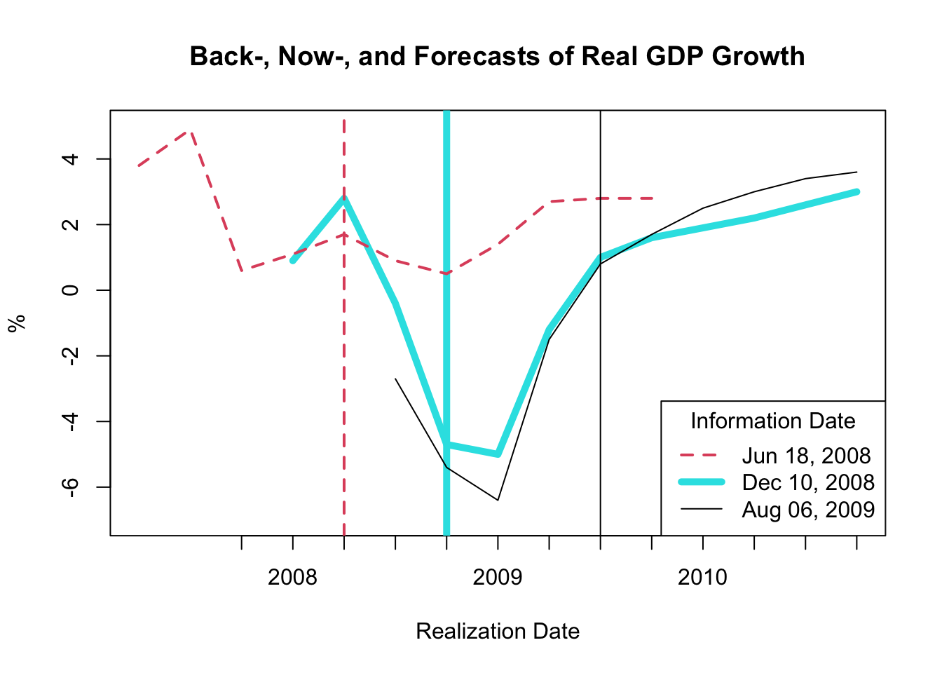
Figure 5.4: Back-, Now-, and Forecasts of Real GDP Growth
The resulting plot, as shown in Figure 5.4, exhibits backcasts, nowcasts, and forecasts derived at three distinct time periods:
- The dashed red line corresponds to the backcasts, nowcasts, and forecasts made on June 18, 2008.
- The thick magenta line represents the backcasts, nowcasts, and forecasts made on December 10, 2008.
- The solid black line signifies the backcasts, nowcasts, and forecasts made on August 06, 2009.
The vertical lines depict the three information dates.
This figure indicates that considerable revisions occurred between June 18 and December 10, 2008, implying that the Federal Reserve did not anticipate the Great Recession. While the revisions between December 10, 2008 and August 06, 2009 are less drastic, it’s noteworthy that there are considerable revisions in the December 10, 2008 nowcasts and backcasts. Consequently, the Federal Reserve had to operate based on incorrect information about growth in the current and preceding periods.
5.4.5 Plotting Forecast Errors
The forecast error for a given period is computed by subtracting the forecasted value from the actual value. This error is determined using an \(h\)-step ahead forecast, represented as follows:
\[ e_{t,h} = y_t - f_{t,h} \]
In this equation, \(e_{t,h}\) stands for the forecast error, \(y_t\) is the actual value, \(f_{t,h}\) is the forecasted value, and \(t\) designates the realization date. The information date of the \(h\)-step ahead forecast \(f_{t,h}\) is \(t-h\), and for \(y_t\) it is either \(t\) or \(t+k\) with \(k>0\) depending on whether the value is observed like asset prices or revised post realization like inflation or GDP growth.
It’s essential to note that the forecast error compares the same realization date with the values of two different information dates. For simplification, we assume that \(y_t=f_{t,-1}\); that is, the 1-step behind backcast is a good approximation of the actual value.
When utilizing the Tealbook inflation data in row format, one might infer that the forecast error is computed by subtracting gPGDPB1 from gPGDPF1 for each row. However, this would be incorrect as it results in \(y_{t-1} - f_{t+1,h}\), where the information date for both variables is \(t\), but the realization dates are \(t-1\) and \(t+1\) respectively, and thus do not match.
Therefore, we need to shift the backcast gPGDPB1 one period forward, and the one-step ahead forecast gPGDPF1 one period backward to compute the one-step ahead forecast error. However, as the realization periods are quarterly, and there are eight FOMC (Federal Open Market Committee) meetings per year, each necessitating Tealbook forecasts, we need to aggregate the information frequency to quarterly as well.
The R code for performing these operations and computing the forecast error is as follows:
# Extract the GDP deflator (inflation) worksheet
gPGDP <- TB[["gPGDP"]]

# Create a date column capturing the information date
gPGDP$date_info <- as.Date(as.character(gPGDP$GBdate),
                           format = "%Y%m%d")

# Aggregate information frequency to quarterly
gPGDP$date_info_qtr <- as.yearqtr(gPGDP$date_info)
gPGDP_qtr <- aggregate(
    x = gPGDP,
    by = list(date = gPGDP$date_info_qtr),
    FUN = last
)

# Lag the one-step ahead forecasts
gPGDP_qtr$gPGDPF1_lag1 <- c(
    NA,
    gPGDP_qtr$gPGDPF1[-nrow(gPGDP_qtr)]
)

# Lead the one-step behind backcasts
gPGDP_qtr$gPGDPB1_lead1 <- c(gPGDP_qtr$gPGDPB1[-1], NA)

# Compute forecast error
gPGDP_qtr$error_F1_B1 <- gPGDP_qtr$gPGDPB1_lead1 -
    gPGDP_qtr$gPGDPF1_lag1
To visualize the inflation forecast errors, we use the plot() function as demonstrated below:
# Plot inflation forecasts for each realization date
plot(x = gPGDP_qtr$date, y = gPGDP_qtr$gPGDPF1_lag1,
     type = "l", col = 5, lty = 1, lwd = 3,
     ylim = c(-3, 15),
     xlab = "Realization Date", ylab = "%",
     main = "Forecast Error of Inflation")
abline(h = 0, lty = 3)

# Plot inflation backcasts for each realization date
lines(x = gPGDP_qtr$date, y = gPGDP_qtr$gPGDPB1_lead1,
      type = "l", col = 1, lty = 1, lwd = 1)

# Plot forecast error for each realization date
lines(x = gPGDP_qtr$date, y = gPGDP_qtr$error_F1_B1,
      type = "l", col = 2, lty = 1, lwd = 1.5)

# Add legend
legend(x = "topright",
       legend = c("Forecasted Value",
                  "Actual Value (Backcast)",
                  "Forecast Error"),
       col = c(5, 1, 2), lty = c(1, 1, 1),
       lwd = c(3, 1, 1.5))
The customization of the plot is achieved using a variety of parameters, as discussed earlier.
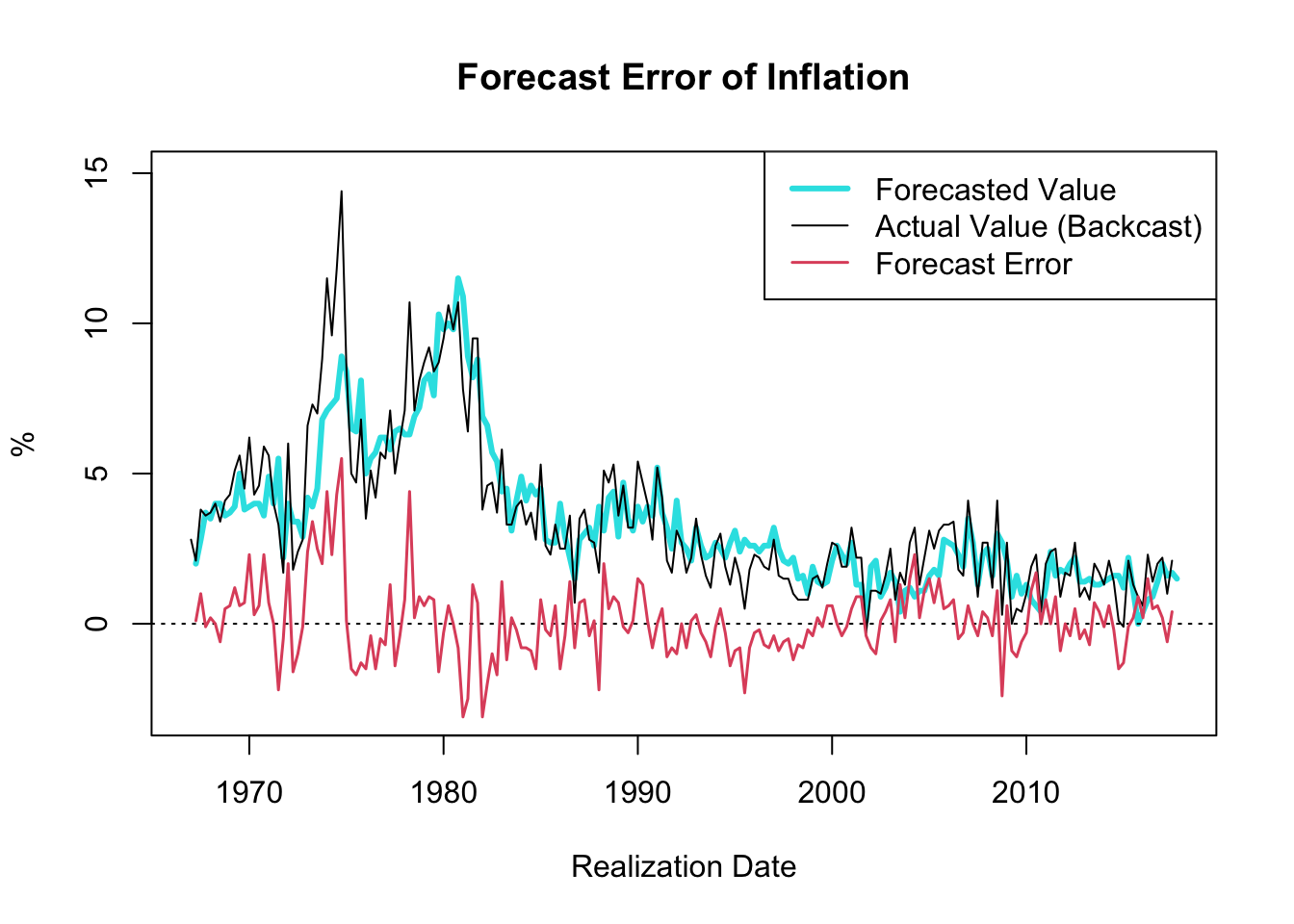
Figure 5.5: Forecast Error of Inflation
The resulting plot, shown in Figure 5.5, showcases the one-quarter ahead forecast error of inflation (GDP deflator) since 1967. A notable observation is the decrease in the forecast error variance throughout the “Great Moderation” period, which spanned from the mid-1980s to 2007.
The term “Great Moderation” was coined by economists to describe the substantial reduction in the volatility of business cycle fluctuations, which resulted in a more stable economic environment. Multiple factors contributed to this trend. Technological advancements, structural changes, improved inventory management, financial innovation, and, crucially, improved monetary policy, are all credited for this period of economic stability.
Monetary policies became more proactive and preemptive during this period, largely due to a better understanding of the economy and advances in economic modeling. These models, equipped with improved data, allowed for more accurate forecasts and enhanced decision-making capabilities. Consequently, policy actions were often executed before economic disruptions could materialize, thus moderating the volatility of the business cycle.
It is worth noting that the forecast error tends to hover around zero. If the forecast error were consistently smaller than zero, one could simply lower the forecasted value until the forecast error reaches zero, on average, consequently improving the accuracy of the forecasts. Thus, in circumstances where the objective is to minimize forecast error, it is reasonable to expect that the forecast error will average out to zero over time.
The following calculations are in line with the description provided above:
## [1] 0.07871287## [1] 1.237391# Compute volatility of FE before Great Moderation
sd(gPGDP_qtr$error_F1_B1[gPGDP_qtr$date <= as.yearqtr("1985-01-01")],
na.rm = TRUE)## [1] 1.728324# Compute volatility of FE at & after Great Moderation
sd(gPGDP_qtr$error_F1_B1[gPGDP_qtr$date > as.yearqtr("1985-01-01")],
na.rm = TRUE)## [1] 0.8499342